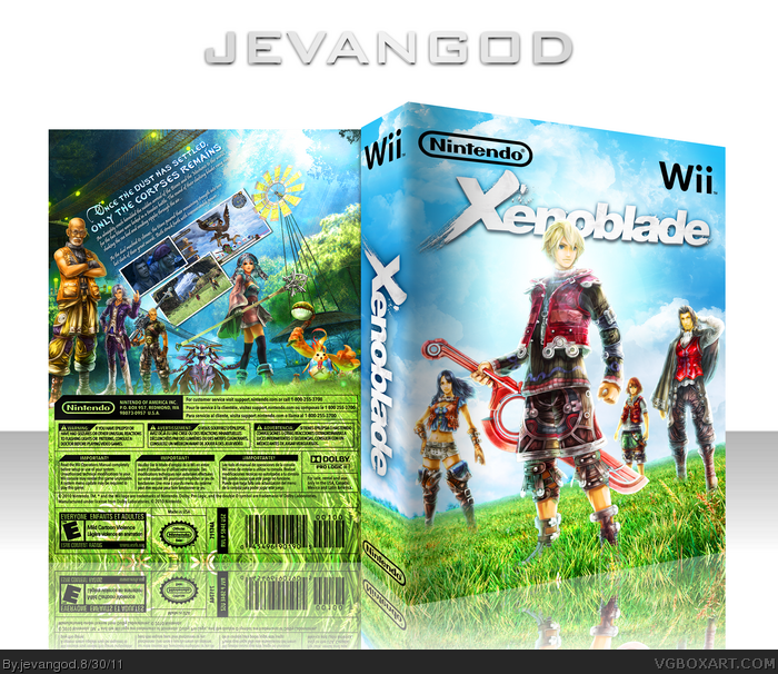
I really think the back is cool how it's night and day and the composition is really good but I'm not at all a fan of the front. I really dislike the characters floating in the air, even if they are blended decently enough. Great colors. I'll fav for the back.
I'm liking the back the most, the transition between dark and light is pretty neat, if I say so myself.
Things like characters overlapping the screens a bit adds a lot more depth to the back.
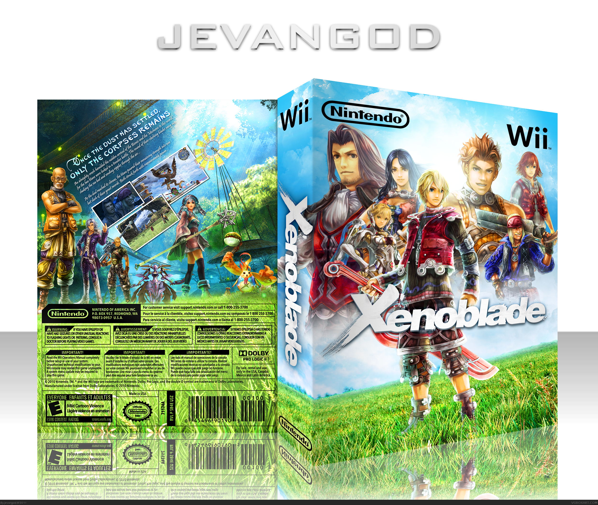
Not bad. I'm glad you've taken the time to update, as V1 had some noticeable balance issues with the character arragement, and the sunrays were distracting and unfitting of Xenoblade's artistic styling. It looked flat and two-dimensional in an otherwise detailed environment. The new front is nice, a little barren, but this isn't necessarily a fault.
The back is better, and it's good that you're continuing to try different layouts with both text and screenshot (at least apart from your usual submissions). One matter, though, is that I would have highly advised towards using an image of Fiora (link) over some of the other choices you made.
#18: I assumed that was the case, but made the suggestion anyway. The poses work well with the layout you went with, so I understood why you chose them.
 Xenoblade Box Cover Comments
Finished this a few days ago. Inspired by SD1833's cover. I don't use artwork like this cause I'm not really a big fan of it. But it grew on me.
[ Reply ]
I really think the back is cool how it's night and day and the composition is really good but I'm not at all a fan of the front. I really dislike the characters floating in the air, even if they are blended decently enough. Great colors. I'll fav for the back.
Edited at 1 decade ago
[ Reply ]
#2, Yea I see what you mean. I just updated it.
EVERYONE tell me what you think of both V1 and V2.
[ Reply ]
I really like both. But Version 2 makes more sense just because they aren't floating. Love the back, though.
[ Reply ]
The sunray is a real turnoff, I would remove it.
[ Reply ]
I much prefer V1, that sunray is wack. Back looks great too, but the screens and description text seem crammed in.
[ Reply ]
Stunning.
[ Reply ]
This^^
[ Reply ]
The sunrays are a bit cheesy, take those out! But wow, you've really gotten better, that back is beautiful!
[ Reply ]
UPDATED for yall. lol.
[ Reply ]
Much better without those sunbursts.
I'm liking the back the most, the transition between dark and light is pretty neat, if I say so myself.
Things like characters overlapping the screens a bit adds a lot more depth to the back.
non other than a fav for this fine box ;)
Edited at 1 decade ago
[ Reply ]
Much better than V1. All around nice box now.
[ Reply ]
Printable added.
[ Reply ]
Loads better, very nice job dude!
[ Reply ]
I can't stare away. Very nice job!
Edited at 1 decade ago
[ Reply ]
Beautiful! Love it!
[ Reply ]
Not bad. I'm glad you've taken the time to update, as V1 had some noticeable balance issues with the character arragement, and the sunrays were distracting and unfitting of Xenoblade's artistic styling. It looked flat and two-dimensional in an otherwise detailed environment. The new front is nice, a little barren, but this isn't necessarily a fault.
The back is better, and it's good that you're continuing to try different layouts with both text and screenshot (at least apart from your usual submissions). One matter, though, is that I would have highly advised towards using an image of Fiora (link) over some of the other choices you made.
Edited at 1 decade ago
[ Reply ]
#17, Yea. Well I never played the game or anything. So I just chose people that just looked good in the spots.
[ Reply ]
#18: I assumed that was the case, but made the suggestion anyway. The poses work well with the layout you went with, so I understood why you chose them.
[ Reply ]
So beautiful and unlike your usual, great job.
[ Reply ]
I'm pretty sure you'll get rewarded for this soon enough.
[ Reply ]
Congrats My Friend ;)
[ Reply ]
Hell, finally!
[ Reply ]
Absolutely deserved HoF. And it's from 2011 :D Congrats.
[ Reply ]