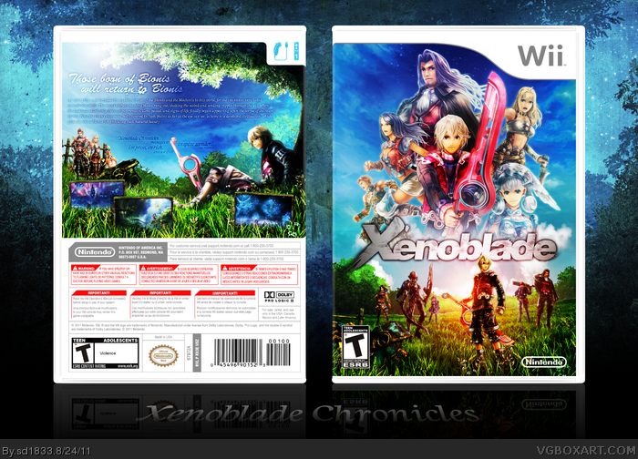
Very shiny and colorful. I really like how the screens are sunk into the grass. Everything looks great but the text is kinda hard to read in the regular view.
#4/5: Thanks a lot, man. I'd made sure to keep the text visible when viewing the printable, and the screenshots were actually one of the first ideas I'd come up with when starting the cover.
#6: That's a bit generous, but I appreciate it nonetheless. Thanks.
#7: I had to resize the image to upload, as it was too large before, which is why the text is a bit difficult to read in full view. It should be perfectly legible if you printed it out though.
I'd like to take this time to tell all of you capable of buying this game without the need to import or mod, you'd better do so, because I want my US release. Plus, it's not like you would want to pass over what's likely one of the best games of the year.
Impressive, the colors are gorgeous and the way you presented the screens on the back is amazing. Text is a bit hard to see thoug, but great job nevertheless!
Great, great work, but I feel you may be relapsing with your love for effects...except this time it's lighting. If you can keep it tasteful then it's fine, but i'm gonna have to object when you have two, very distinct light sources on the back coming from completely opposite ends.
Overlooking that flaw, this is excellent; I particularly like the way you've presented the screens.
#17: Patience is a virtue. I'll wait until a proper North American release is made.
#18: Both out and in the printable view? I made sure the text was legible enough if printed. Thanks much, either way.
#19: I see. My intentions were less about adding another source of light, and continuing the orange glow from the front. Purely for consistency's sake. I decided to throw together a back with a lighting scheme I assume you'd find more preferable: (link) If you guys think I should update with this, let me know. I truly appreciate the criticisms, Flexx, thanks.
Very nice job SD, the front is perfect. The back though is really bothering me. Nice job on the screen shots and background, but the text is much to difficult to read. It needs to stand out more, and the screens could be a bit bigger. But of course, wonderful job!
Edit: The new back lighting does look much better.
#20, Ahh, I can see now that you did indeed continue the lighting from the front. My bad for missing that one. In either case, I find your updated design to be much more pleasant...maybe if you were thinking of updating the back text you'd have a go at changing the back as well?
OH MY, this is so perfect. I was going to mention that the text was too small, but in the printable view it's clearly not. This makes me want to start posting boxes again, wow it's fantastic.
Apologies for the late response. I updated the back with the red lighting removed and the synopsis drop shadow enhanced. I didn't have an issues reading the text before, but it should at least be easier now.
The idea of the screenshots being on the grass was creative, but I thing it would be better without it, I preffer the screenshots "un the air" but it's just me
The front is gorgeous! I love this design, a lot of characters above the logo and some "background" under.
#32: I did consider having the screenshots simply hover above the image, but in the end felt it was a bit too basic, and I couldn't think of another way to blend them in with the image. Thanks for leaving a comment though, I always appreciate it.
You never seem to disappoint me when you release a new boxart!
This is so awesome, and it makes me want to try that much harder at making more quality boxart!
Deffinite +fav!
 Xenoblade Box Cover Comments
You have no idea how beautiful this is.
[ Reply ]
#1, Thank you, Sarashi. Glad you like it.
And thanks to Beardedwalrus for the template.
Edit: And make sure to view the printable version, for full resolution and best quality.
Edited at 1 decade ago
[ Reply ]
Beautiful. Very striking.
About time I author faved you.
Edited at 1 decade ago
[ Reply ]
Beautiful, very nice to look at, that's what's important! :D
[ Reply ]
I took a closer look thinking I'd end up telling you to make the text more visible, but fuck no. Even the screens, man.
This is awesome.
[ Reply ]
#3, Same here.
I love what you did with the screens at the back and the lightning is spot on, ;) lol
This should be moved to masterworks,straight away.
Now, We have to wait endlessly to look at the box in Hall and Masterworks :(
Edited at 1 decade ago
[ Reply ]
Very shiny and colorful. I really like how the screens are sunk into the grass. Everything looks great but the text is kinda hard to read in the regular view.
[ Reply ]
Whoa.
[ Reply ]
#3: That means a good deal, ADFD, thanks.
#4/5: Thanks a lot, man. I'd made sure to keep the text visible when viewing the printable, and the screenshots were actually one of the first ideas I'd come up with when starting the cover.
#6: That's a bit generous, but I appreciate it nonetheless. Thanks.
#7: I had to resize the image to upload, as it was too large before, which is why the text is a bit difficult to read in full view. It should be perfectly legible if you printed it out though.
I'd like to take this time to tell all of you capable of buying this game without the need to import or mod, you'd better do so, because I want my US release. Plus, it's not like you would want to pass over what's likely one of the best games of the year.
Edited at 1 decade ago
[ Reply ]
US Xenoblade...
*sigh*
[ Reply ]
#10: Yeah, I know...
*sigh*
[ Reply ]
Amazing work.
[ Reply ]
Very good work, the front reminds me the artwork from the complete guide. Excellent idea with the screenshots in the grass, very creative.
[ Reply ]
This is so dynamic and impressive. Everything about it feels so cohesive. Very refreshing.
[ Reply ]
#12/14: Thanks for taking some time to leave comments, guys. Hopefully I'll be able to put the printable to use at some point.
#13: The images of Shulk and Sharla were actually from the complete guide. The other characters I arranged myself.
[ Reply ]
Stunning! A beauty to behold!!
[ Reply ]
Sd, don't you dare. I'm ONE INCH away from importing this game; get this pretty thing out of my face at once! :P
[ Reply ]
Impressive, the colors are gorgeous and the way you presented the screens on the back is amazing. Text is a bit hard to see thoug, but great job nevertheless!
Edited at 1 decade ago
[ Reply ]
Great, great work, but I feel you may be relapsing with your love for effects...except this time it's lighting. If you can keep it tasteful then it's fine, but i'm gonna have to object when you have two, very distinct light sources on the back coming from completely opposite ends.
Overlooking that flaw, this is excellent; I particularly like the way you've presented the screens.
[ Reply ]
#17: Patience is a virtue. I'll wait until a proper North American release is made.
#18: Both out and in the printable view? I made sure the text was legible enough if printed. Thanks much, either way.
#19: I see. My intentions were less about adding another source of light, and continuing the orange glow from the front. Purely for consistency's sake. I decided to throw together a back with a lighting scheme I assume you'd find more preferable: (link) If you guys think I should update with this, let me know. I truly appreciate the criticisms, Flexx, thanks.
[ Reply ]
Teach me your ways.
[ Reply ]
Beautiful indeed. A well deserved fav and author fav.
[ Reply ]
Very nice job SD, the front is perfect. The back though is really bothering me. Nice job on the screen shots and background, but the text is much to difficult to read. It needs to stand out more, and the screens could be a bit bigger. But of course, wonderful job!
Edit: The new back lighting does look much better.
Edited at 1 decade ago
[ Reply ]
Damn, stunning work again!
[ Reply ]
#20, Ahh, I can see now that you did indeed continue the lighting from the front. My bad for missing that one. In either case, I find your updated design to be much more pleasant...maybe if you were thinking of updating the back text you'd have a go at changing the back as well?
[ Reply ]
I love the front. The text on the back is very weak and hard to read.
[ Reply ]
OH MY, this is so perfect. I was going to mention that the text was too small, but in the printable view it's clearly not. This makes me want to start posting boxes again, wow it's fantastic.
[ Reply ]
Apologies for the late response. I updated the back with the red lighting removed and the synopsis drop shadow enhanced. I didn't have an issues reading the text before, but it should at least be easier now.
Thanks for feedback and compliments, guys.
[ Reply ]
Great work with the update!
[ Reply ]
Thanks, Flexx. I assume the text is easier to read now. ;]
[ Reply ]
Congrats.
[ Reply ]
The idea of the screenshots being on the grass was creative, but I thing it would be better without it, I preffer the screenshots "un the air" but it's just me
The front is gorgeous! I love this design, a lot of characters above the logo and some "background" under.
I shall fav it
[ Reply ]
#31: Thanks, Jevan.
#32: I did consider having the screenshots simply hover above the image, but in the end felt it was a bit too basic, and I couldn't think of another way to blend them in with the image. Thanks for leaving a comment though, I always appreciate it.
[ Reply ]
You never fail to amaze, sd, and this is no exception.
Truly stunning.
[ Reply ]
and pop into the hall, it actually didn't took that long :)
Congrats!
Edited at 1 decade ago
[ Reply ]
Deliciously gorgeous. As always.
[ Reply ]
very well done nice logo placement. I like how you placed the characters of the game and the quality of the graphics is stunning as well.
[ Reply ]
This is Freakin' Amazing :D
[ Reply ]
#38: Hey, thanks. And thanks to everyone else, too. ;]
[ Reply ]
Ironic thing about this box is that a little over a month later it got announced for U.S.
Anyway awesome box man. Fav'd :D
[ Reply ]
You never seem to disappoint me when you release a new boxart!
This is so awesome, and it makes me want to try that much harder at making more quality boxart!
Deffinite +fav!
[ Reply ]
Wow ! Great work there ! Where did you get that background ? I just try to find it and I can't
[ Reply ]