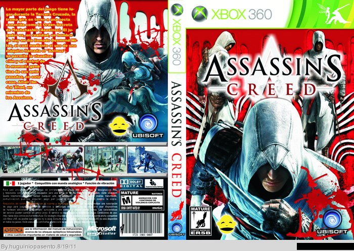
The overused blood doesn't really do well with this cover :/
He's assassin, it does involve blood, but he's not such
a brutal killer like for example Kratos from GOW.
I think you'll have to tone it down a notch.
I also agree with #1 about the presentation, they all look
the same. try to be a bit more creative, rather than just
upload the print, right away.
Try to make the box in 3D (there are even programs that do it for you)
The quality isn't the best, but it still looks way better than just a flat image imo.
and about the back yellow font, it kinda worked with your Alice box,
but here it clashes way to much, try another color and font instead.
Just a last thing I've noticed: don't use logos on the back, they're useless (a logo is used for present the game, that's why it is on the front. I suppose that a person who looks at a Boxart watches the front first.
 Assassin's Creed Box Cover Comments
Good box, but you're using too much blood and red, too much Altaiirs and the screenshot presentation is always the same. Since three boxes.
[ Reply ]
The overused blood doesn't really do well with this cover :/
He's assassin, it does involve blood, but he's not such
a brutal killer like for example Kratos from GOW.
I think you'll have to tone it down a notch.
I also agree with #1 about the presentation, they all look
the same. try to be a bit more creative, rather than just
upload the print, right away.
Try to make the box in 3D (there are even programs that do it for you)
The quality isn't the best, but it still looks way better than just a flat image imo.
and about the back yellow font, it kinda worked with your Alice box,
but here it clashes way to much, try another color and font instead.
Edited at 1 decade ago
[ Reply ]
Just a last thing I've noticed: don't use logos on the back, they're useless (a logo is used for present the game, that's why it is on the front. I suppose that a person who looks at a Boxart watches the front first.
[ Reply ]