Boy, you put most of the other XIII boxes on the site to shame. Good Job. I especially like the hexagonal overlay and the line separator from the tagline to the end of the description. Wonderful.
Make the SE logo bigger though. That'd help. The logo should be moved down to the left of Lightning and below Snow and Hope's faces.
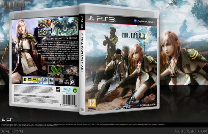
 Final Fantasy XIII Box Cover Comments
Woah, nice one man. This is excellent, I especially like the back.
[ Reply ]
Simple, good. Not much done in the way of editing or effects, but that's not always necessary. Good layout on the back, too.
[ Reply ]
Boy, you put most of the other XIII boxes on the site to shame. Good Job. I especially like the hexagonal overlay and the line separator from the tagline to the end of the description. Wonderful.
Make the SE logo bigger though. That'd help. The logo should be moved down to the left of Lightning and below Snow and Hope's faces.
Edited at 1 decade ago
[ Reply ]
I really like this. its done very well good job!
[ Reply ]
What is wrong with you? You keep popping out amazing box-arts!
[ Reply ]
#5, hehe xD
[ Reply ]
Plese add the printable version.
[ Reply ]