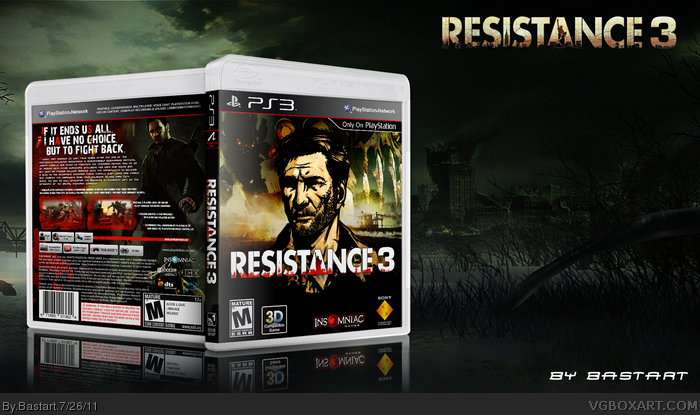
I made the front using three different screenshots blending in eachother and my own render of a chimera.
At the back I used some artwork of the official website and a SRPA logo from link
Credits to 'Sens' for the template and 'Darsephtan' for the SRPA logo.
Realised I've never give credits to 'Scorpion Soldier' for his PS3 Print Template, wich I used for all of my boxes.
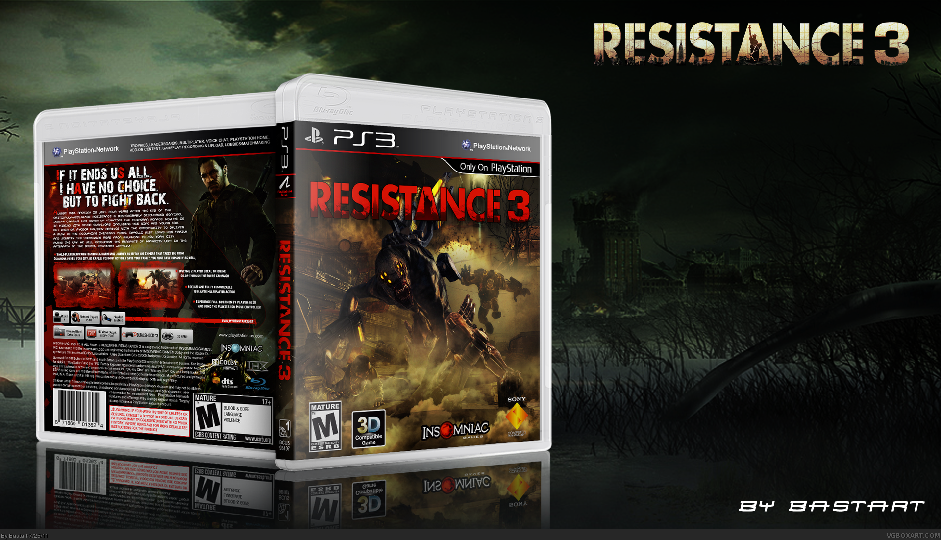
I agree with Deadpool... the red logo might just be my problem with the front. Then again, I'm not sure if a different color would clash with the back. I do think you should experiment with that though.
#10, Thanks, I also like the back the most. As for the front, mostly I'm pretty happy with my front, I must say that I was pleased with the result, but the more I look at it, I'm getting a feeling there's something missing. I'm gonna have a last go on re-working the front.
#11 Thanks for the help, I'm going to update it one last time, I think I've got an idea of making a better front.
I found a nice Artwork picture of Capelli. I had to cut it out and adjust it a bit, but I think it looks nice.
I added a boat scene from the game and blended in a Chimera Artwork image. This gonna be my final,
go at the front.
I really did the best I could.
Thanks for the comments and help.
I think I'm ready now, to upload the follow up on this box the 'Doomsday Edition'
 Resistance 3 Box Cover Comments
I made the front using three different screenshots blending in eachother and my own render of a chimera.
At the back I used some artwork of the official website and a SRPA logo from link
Credits to 'Sens' for the template and 'Darsephtan' for the SRPA logo.
Realised I've never give credits to 'Scorpion Soldier' for his PS3 Print Template, wich I used for all of my boxes.
Edited at 1 decade ago
[ Reply ]
The front is lacking something... it seems kinda dull. But the back is great. +fave
[ Reply ]
#2, Is it those brownish colors? I'll try to make a more interesting front.
Maybe, you like the front of my 'Doomsday Edition' better?
I'll upload it, when the day is passed.
Edited at 1 decade ago
[ Reply ]
Nice overall, but a red title really doesn't work IMO
[ Reply ]
I agree with Deadpool... the red logo might just be my problem with the front. Then again, I'm not sure if a different color would clash with the back. I do think you should experiment with that though.
[ Reply ]
Alright, I'll try to change the color of the logo and make a better front.
thanks for the suggestions ;)
Edited at 1 decade ago
[ Reply ]
I've made some changes at the front the logo is now white, but I kept the inside orange to match with the back.
I've used a screenshot of capelli taking cover and merged some chimera in the picture.
I hope these changes, have improved the front quite a bit?
Edited at 1 decade ago
[ Reply ]
I liked the old one better tbh. Could you have kept the picture and changed the logo?
Edited at 1 decade ago
[ Reply ]
#8, Sure ;)
[ Reply ]
I love the back, just don't like the front too much. Anyway, good work!
[ Reply ]
It looks alot better now, great job.
[ Reply ]
#10, Thanks, I also like the back the most. As for the front, mostly I'm pretty happy with my front, I must say that I was pleased with the result, but the more I look at it, I'm getting a feeling there's something missing. I'm gonna have a last go on re-working the front.
#11 Thanks for the help, I'm going to update it one last time, I think I've got an idea of making a better front.
Edited at 1 decade ago
[ Reply ]
I found a nice Artwork picture of Capelli. I had to cut it out and adjust it a bit, but I think it looks nice.
I added a boat scene from the game and blended in a Chimera Artwork image. This gonna be my final,
go at the front.
I really did the best I could.
Thanks for the comments and help.
I think I'm ready now, to upload the follow up on this box the 'Doomsday Edition'
Edited at 1 decade ago
[ Reply ]
#3, to brown? link
[ Reply ]