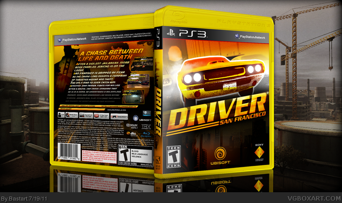
A box I made earlier, but never posted it.
I made the front using this driver screen link and this city skyline image link
and yes, this is a yellow box! I like it. thought it would look cool with the color scheme.
It gets your attention. That's what I think, is setting a game box apart, from the rest,
that are standing on a shelf. it will catch the eye and interest of a person walking by a store.
off course, the print is what counts the most, but from a distance you hardly notice it.
I think i'm drifting away a little here ;)
Credits to 'Sens' for the template.
p.s. I forgot to fill in the legal info :/ printable will follow...
Looks pretty neat. Good job on editing the front image and the yellow template looks neat and unique.
I would however, make Ubisoft logo smaller on front and back seems a bit text heavy.
* re-did the text (smaller font, little gradient; to let it disappear like some sort of movie scroll)
* added 2 small lines of features.
* removed some PSN Network info at the bottom
I love the colours of this one! I usually hate coloured templates, but this one is great. It actually makes me want to play this game... And I don't like driving games.
Though the back needs some screenshots visible instantly. It took me a while to find them.
about the Sony logo, I don't really know if they use a version with white letters?
anyway, what I do know is, that the official one uses blue as the font color.
 Driver: San Francisco Box Cover Comments
A box I made earlier, but never posted it.
I made the front using this driver screen link and this city skyline image link
and yes, this is a yellow box! I like it. thought it would look cool with the color scheme.
It gets your attention. That's what I think, is setting a game box apart, from the rest,
that are standing on a shelf. it will catch the eye and interest of a person walking by a store.
off course, the print is what counts the most, but from a distance you hardly notice it.
I think i'm drifting away a little here ;)
Credits to 'Sens' for the template.
p.s. I forgot to fill in the legal info :/ printable will follow...
Edited at 1 decade ago
[ Reply ]
Looks pretty neat. Good job on editing the front image and the yellow template looks neat and unique.
I would however, make Ubisoft logo smaller on front and back seems a bit text heavy.
[ Reply ]
#2, Thanks, what do you suggest?
make the font size smaller? cut down a part of the story description?
Your right about that Ubi logo, it's a bit big, i'll fix it.
[ Reply ]
#3, Definitely make the font size smaller, so it does not overlap screenshots because it's hard too see them.
[ Reply ]
#4, You're right, the font size is to big now.
[ Reply ]
You deserve a LOT more attention.
[ Reply ]
#6 Thanks man, I think the rest is kinda busy with those VGBA Cups,
and there are some boxes lately that are the icing of the cake if you ask me.
Edited at 1 decade ago
[ Reply ]
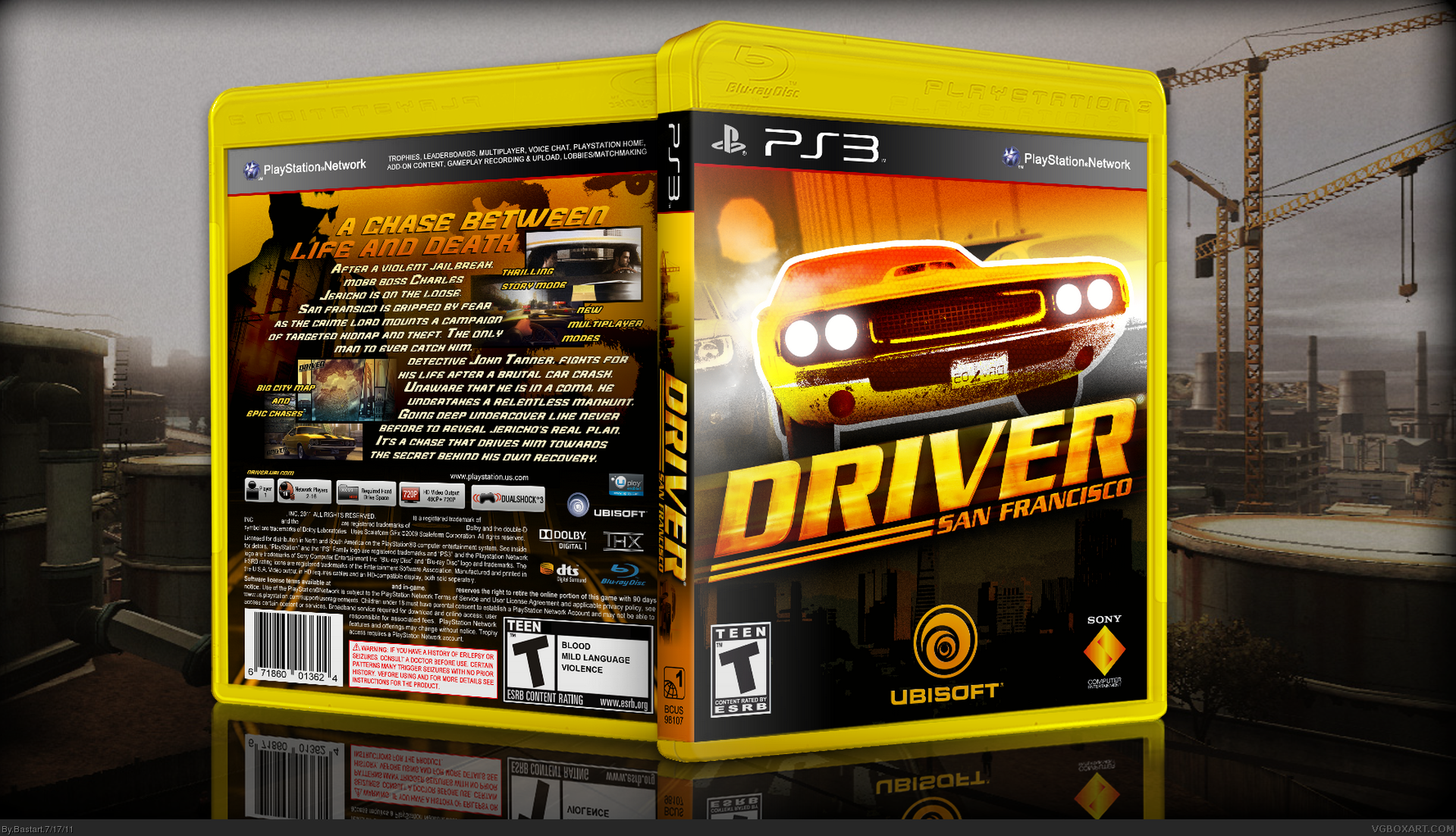
Update, I've changed the back.
* re-did the text (smaller font, little gradient; to let it disappear like some sort of movie scroll)
* added 2 small lines of features.
* removed some PSN Network info at the bottom
Edited at 1 decade ago
[ Reply ]
#7, like that inception one and the daniel rycliffe is ugly one? ya those ARE amazing props to your for realising... oh and this sucks
[ Reply ]
I love the colours of this one! I usually hate coloured templates, but this one is great. It actually makes me want to play this game... And I don't like driving games.
Though the back needs some screenshots visible instantly. It took me a while to find them.
But a fav non the less!
[ Reply ]
#10, Thanks :)
I've made an update on the back and front, this will be my last version.
[ Reply ]
I love it, but I don't like the yellow template.
[ Reply ]
#12, just as I expected, not everyone is liking the yellow template /:
well, I can't say everybody has to love it lol,
but in this case, I thought it worked.
It's always a matter of taste, on the other hand, I like it :)
Oh yeah, I almost forgot to thank anyone who favored this box ;)
except SirSuckySuckSuck.....
Edited at 1 decade ago
[ Reply ]
Pretty solid box man. Normally I don't fancy the colored plastic but it works for me on this design.
On the front do they usually use that logo for Sony? Just wondering.
[ Reply ]
#14, Thanks, glad you like the plastic :)
about the Sony logo, I don't really know if they use a version with white letters?
anyway, what I do know is, that the official one uses blue as the font color.
Edited at 1 decade ago
[ Reply ]
Great update for the back. Looks much better and the yellow plastic works well for this cover.
+FAV
[ Reply ]
#16, Thanks ;)
[ Reply ]
i like my little nickname very creative
[ Reply ]