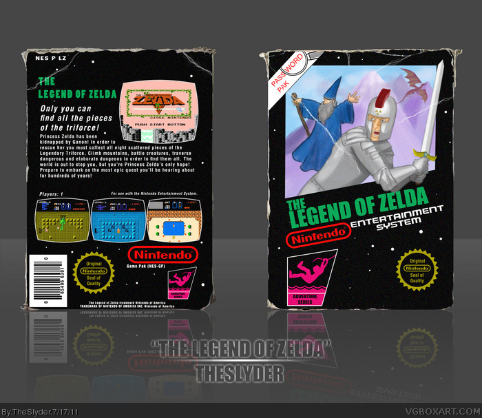
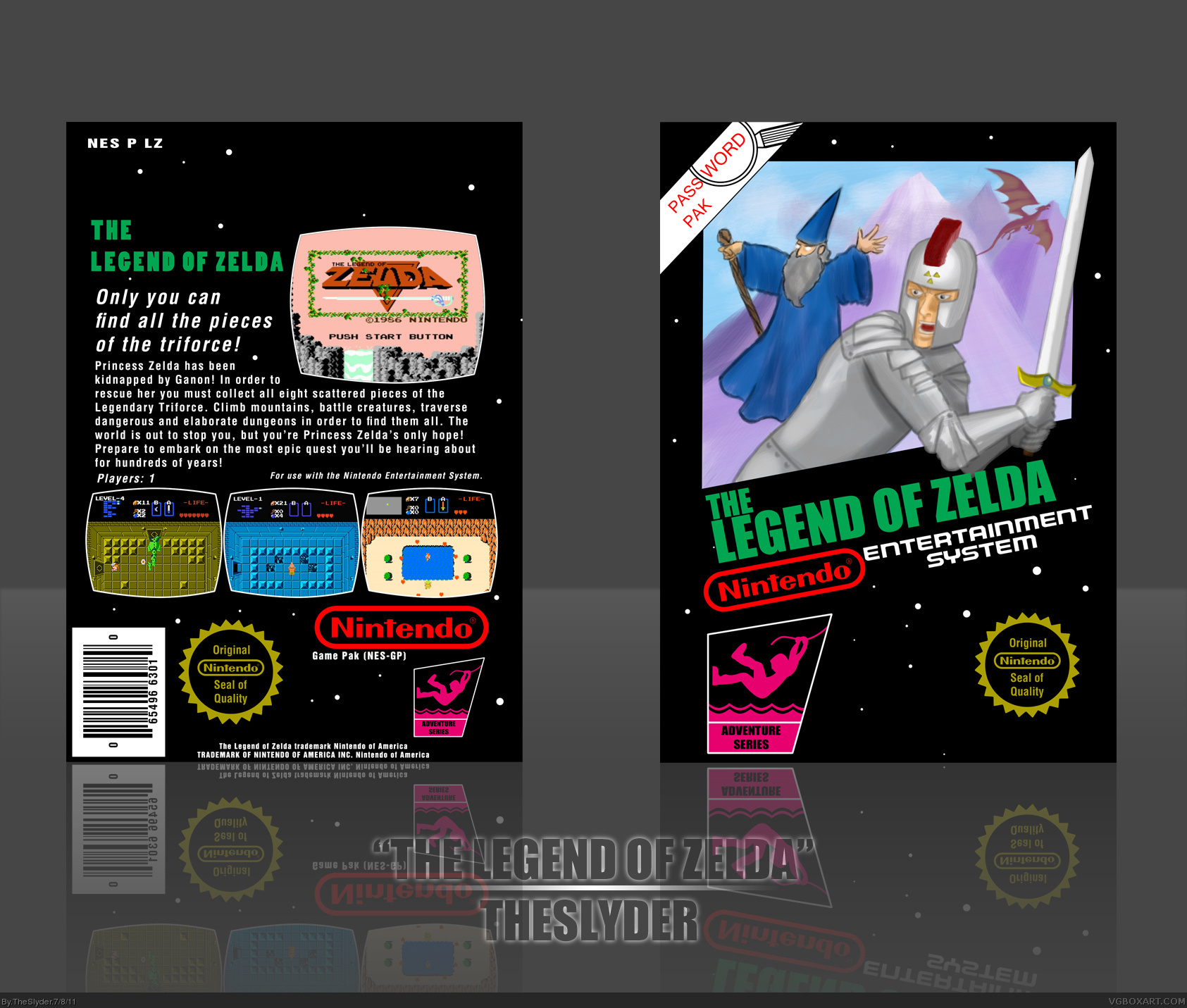
Looks like I'm the first one to submit an entry this round. I believe I have some explaining to do. A lot of NES games had notoriously bad covers that rarely bore any resemblance to the source material. The most popular example of this would be the notorious Mega Man cover. More noteworthy examples would be Psycho Soldier and Crystalis. That was the concept I went with here. What if Nintendo had gotten some schmuck who had never even seen a screenshot of The Legend of Zelda to paint up a cover for it based on the fact that it was loosely a "Fantasy RPG style setting."
The dilemma I had with this is that the template I used exclusively had pixel art in place of a cover, and I greatly deviated from that when I painted this image for it. I'm hoping the judges of the competition will be able to overlook the technical inaccuracy of it in favor of the spirit of the concept.
Even before I read your comment, I thought "he pulled a Capcom!". I'm going with a totally different idea, but I definitely appreciate what you did. I think we would be looking at Zelda a whole different way if Nintendo did this back in the day. That also calls back the original Final Fantasy art in my mind.
I realized your intentions immediately. Great idea, although I think some of the charm is lost in that it doesn't look as horrifically ugly as the original Mega Man cover.
Wow, I'm so glad you guys all got it and like it. I really expected a lot of "Ehhh" going on.
#11, I agree. I didn't really notice it until you said something. I actually made that entire back by making it all from scratch on top of the the real back for Super Mario Bros. So the spacing is like that for real (There's a peg-hole that's near the top that I didn't want to make, which explains the negative space.)
It's a very good idea for a humour box. The front is well made and the art is also very good, also the back is very official looking so there isn't really anything wrong with it, but I would have moved everything up a little bit because you don't have to worry about the peg hole being in the way.
This cover perfectly fills the retro category and I prefer this to your Metroid one. The artwork is perfect, and the box has an overall pleasing vibe, you'll do excellent in Round 2.
#19, Thanks a lot, Brett. I was VERY torn on which one I wanted to enter in Round 2, but your comment helped tip me towards using this one. I think I might take the next day or two to spruce it up some for the competition.
I am glad you went with this one. I think it is a lot nicer than the Metroid one. The art is fantastic on both, but this one was the original concept, and I think it overshadowed your Metroid one. Well done.
 The Legend of Zelda Box Cover Comments
Looks like I'm the first one to submit an entry this round. I believe I have some explaining to do. A lot of NES games had notoriously bad covers that rarely bore any resemblance to the source material. The most popular example of this would be the notorious Mega Man cover. More noteworthy examples would be Psycho Soldier and Crystalis. That was the concept I went with here. What if Nintendo had gotten some schmuck who had never even seen a screenshot of The Legend of Zelda to paint up a cover for it based on the fact that it was loosely a "Fantasy RPG style setting."
The dilemma I had with this is that the template I used exclusively had pixel art in place of a cover, and I greatly deviated from that when I painted this image for it. I'm hoping the judges of the competition will be able to overlook the technical inaccuracy of it in favor of the spirit of the concept.
Hope you guys get a kick out of it.
[ Reply ]
Well, I didn't get it by looking at the box, but reading your comment, I love it :)
[ Reply ]
I love this so much, I understood it right away. Amazing job man!
[ Reply ]
I knew right away what you were going for, knowing the history of the Megaman cover. Nice job, I actually think it's kinda clever.
[ Reply ]
Even before I read your comment, I thought "he pulled a Capcom!". I'm going with a totally different idea, but I definitely appreciate what you did. I think we would be looking at Zelda a whole different way if Nintendo did this back in the day. That also calls back the original Final Fantasy art in my mind.
[ Reply ]
#4, This.
Love it.
[ Reply ]
Gotta love the humor in this. Good job.
[ Reply ]
very retro looking and real funny cover (in a good way)
not my kinda game though :/
it's getting my fave for the idea and the work you put in here :)
Edited at 1 decade ago
[ Reply ]
I realized your intentions immediately. Great idea, although I think some of the charm is lost in that it doesn't look as horrifically ugly as the original Mega Man cover.
[ Reply ]
#9, I aagree with that. Mega Man looked bad even if you factor out that it didn't match the character. This is still really fun, though.
[ Reply ]
I really like the entire concept of this, though I feel as if the back could be spaced out a tiny bit more and nudged toward the top.
[ Reply ]
Wow, I'm so glad you guys all got it and like it. I really expected a lot of "Ehhh" going on.
#11, I agree. I didn't really notice it until you said something. I actually made that entire back by making it all from scratch on top of the the real back for Super Mario Bros. So the spacing is like that for real (There's a peg-hole that's near the top that I didn't want to make, which explains the negative space.)
[ Reply ]
This is sorta like "that guy who made the Mega Man 1 box art making the Legend of Zelda box art"
[ Reply ]
At first I was confused but after reading the comment I understand and faved. I really like the art too.
[ Reply ]
This wasn't a bad idea at all. Great job.
[ Reply ]
looks good! :D
The tagline on the back could be moved up though.
[ Reply ]
It's a very good idea for a humour box. The front is well made and the art is also very good, also the back is very official looking so there isn't really anything wrong with it, but I would have moved everything up a little bit because you don't have to worry about the peg hole being in the way.
[ Reply ]
This cover perfectly fills the retro category and I prefer this to your Metroid one. The artwork is perfect, and the box has an overall pleasing vibe, you'll do excellent in Round 2.
[ Reply ]
#19, Thanks a lot, Brett. I was VERY torn on which one I wanted to enter in Round 2, but your comment helped tip me towards using this one. I think I might take the next day or two to spruce it up some for the competition.
[ Reply ]
I am glad you went with this one. I think it is a lot nicer than the Metroid one. The art is fantastic on both, but this one was the original concept, and I think it overshadowed your Metroid one. Well done.
[ Reply ]
Love the update Sly, it really adds a genuine feel to the box.
[ Reply ]
Truly fantastic.
[ Reply ]
Im getting more of a Skyrim old school feel to it more than Zelda for the front. But still pretty cool! And Congrats on the HoF
[ Reply ]
Haha, my fav totally got it in! xD
Surprised I didn't fav it earlier.
[ Reply ]
It's about time this got into the Hall of Fame. I love this box.
[ Reply ]
Hah, awesome. Thanks gang.
[ Reply ]
While I like it, I don't understand why you put all the noise in there.
[ Reply ]
I wanted "texture" for it. Looking back though it didn't add any sense of texture, just Silent Hill style noise. I regret doing it.
[ Reply ]
On another note, I would love a less intense version of those edges to use on soundtrack covers.
[ Reply ]
If you want I can send you the .psd file for you to utilize.
[ Reply ]