A nice design. A bit too basic for my tastes tho. It seems like there was more you could have done. I'm not sure if you were going for a more "artistic minimalism" approach, but I would have added more to the back describing what the game is about.
I like the simplicity and the art style. However I have no idea what's on the front or back. The front looks to be from a scene with a camera on the ground, and the back the screenshots don't show much action, and if there are ones on there that do, it's really hard to see what going on in them.
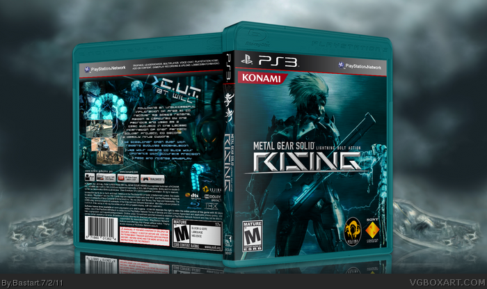
I wanted to go really simplistic with this box, no game description, obvious Raiden on the front.
it suppose to be different, and maybe a bit to simple and crowded on the back, but I think it still works imo.
about the color scheme, it's always a matter of taste.
I like the back, and the straight-forward approach to describing the game. The front could use a clearer image to focus on. I've seen the piece of artwork you used, which is how I recognized it, but otherwise it's difficult to discern exactly what's going on.
Despite this, it's a good effort. I'm digging the dark colors, and again the back's pretty cool.
#11, nope a troll is not affected by words so by saying im not funny is not going to change my mind! i will be your fan wether you like it or not!!!! BITCH!
Only 2 problems.
1) The Konami logo is pushed too far into the corner, bring it out just a little
2) the game is multi-platform so the 'Only on PS3' banner isn't needed
other than that, epic!
#21, are you replying to RobbyG or me? anyway, the font is link
#22, i know the logo isn't supposed to be in the corner and that it's not 'only for playstation',
but the logo's are in the same shape, that's why I've chosen to leave it like this.
I'm gonna change is it in the 2nd version, when I re-do the front,
and add a game description to the back of the box.
re-did the front by zooming in on Raiden, I got rid of the 'Only for Playstation' Logo,
adjusted the 'Konami' logo a bit to the right and I changed the box color to aqua blue.
added some small in-game screens, a little description,
about Raiden and some game features to the back of the box.
 Metal Gear Solid: Rising Box Cover Comments
This is not bad at all. Good work
[ Reply ]
omg... this is the only good box on this site all the other ones (except mine) suck really bad but this is good + fav and + author fav
[ Reply ]
Looks really good... Maybe give it a little bit more color besides blue. Faved.
[ Reply ]
I'm a fan of everything apart from the odd coral template.
[ Reply ]
#2, You're funny.
[ Reply ]
Not bad but the front doesnt really say much about the game and the back just says its just another cutting game.
[ Reply ]
A nice design. A bit too basic for my tastes tho. It seems like there was more you could have done. I'm not sure if you were going for a more "artistic minimalism" approach, but I would have added more to the back describing what the game is about.
[ Reply ]
I like the simplicity and the art style. However I have no idea what's on the front or back. The front looks to be from a scene with a camera on the ground, and the back the screenshots don't show much action, and if there are ones on there that do, it's really hard to see what going on in them.
[ Reply ]
Thanks for all the comments guys
I wanted to go really simplistic with this box, no game description, obvious Raiden on the front.
it suppose to be different, and maybe a bit to simple and crowded on the back, but I think it still works imo.
about the color scheme, it's always a matter of taste.
Edited at 1 decade ago
[ Reply ]
+<3
[ Reply ]
#5, no, he isn't...i think i will lose a fan when he reads this. oh well, there worse things.....now that's funny.
Edited at 1 decade ago
[ Reply ]
I like the back, and the straight-forward approach to describing the game. The front could use a clearer image to focus on. I've seen the piece of artwork you used, which is how I recognized it, but otherwise it's difficult to discern exactly what's going on.
Despite this, it's a good effort. I'm digging the dark colors, and again the back's pretty cool.
Edited at 1 decade ago
[ Reply ]
Oh mah gootness.
[ Reply ]
#11, nope a troll is not affected by words so by saying im not funny is not going to change my mind! i will be your fan wether you like it or not!!!! BITCH!
[ Reply ]
#14, i'm not your BITCH! and don't yell in here,
some mod might hear you and have a little talk with you.
so, cool down....
[ Reply ]
#15, There are no mods, this guy has broken several rules, but still seems to be alive.
[ Reply ]
#16, alright, we will ignore him than....
[ Reply ]
awsome
[ Reply ]
plus the idea of giving the plastic that "army/gun metal" greenish color works great
[ Reply ]
#19, Glad you like it :) not everyone is liking the color on this box.
[ Reply ]
#19, this.
The text on the back is equally beautiful. May I ask what it is?
[ Reply ]
Only 2 problems.
1) The Konami logo is pushed too far into the corner, bring it out just a little
2) the game is multi-platform so the 'Only on PS3' banner isn't needed
other than that, epic!
[ Reply ]
#21, are you replying to RobbyG or me? anyway, the font is link
#22, i know the logo isn't supposed to be in the corner and that it's not 'only for playstation',
but the logo's are in the same shape, that's why I've chosen to leave it like this.
I'm gonna change is it in the 2nd version, when I re-do the front,
and add a game description to the back of the box.
Edited at 1 decade ago
[ Reply ]
Update version 2
re-did the front by zooming in on Raiden, I got rid of the 'Only for Playstation' Logo,
adjusted the 'Konami' logo a bit to the right and I changed the box color to aqua blue.
added some small in-game screens, a little description,
about Raiden and some game features to the back of the box.
Edited at 1 decade ago
[ Reply ]