[ Box updated on July 27th, 2011 ] [ original ]
 The Legend of Zelda: Majora's Mask 3D Box Cover Comments
Comment on PoppinsDEBO's The Legend of Zelda: Majora's Mask 3D Box Art / Cover.
[ Box updated on July 27th, 2011 ] [ original ]
Comment on PoppinsDEBO's The Legend of Zelda: Majora's Mask 3D Box Art / Cover.
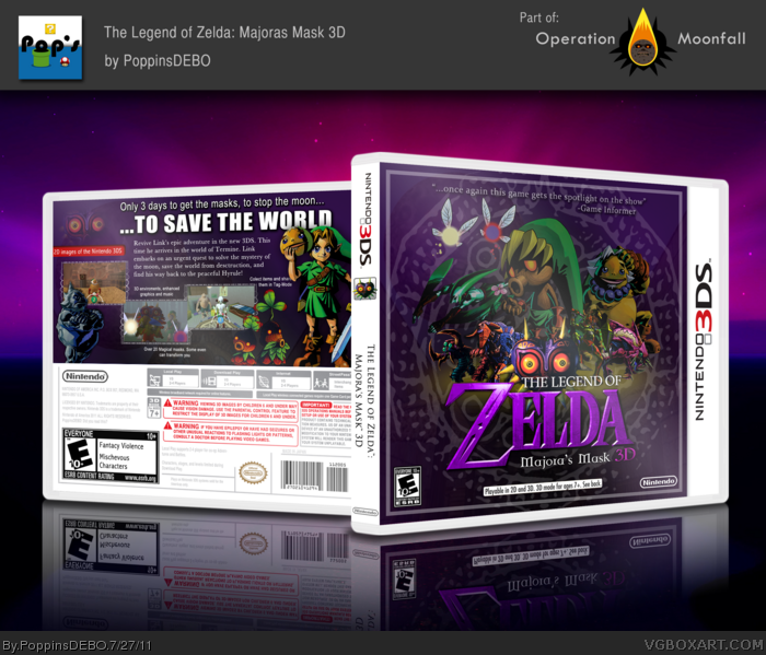
This has been a project in which I've been working since a long time ago.
I would like to thank Indexenos for the GBA Plastic Template (which I changed i little bit), but most specially I would like to SUPER thank Manuel_Alejandro95 for his major help with tips and good ideas for this box, without him this wouldn't have been near as awesome as it is. Well Hope you like it and please tell me if it has any flaws. Thanks
P.S.: I made the 3DS template (not the outer part but the legal stuff, the spine and the bar in the front :D)
[ Reply ]
I feel that Times New Roman can be a better alternative for the font on the back.
[ Reply ]
I could really picture that box on store shelves.
[ Reply ]
This is really nice. Purple needs to be on more things.
[ Reply ]
I like the front, but the back is all 'TEXT YO' and eh.. But again, the front is sweet.
[ Reply ]
Wow, very nice, my only suggestions would be to include a human Link on the front and switch the font.
[ Reply ]
Pretty much the same thing eggboy said, th back is really text heavy.
[ Reply ]
I love the front and spine. I really dislike the composition of the back though, specifically with the text. The font is very bland and doesn't fit with the game or the box at all. There also seems to be way too much text.
[ Reply ]
Thanks for the all the criticism, I'm going to fix as soon as i can, it seems that the major dislike is the back, so I'm going to fix that first.
[ Reply ]
Your best so far, Daniel, really great work!
Loving the entire box, though as I said, there's something I don't like about the text on the back, although I can't place my finger on it (I don't belive It to be the "text heaviness", as others have said, because I often like tex-cluttered designs. I think It has more to do with the spacing between the characters or even the lines.) The front composition is great, also!
As I said, your best work so far!
[ Reply ]
#2, #5, #7, #10 *UPDATE*!
Back completely remade, more renders and better organization, hope you like it!
Edited at 1 decade ago
[ Reply ]
Much better now.
[ Reply ]
#12, Thanks!
[ Reply ]
I like that the front gives the spotlight to someone other than Link, or at least the Link one would usually expect on a Zelda cover. The character arrangement is a little cluttered, and that yellow glow behind the logo could be more subtle. Despite this, it does a decent job capturing the darker mood of the game.
The back's what I'd call "safe". It doesn't try anything new, but is essentially what I'd expect from the real deal, if this ever came to be.
[ Reply ]
Back is all WOAH.
Nicely done, sir.
[ Reply ]
#14, #15, thanks for your criticism and compliments!
[ Reply ]
Fantastic update!
[ Reply ]
Big fan of the back - I think it generally works. But before I give a favourite, I'd like to see the characters on the front more defined - at the moment its quite difficult to see where one ends and the next begins.
[ Reply ]
#18 when you say that the characters should be more defined you mean to just move them or to add effects and modifications to them?
[ Reply ]
I guess effects to seperate them more. Moving them isn't nessercery, but using some form of drop shadows might work, but I'm not sure. Just have a play around and see if you can successfully seperate the characters more without need to move them - and I'll get that favourite to you.
[ Reply ]
So good.
[ Reply ]
#21 thanks!
[ Reply ]
Small nitpick: the ESRB and Nintendo logo should be on opposite sides.
[ Reply ]
Just incredible :3
[ Reply ]
#23 Im planning to make an update soon with SO request, Ill change that ASAP :D
#24 Thanks!
[ Reply ]
#25 Cool, its great either way.
[ Reply ]
#20, #26 Another *UPDATE*!!!!
SilentOblovion's tips were added
bradley's tips were added
Manuel's tips were added
Background added, back re-made (I deleted it)
EDIT: I just noticed that i forgot the shadow to the whole box, well ill add it in the next update...
Thanks! and don't forget to fav :D
Edited at 1 decade ago
[ Reply ]
Another update, mostly presentational, and now I decided that this is part of Operation Moonfall, the operation to practically make nintendo develop this game that most of us want!
[ Reply ]
The front is very nice, but the back seems unorganized and inconsistent, renders seem like they're being used almost as a space filler.
[ Reply ]
Your lucky. You got this cover on the front page of IGN. link
[ Reply ]
OMG! WHAT THE HELL SO EXCITED, although they mispelled my name LOL
Edited at 1 decade ago
[ Reply ]
Sorry I missed this. Congrats for being featured on IGN. Maybe next time they will spell your name right. Even better, direct people to VGBA, not Tiny Cartridge, as well.
[ Reply ]
Nice job, awesome to see it on ign
[ Reply ]
Simply an amazing cover. Glad to see you made it to IGN. Definitely faving this/author faving, just to see what you come up with next, depsite this not being your newest box.
[ Reply ]
They changed my name :D! Yes !
[ Reply ]
I just realized that I never credited Djipi the creator of the textures (in-game) in the screenshots, Thanks?
[ Reply ]
#31, Great job, this certainly gets the attention that's needed.
Edited at 1 decade ago
[ Reply ]
Great new improvements - looks fantastic.
[ Reply ]
#32, #33, #34, #37, #38 Thanks!
I want to make this box the best possible, I want to make it perfect, so please if you find any improvements I could make, tell me right here so I can fix it :D
Edited at 1 decade ago
[ Reply ]
AWESOME!!!!!!!!!!! 11/10 +fav
[ Reply ]
This is amazing! I don't like how people over do the purple on mm boxes, but this is epic. Makes mine look like crap :)
[ Reply ]
#41, Dont say that, your box is amazing too!
[ Reply ]
Thanks:D
[ Reply ]
link
Some hole is claiming credit for this over here. Just so you know
[ Reply ]
On it
[ Reply ]
This looks awesome! Good job!
[ Reply ]
Seriously dude, this cover art is AMAZING. Very professionally done and an art style that could be seen on store shelves should the game ever come out. A+ job, 11/10.
I literally made this account to comment on how awesome this art it. And + 1 for having a printable to be able to showcase this beautiful work!
[ Reply ]
Only Problem would be the flavour text on the back. There are a few grammar and syntax errors. Should read something like:
Revive Link's epic adventure on the 3DS. In the world of Termine, Link embarks on an urgent quest to solve the mysteries of the moon and save the world from destruction. Return the peace to Hyrule using revamped 3DS graphics and controls!
[ Reply ]