An excellent example of what makes a good CD design! The way you presented it is great too, with how subtle it is: it looks like it's on a table.
I don't think I've any right to be counseling you :o, but if you don't mind, I can least offer some of my opinion:
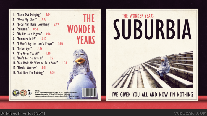
The typography you've chosen works really well in conveying the image on the front, but on the back...I don't know why, but for some reason, I feel like some of that aesthetic value is lost there. I understand that one would to keep the font consistent throughout the whole design, and it might look odd if you change it only there, but when it's used in such a large quantity next to each other as in the song titles, it looks too...elongated? I don't know if I'm making any sense at all :). It's probably just a difference in individual aesthetics anyway.
Also, while I like the front image a lot, I think it might look a little better if the bleachers came to an end, rather than being lopped off at a rectangle. Again though, that might just be a difference in designs opinions, so feel free to ignore me :)! Or you may have gotten that image that way to begin with, in which case, that's a spectacular use of constrictive materials.
I hope those musings actually helped, in some capacity! Sorry to take up your time if they didn't, because I know that was a lengthy read. Again, it's an excellent design, and you get bonus points for promoting a band I've never heard of. What genre is this?
Very awesome. I could easily see this on a shelf somewhere. The subtle texture keep the background from being bland, and all of the images are high quality. The back is clean and well put together as well.
 The Wonder Years - Suburbia I've Given You All Cover Comments
This is a very cool album. So, you know, I made a box for it.
[ Reply ]
The band name made me think of the TV show The Wonder Years. I've never heard of the band.
When I see the duck guy in the box preview thread, I thought it was Howard the Duck.
The design looks very authentic and well assembled. If only for that, I'll give you a fav.
[ Reply ]
I love this.
[ Reply ]
Love it, you should use more pink on the front too.
[ Reply ]
This is really nice.
[ Reply ]
I believe this is one of your best yet. Something about this I just really admire.
[ Reply ]
An excellent example of what makes a good CD design! The way you presented it is great too, with how subtle it is: it looks like it's on a table.
I don't think I've any right to be counseling you :o, but if you don't mind, I can least offer some of my opinion:
The typography you've chosen works really well in conveying the image on the front, but on the back...I don't know why, but for some reason, I feel like some of that aesthetic value is lost there. I understand that one would to keep the font consistent throughout the whole design, and it might look odd if you change it only there, but when it's used in such a large quantity next to each other as in the song titles, it looks too...elongated? I don't know if I'm making any sense at all :). It's probably just a difference in individual aesthetics anyway.
Also, while I like the front image a lot, I think it might look a little better if the bleachers came to an end, rather than being lopped off at a rectangle. Again though, that might just be a difference in designs opinions, so feel free to ignore me :)! Or you may have gotten that image that way to begin with, in which case, that's a spectacular use of constrictive materials.
I hope those musings actually helped, in some capacity! Sorry to take up your time if they didn't, because I know that was a lengthy read. Again, it's an excellent design, and you get bonus points for promoting a band I've never heard of. What genre is this?
[ Reply ]
#7, how DARE you.
Kidding, I appreciate the critiques. I get what you mean about the typography, but after trying multiple designs I felt that layout looked best.
The image on the front cuts off because I got it from the digital booklet and the image was small and kind of blurry, so I chose this design.
I appreciate the critiques. I'd take them into consideration, but I already have and I concluded that this layout looks best. n_n
[ Reply ]
Very awesome. I could easily see this on a shelf somewhere. The subtle texture keep the background from being bland, and all of the images are high quality. The back is clean and well put together as well.
[ Reply ]
This is fantastic and striking. Very well done.
[ Reply ]
I love the simplicity of this, it looks like it should be official.
Great job! +fave
[ Reply ]
Fantastic! :D
[ Reply ]
This is just so sleek. Excellent job all across the board!
[ Reply ]