This one came out of nowhere...the thought process behind it (to come up with the actual concept, atleast) was kinda weird, but I guess it worked out :)
Thanks for viewing, enjoy!
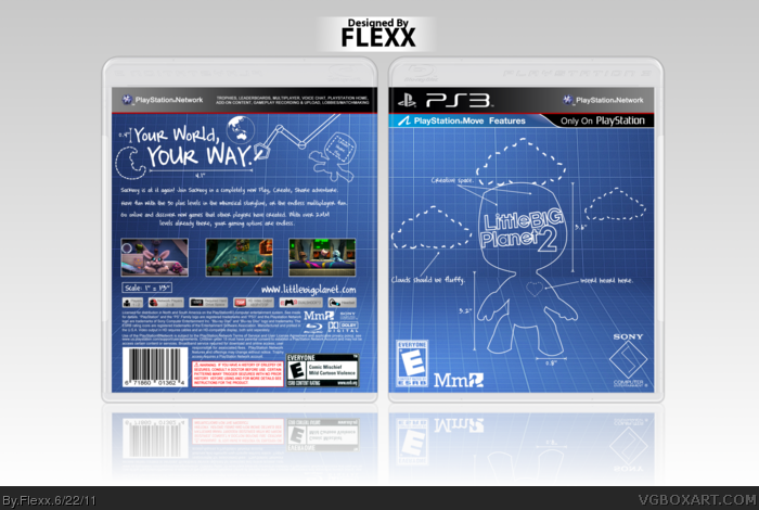
Credit to Sens and Scorpion Soldier for the template.
Very nice job, the blueprint style fits the game's idea, and it was executed well. The only thing that takes away from it is the screenshots, but what could you do?
Very creative and fitting for this type of game.
I just wish you incorporated some of the creativity to the screenshots as well. They seem pretty plain compared to the rest of the design.
 LittleBigPlanet 2 Box Cover Comments
Slick. You did the blueprint style quite nicely.
[ Reply ]
link
This one came out of nowhere...the thought process behind it (to come up with the actual concept, atleast) was kinda weird, but I guess it worked out :)
Thanks for viewing, enjoy!
Credit to Sens and Scorpion Soldier for the template.
[ Reply ]
I really like this.
[ Reply ]
I thought this was Call of Duty... But seriously I do like the like this, but the screenshots take away from the feel.
[ Reply ]
Thanks guys!
Printable added.
[ Reply ]
Pure sexuality my friend.
[ Reply ]
I actually just PM'd you my suggestions. I like this layout better, but I also think you should consider what I suggested regarding the screenshots.
[ Reply ]
This turned out really great, and I love the updated back. It complements the front well and shows off the creativity of the game.
[ Reply ]
Love it! I like the blueprint style.
[ Reply ]
Blueprint style is nailed here. Great stuff, and I love that tagline design.
[ Reply ]
Very nice job, the blueprint style fits the game's idea, and it was executed well. The only thing that takes away from it is the screenshots, but what could you do?
Edited at 1 decade ago
[ Reply ]
Very creative and fitting for this type of game.
I just wish you incorporated some of the creativity to the screenshots as well. They seem pretty plain compared to the rest of the design.
Still, great idea and execution..fav :)
[ Reply ]
Nice idea and execution, although I don't like the white Dev logos and rating on the front, which also, I think, looks kind of empty.
[ Reply ]
Pretty much what everyone else said in terms of the blueprint style working with this game. Nice idea and execution. ^^d
[ Reply ]
Now that i've actually played the first one, i understand why this box is like this. It's a really good idea and execution. Nice work.
[ Reply ]
Nice, how coud I missed it ?
[ Reply ]