[ Box updated on January 31st, 2013 ] [ original ]
 The Legend of Zelda: The Wind Waker Box Cover Comments
Comment on Delicious1's The Legend of Zelda: The Wind Waker Box Art / Cover.
[ Box updated on January 31st, 2013 ] [ original ]
Comment on Delicious1's The Legend of Zelda: The Wind Waker Box Art / Cover.
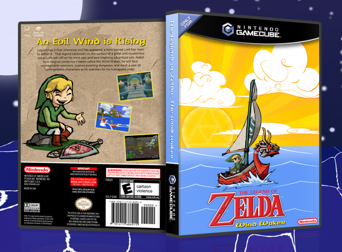
This is my entry to Mariolee's 1st Theme of the Month event. I've been playing through the entire Zelda franchise in preparation for Skyward Sword, and I'm about to finish Wind Waker. It's in my top 2 for favorite Zelda. I was going for a clean and simple design that had some bright and fun colors that remind me of the game itself. Please enjoy.
Credit:
Manuel_Alejandro95 - Gamecube temp
ADFD - 3D wii temp I used for the plastic
I googled and rendered the images myself.
[ Reply ]
The back looks to stray from a "clean" design and comes across more as "bare". The front is a swell representation of the game, but could do with some fixes. Most notably to me, are the clouds, which look too bunched up and cluttered. Instead of being strung together into some weird shapes, they'd look nicer more like this (link
[ Reply ]
The front is gorgeous aside from some of the criticism sd1833 had, but the back seem's a bit boring. Simply adding clouds in the background of Link would make this remain simple yet attractive.
[ Reply ]
Fronts fantastic.
Back is lacking in the same whimsy
[ Reply ]
Hey everyone,
Thanks for the comments and critique.
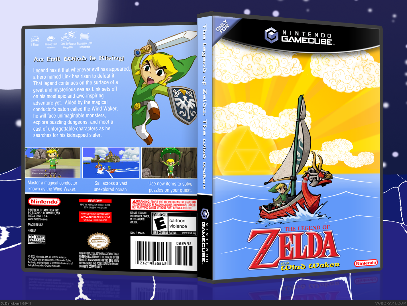
I've updated with the changes that sd had suggested. The front seems to be a crowd pleaser so I only switched up the clouds with some I drew to better resemble the clouds from the artwork sd had linked.
The back got a major overhaul. After reading the contest rules I decided I should leave out all the clutter from the legal info and what not. I like what Moogle said about the front being whimsical so I tried to match that. It's still kinda simple and clean but I think overall it's more whimsical - which works for me.
[ Reply ]
Both the front and back are nice, but I think the artwork does not mesh as well together as it should. There are a few portions of the art that makes it easy to see it was photoshopped.
THe black outline around the water beneath the boat. The character positioning on the back as well is a little off, their sizes don't equate well, and the back's perspective is a little weird, the clouds are quite low, and the floating frog characters are bigger than Link, and in the background, but the same size as he is.
Just small things that can really turn everything around need to be done, and this could be amazing.
[ Reply ]
#6, Agreed. The biggest example of the proportions being off would probably be that the grandma is a giant compared to Link. Also, I would like to see a cleaner transition between the water and the sky on the front. The fade doesn't look right.
[ Reply ]