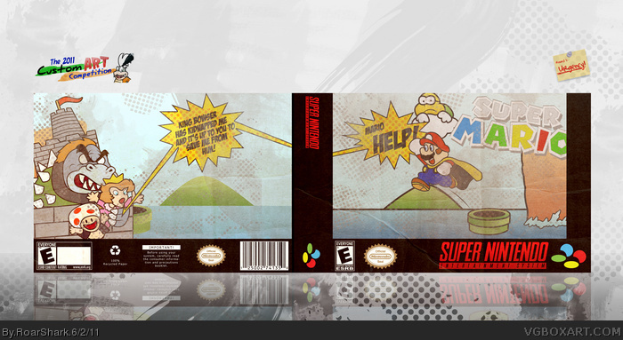
Not one of my favorite box art ever. One of my least favorite custom art work I did. Anyway this is my entry for the Custom Art Competition held by KoopaDasher. The theme was Urgency. That was a hard theme to work with because it was so broad, yet incredibly narrow at the same time. My original plan was Austin Powers, but that fell apart around Saturday night. I suddenly got the idea of a Princess Peach yelling for Mario to come and save her... and I thought that sounded urgent. Anyway so I ended up throwing this together, and as I said I really am not a huge fan of it myself. Not to point out my own faults, but you can visibly tell the background on the back is identical to that of the front. Anyway if you have any comments or critiques of my box that you would be willing share, please do post a comment. Thanks for viewing, and good luck and congrats to all involved in the competition.
I like your own unique style that you've imparted on this art and really I don't think it's too bad. Since you said this was rushed yourself, I guess it's not really worth mentioning any points of contention
Really nice, this actually is my favourite box from the CustomArtComp -and from you- so far. My only complaints would be the lack of reasons for rating on the back's ESRB, the lack of a logo on the spine and the way you hid the right part of the main logo behind the template. Well, that, and maybe that -I think- I'm not really a fan of these dots.
Great job, anyway.
 Super Mario Box Cover Comments
Not one of my favorite box art ever. One of my least favorite custom art work I did. Anyway this is my entry for the Custom Art Competition held by KoopaDasher. The theme was Urgency. That was a hard theme to work with because it was so broad, yet incredibly narrow at the same time. My original plan was Austin Powers, but that fell apart around Saturday night. I suddenly got the idea of a Princess Peach yelling for Mario to come and save her... and I thought that sounded urgent. Anyway so I ended up throwing this together, and as I said I really am not a huge fan of it myself. Not to point out my own faults, but you can visibly tell the background on the back is identical to that of the front. Anyway if you have any comments or critiques of my box that you would be willing share, please do post a comment. Thanks for viewing, and good luck and congrats to all involved in the competition.
[ Reply ]
I really like this but the paper effect is a bit too much and the back is too empty. The artwork is is nicely done too :)
[ Reply ]
All I can say is that the art is fantastic and has a great retro feel to it. I can see how you got the upper hand on me.
[ Reply ]
#3, .3 percent of an upper hand. Lol.
[ Reply ]
I very much like the Roy Lichtenstien kind of feel to it, this is why you beat me by 4% lol.
FAV, oh and round 2 has been posted already
[ Reply ]
I like your own unique style that you've imparted on this art and really I don't think it's too bad. Since you said this was rushed yourself, I guess it's not really worth mentioning any points of contention
[ Reply ]
I like the thick stroked, retro-styled artwork. The rough textures and halftones really add to the box as a whole and give it a unique feel.
[ Reply ]
Really nice, this actually is my favourite box from the CustomArtComp -and from you- so far. My only complaints would be the lack of reasons for rating on the back's ESRB, the lack of a logo on the spine and the way you hid the right part of the main logo behind the template. Well, that, and maybe that -I think- I'm not really a fan of these dots.
Great job, anyway.
Edited at 1 decade ago
[ Reply ]
Wow, awesome!!!
[ Reply ]
Thanks guys, I appreciate the responses.
[ Reply ]