Just finished this up. Started around 7:00pm yesterday and stopped at 3:00am then picked back up this morning around 10:00am and just finished around 1:00pm. Im really proud of this box. It came out just how I wanted it to.
#2, Thanks. Color was a major thing with this box. I love bright colors. Yea the screenshots were pretty small but if I had made this box on a normal sized temp they would be very clear and alot bigger.
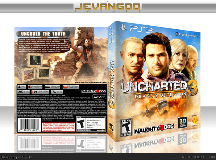
Front is almost perfect, except for that huge Naughty Dog logo.
Back is ok. Screens are way too small and that the black background for legal info throws the balance off.
That is SO AWESOME. Unreal work, but I don't like the black background for the legal info and the huge Naughty Dog logo is a little distracting.
Also, when I saw the boxes with the screenshots on the back I immediately thought of Crash Bandicoot. Whether that was intentional or not, it's a nice nod to Naughty Dog's past games. =)
I like the Flight of the Phoenix-inspired front. The upper half looks too cluttered though. Shrinking the characters aside from Drake, and maybe flipping Sullivan, would be a huge improvement, I think. The back's rather boring, and something about those boxes seems off to me.
I'd like to add I'm really vibrant colors and bright lighting on this, especially the on the front.
The only things I don't like are the black square bahind the legal info and that the boxes don't seem to be actually placed over the sand, they seem floating (May be something about their shadow and perspective).
#21, Yea. I rendered everything myself. The only thing I saved that was rendered is the woman on front and I uploaded her already in the resource section.
I like the vibrant colors of your cover. As sd1833 mentioned is the front a little bit too cluttered with the faces. On my cover i flipped sullivan too and it worked better.
Where did you get the picture of Nathan hiding behind the wall from your back? It had been a good choice for my back too ;).
 Uncharted 3: Drake's Deception Box Cover Comments
Just finished this up. Started around 7:00pm yesterday and stopped at 3:00am then picked back up this morning around 10:00am and just finished around 1:00pm. Im really proud of this box. It came out just how I wanted it to.
[ Reply ]
Wow, fantastic! The color is the thing I love of this box, screenshots are bit small but I like the way you put them on wooden boxes.
Edited at 1 decade ago
[ Reply ]
#2, Thanks. Color was a major thing with this box. I love bright colors. Yea the screenshots were pretty small but if I had made this box on a normal sized temp they would be very clear and alot bigger.
[ Reply ]
I like it, the front really has a classic movie poster style. Great job as always Jevan!
[ Reply ]
You make some very vibrant boxes Jev. Great work as always. :)
[ Reply ]
Love the colors in the front, and you did a good job with the screenshot idea. Nicely done Jevan!
[ Reply ]
Every time; Brilliant...
This time; outstanding :D
[ Reply ]
Nice. The front reminds me of flight of the Phoenix:) But yeah, the colors look great, especially on the front, I love that blue.
[ Reply ]
#8, lol. The airplane on the front is from Flight of the Phoenix. Thanks.
[ Reply ]
Front is almost perfect, except for that huge Naughty Dog logo.
Back is ok. Screens are way too small and that the black background for legal info throws the balance off.
[ Reply ]
That is SO AWESOME. Unreal work, but I don't like the black background for the legal info and the huge Naughty Dog logo is a little distracting.
Also, when I saw the boxes with the screenshots on the back I immediately thought of Crash Bandicoot. Whether that was intentional or not, it's a nice nod to Naughty Dog's past games. =)
[ Reply ]
it.. just.. looks very.. official
[ Reply ]
#10, Yea I was trying to make it look official thats why the Naughty Dog logo is so big. On the official box its just as big.
[ Reply ]
what the hey, i'll fav it. fav my new box jevangod. tell me if you like it
[ Reply ]
you could possible nudge Drake (on the back) to the right like 7 or 8 pixels as he is obstructing the text
[ Reply ]
#15, Yea. Well the wallpaper with drake on it on the back isnt very big so thats all I had to work with.
[ Reply ]
I like the Flight of the Phoenix-inspired front. The upper half looks too cluttered though. Shrinking the characters aside from Drake, and maybe flipping Sullivan, would be a huge improvement, I think. The back's rather boring, and something about those boxes seems off to me.
I'd like to add I'm really vibrant colors and bright lighting on this, especially the on the front.
[ Reply ]
The only things I don't like are the black square bahind the legal info and that the boxes don't seem to be actually placed over the sand, they seem floating (May be something about their shadow and perspective).
Excellent design, otherwise.
[ Reply ]
One other thing: what's up with the Naughty Dog logo? It's enormous.
[ Reply ]
#19, Just going by this cover. link
PRINTABLE ADDED!
[ Reply ]
Well Done! The back is Simply Amazing. Are you going to upload the resources you used? That is if you rendered it you're self, which you usually do.
[ Reply ]
#21, Yea. I rendered everything myself. The only thing I saved that was rendered is the woman on front and I uploaded her already in the resource section.
[ Reply ]
#22, What a shame,I kinda wanted the other ones to, because I'm probably going to make an Uncharted 3 box in the near future.
[ Reply ]
Love how bright this is and the colors are really nice.
[ Reply ]
I like the vibrant colors of your cover. As sd1833 mentioned is the front a little bit too cluttered with the faces. On my cover i flipped sullivan too and it worked better.
Where did you get the picture of Nathan hiding behind the wall from your back? It had been a good choice for my back too ;).
[ Reply ]
bloody perfect <3
[ Reply ]
Bloody brilliant, amazing cover!
@Pharao, link for the website to the wallpaper.
[ Reply ]
Thanks for the critics guys.
[ Reply ]
Well when i get this game i'll definitely be printing this out ! Absolutely amazing job !!! My favourite box on here by far !!!
[ Reply ]
Best U3DD Box I've Seen
[ Reply ]
Amazing
[ Reply ]