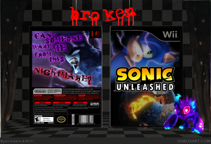
The darker concept you've created for this box is very intriguing, and works very well with the theme you've created for yourself. You show the darker side of Sonic, and, if this game actually contained actual darker tones than what is placed in the game, the box would probably look something like this. Good job.
 Sonic Unleashed Box Cover Comments
i wanted to focus on the darker side of the game, the whole planet being ripped apart thing.
[ Reply ]
The darker concept you've created for this box is very intriguing, and works very well with the theme you've created for yourself. You show the darker side of Sonic, and, if this game actually contained actual darker tones than what is placed in the game, the box would probably look something like this. Good job.
Edited at 1 decade ago
[ Reply ]
I don't like it that much, but it looks great, the way you conflicted the styles.
[ Reply ]
The font you used looks way too forced. It's trying too hard to be grungy and dark, and it comes off looking adolescent.
Also, I can say with certainty that I'd never play a game that had Sonic's bedroom eyes on the cover.
[ Reply ]