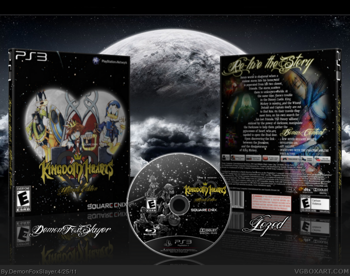
Whew!!! Okay, so this is my very first collaboration box. It's with a very good box artist name, "lozod". I think the results are pretty damn good.
Originally, this wasn't going to be a collab. If you seen my WIP of this box, it's look way different than this. But lozod, saw my WIP thread and he posted saying he wanted to
do A collab with me, on this box... and I said yeah. He came out with the layout you see for the back, hen showed me it, I liked it, but I told a few things to change, like
putting the screenshots, and the giant hooded Sora, in color, instead of no color. And he changed it, and it was good. I have to say, Awesome Job lozod! The Back is great
, since, I suck at coming up with layouts for the back of boxes. haha. The front, was kinda of challenging for me... I couldn't think of what the put. I Had this GIANT
moon in the center of the box, and this Giant logo, on top of the moon... lozod, renderd the Picture of "King" Sora, and then I, had the craziest idea to put the actual
render in the moon. I down sized the logo, And it looked great... After that, lozod, messaged me saying I should put the sora render in the moon... Coincidence? Haha. As for the final presentation
lozod told me to just put my name under the front of the case, and his on the back. But of course I'm going to go the extra step... I created a disc, made it 3D, and
added a nice backdrop. I COULD NOT get the front cover on the right side, and when I did, the layout looked horrible, so please ignore. It was a pleasure working with lozod. Anyways... Please Enjoy this box, me and lozod, put lots of effort, and we really appreciate, feedback. Oh, and "Throavium-Redux " rendered
the original logo, and I edited it to make it gold, and gray.
Not bad man :) There are some things you could do to fix it up though.
I think the heart on the front should have some sort of fancy border, because the straight transition from white to black isnt nice.
I think you could make the background on the front more interesting also.
On the back, there is wayy too much text. The two smaller screenshots are difficult to see, also. Finally, that half-faded render just looks kinda messy.
So yeah, not bad but I think those things could be fixed.
#6, Thanks for your feedback! I can see what you're saying about way to much text on the back. Maybe we could of summarized the description a bit, and then added something, to fill in the blank spaces.
Not bad, but the whole cover is too dark imo. Maybe it's due to 3D-ing but there needs to be a better contrast.
Also, the presentation is too distracting. My attention goes more to that moon rather than the cover itself.
#11, If you take a look, at the original Kingdom Hearts Logo link
You would see that there is a Disney and Square-Enix, logom above the KH logo. Not Watermarks... And I couldn't find a better color for them.
As been said before I think the background could be more interesting and there could be a border around the heart. Also the screenshots on the back could be shown better, I don't really like the faded look.
EDIT: Couldn't of pulled it off without lozod... Backs are my weak point. I have a hard time with them... But thanks to lozod, for creating this incredible back side.
 Kingdom Hearts: Ultimate Edition Box Cover Comments
Whew!!! Okay, so this is my very first collaboration box. It's with a very good box artist name, "lozod". I think the results are pretty damn good.
Originally, this wasn't going to be a collab. If you seen my WIP of this box, it's look way different than this. But lozod, saw my WIP thread and he posted saying he wanted to
do A collab with me, on this box... and I said yeah. He came out with the layout you see for the back, hen showed me it, I liked it, but I told a few things to change, like
putting the screenshots, and the giant hooded Sora, in color, instead of no color. And he changed it, and it was good. I have to say, Awesome Job lozod! The Back is great
, since, I suck at coming up with layouts for the back of boxes. haha. The front, was kinda of challenging for me... I couldn't think of what the put. I Had this GIANT
moon in the center of the box, and this Giant logo, on top of the moon... lozod, renderd the Picture of "King" Sora, and then I, had the craziest idea to put the actual
render in the moon. I down sized the logo, And it looked great... After that, lozod, messaged me saying I should put the sora render in the moon... Coincidence? Haha. As for the final presentation
lozod told me to just put my name under the front of the case, and his on the back. But of course I'm going to go the extra step... I created a disc, made it 3D, and
added a nice backdrop. I COULD NOT get the front cover on the right side, and when I did, the layout looked horrible, so please ignore. It was a pleasure working with lozod. Anyways... Please Enjoy this box, me and lozod, put lots of effort, and we really appreciate, feedback. Oh, and "Throavium-Redux " rendered
the original logo, and I edited it to make it gold, and gray.
CREDIT:
"Kingdom Hearts" Logo - Throavium-Redux
"King Sora(Donald, Goofy)" Render - lozod
Rating Logos - ADFD
PS3 Template - Leegion
PS3 Disc template - Eggboy'13
I think thats all?
Oh, yes, and the game it's self is suppose to be an HD Graphic, PS3 Upscale, version of Kingdom Hearts 1, with bonus content.
Enjoy Please =)
[ Reply ]
i really like the end result :D
[ Reply ]
That's the biggest first comment I have ever seen...
Anyway, nice one guys. You both did an awesome job :D
[ Reply ]
#3, thanks from me & DFS ;D
Edited at 1 decade ago
[ Reply ]
#3, Haha, Yeah... I thought so too. Thanks.
[ Reply ]
Not bad man :) There are some things you could do to fix it up though.
I think the heart on the front should have some sort of fancy border, because the straight transition from white to black isnt nice.
I think you could make the background on the front more interesting also.
On the back, there is wayy too much text. The two smaller screenshots are difficult to see, also. Finally, that half-faded render just looks kinda messy.
So yeah, not bad but I think those things could be fixed.
[ Reply ]
#6, Thanks for your feedback! I can see what you're saying about way to much text on the back. Maybe we could of summarized the description a bit, and then added something, to fill in the blank spaces.
[ Reply ]
Not bad, but the whole cover is too dark imo. Maybe it's due to 3D-ing but there needs to be a better contrast.
Also, the presentation is too distracting. My attention goes more to that moon rather than the cover itself.
[ Reply ]
brighten the box and it'll be perfect to me.
Nice Job Dude!
[ Reply ]
#8, Hmm... You may be right about the "Distracting" part...
#9, yeah, I think It might need some lightning on it.
[ Reply ]
yes, adhere to what #8 & 9 told you. What's with the Disny and Square Enix "water marks" right smack dab in the middle of the heart on the front?
[ Reply ]
#11, If you take a look, at the original Kingdom Hearts Logo link
You would see that there is a Disney and Square-Enix, logom above the KH logo. Not Watermarks... And I couldn't find a better color for them.
[ Reply ]
As been said before I think the background could be more interesting and there could be a border around the heart. Also the screenshots on the back could be shown better, I don't really like the faded look.
[ Reply ]
#13, I really couldn't think of something for it. I thought the faded looked better than with a solid outline, In my opinion.
[ Reply ]
The whole cover seems a little bit blurry to me. I also don't like the font you used "Ultimate Edition" and the backs headlines.
[ Reply ]
#15, Did you see full size? If you did, and it still looks blurry to you, it because of the Depth-blur. It has depth to it, so there is a slight blur.
[ Reply ]
nice job. Looks very offical
[ Reply ]
Damn kid! This is pretty good!
[ Reply ]
#18, Thanks... Means a lot coming from you.
EDIT: Couldn't of pulled it off without lozod... Backs are my weak point. I have a hard time with them... But thanks to lozod, for creating this incredible back side.
Edited at 1 decade ago
[ Reply ]