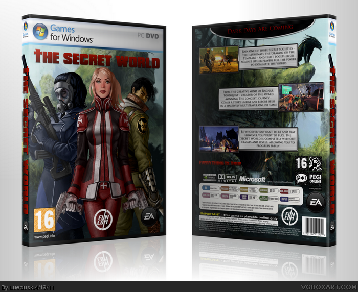
I think it's pretty nice. I'd like to see some more effects, as the design is somewhat bare-bones. The back is a bit empty, but it could be easily fixed if you made the tagline bigger. I think you should use a different font - preferably one that doesn't make everything in caps lock. If you inverted the placement of the screenshots (as in, move the two on the left to the right and the one on the right to the left) then you could put a render of a character in the bottom left next to the text, which make make it less empty.
 The Secret World Box Cover Comments
Amazing for a first, much better than anything I've made.
I can't wait to see more from you.
[ Reply ]
Very official looking. Welcome to VGBA.
[ Reply ]
Nice work, very promising of your future here.
[ Reply ]
Very good work, keep up...
[ Reply ]
Thanks for the comments guys. Most appreciated.
Just want to tell you. The lead designer of this game, Ragnar Tørnquist, made a twitter-comment about my box-art :D
"And probably not far from the real deal. @KurtisNyte: Very cool and well-made fan-art concept for #TSW Box Art. link;
Link: link
And by the way. Added a printable.
[ Reply ]
#5, That's nice!
Sweet box though.
[ Reply ]
I think it's pretty nice. I'd like to see some more effects, as the design is somewhat bare-bones. The back is a bit empty, but it could be easily fixed if you made the tagline bigger. I think you should use a different font - preferably one that doesn't make everything in caps lock. If you inverted the placement of the screenshots (as in, move the two on the left to the right and the one on the right to the left) then you could put a render of a character in the bottom left next to the text, which make make it less empty.
Not bad for a first, I'd say.
[ Reply ]
Very good! :D
The tagline on the back is a little hard to see though.
[ Reply ]