well, i cant seem to me the logo transparent!i tried millions of times and it doesnt work for me but it only works for my bro! i tried every single kind of sight but i cant find one thats lets me my make my text transparent!
If you're using gimp, use the tool that has the hand and the 3 colors. Pick the layer you want to get rid of the outline. Click on the color of the outline, and when there's a dotted line around your logo, press Ctrl+x
Then you should be good.
#8, Haha, who gave this crap 5/5? Yeah. Look at me now. Look at my last two boxes. They're decent. I have yet to see you do a decent boxart, let alone improve.

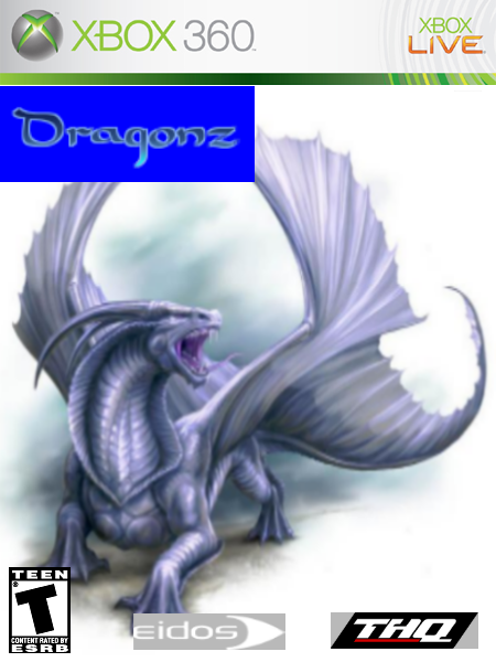
 Dragonz Box Cover Comments
ok this is my first box in a very long time, and please feel free to comment and rate this box.
[ Reply ]
that doesetn look like official art it looks stolen from a artist
[ Reply ]
Get rid of the outlines. Also, more detail would be better. It's also kinda bland. 2.5/5
[ Reply ]
I mean 2/5
[ Reply ]
well, i cant seem to me the logo transparent!i tried millions of times and it doesnt work for me but it only works for my bro! i tried every single kind of sight but i cant find one thats lets me my make my text transparent!
[ Reply ]
If you're using gimp, use the tool that has the hand and the 3 colors. Pick the layer you want to get rid of the outline. Click on the color of the outline, and when there's a dotted line around your logo, press Ctrl+x
Then you should be good.
[ Reply ]
Like your other boxes: 1.5/5
[ Reply ]
hawaiian u stink a box arts!u shouldn't be talking!
[ Reply ]
this is pathetic
[ Reply ]
#9, lol......
[ Reply ]
#8, Haha, who gave this crap 5/5? Yeah. Look at me now. Look at my last two boxes. They're decent. I have yet to see you do a decent boxart, let alone improve.
[ Reply ]
New Box!is it any better guys?i cut out the logo now and sharpened it up
[ Reply ]
why dont you just make a new box thats worth our time to look at.
[ Reply ]
yeah you neeya get rid of the gray traingles on teh thq logo so its just a parallelogram and the same for eidos. maybe make teh title bigger.
[ Reply ]
Get rid of the gray boxes, make the T logo less blurry. Don't get it from the ESRB site, use the resources on the site.
[ Reply ]
#8 He made boxarts better then yours .
[ Reply ]
#8 u suck, and even is, this is still a very sweet lookin thing to me, it has that white there, which makes it feel more like it is on the xbox 360
[ Reply ]