sonic [ Buy Sonic Heroes at Amazon ] By super-mega-hyper-sonic 41 on February 25th, 2011 No Printable Available Sonic Heroes Box Cover Comments Comment on super-mega-hyper-sonic's Sonic Heroes Box Art / Cover. Cancel Reply super-mega-hyper-sonic 41 [ 1 decade ago ] My first box in a while =D I was kinda inspired by SSBB with the squares. I realize the font isn't the best or the presentation so please help me on those fronts. Many Thanks! [ Reply ] NATHAN JAIN 5 [ 1 decade ago ] Brilliant design and layout. [ Reply ] super-mega-hyper-sonic 41 [ 1 decade ago ] #2, Thanks =D [ Reply ] NATHAN JAIN 5 [ 1 decade ago ] #3, Thats alright, I like what you did with the rings in the logo and turned them into screenshot borders. [ Reply ] Ronthis the Werewolf 39 [ 1 decade ago ] The ESRB on the back is blank, and they don't use that Sonic Team logo on the front anymore. But I still like it :D [ Reply ] super-mega-hyper-sonic 41 [ 1 decade ago ] #5, They did when the game was first released. [ Reply ] Marioshi 3 [ 1 decade ago ] i like the back but hate the front for some reason sexy logo though [ Reply ] roza 44 [ 1 decade ago ] its a bit too plain. add some sort of Sonic-y borders to the images on the front, add a few more screens and use a more interesting font on the back. i can see where its going but im not feeliing it :? [ Reply ] SonicHeroes 1 [ 1 decade ago ] Awesomeeee!! +Fav. Edited at 1 decade ago [ Reply ]
 Sonic Heroes Box Cover Comments
My first box in a while =D
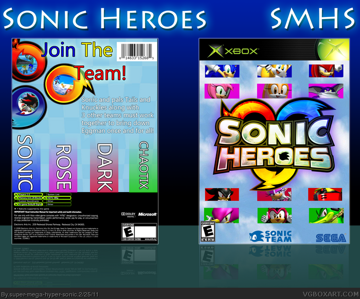
I was kinda inspired by SSBB with the squares.
I realize the font isn't the best or the presentation so please help me on those fronts.
Many Thanks!
[ Reply ]
Brilliant design and layout.
[ Reply ]
#2, Thanks =D
[ Reply ]
#3, Thats alright, I like what you did with the rings in the logo and turned them into screenshot borders.
[ Reply ]
The ESRB on the back is blank, and they don't use that Sonic Team logo on the front anymore.
But I still like it :D
[ Reply ]
#5, They did when the game was first released.
[ Reply ]
i like the back but hate the front for some reason
sexy logo though
[ Reply ]
its a bit too plain. add some sort of Sonic-y borders to the images on the front, add a few more screens and use a more interesting font on the back. i can see where its going but im not feeliing it :?
[ Reply ]
Awesomeeee!!
+Fav.
Edited at 1 decade ago
[ Reply ]