[ Box updated on February 23rd, 2011 ] [ original ]
 The Legend of Zelda: Ocarina of Dimensions Box Cover Comments
Comment on nintendofreak247's The Legend of Zelda: Ocarina of Dimensions Box Art / Cover.
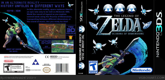
Went for a smooth black & blue color scheme with this one. Also inverted the colors of the Nintendo 3DS logo on the side and inverted the spine as well. Opinions?
[ Reply ]
I was looking through your boxes and you seem to have a certain style of creating these boxes. You seem to like to put a solid image in the background and then some renders on the top. Now, it can work for some boxes depending on how you go about it but it wont work for most. I think this is a good start but you need to really add a lot more to it. Like add more color to the front, background is too dark and it makes everything look too plain. Put some borders around the screenshots. Make the tag line stand out a little more. Just some things to think about. And have you put these up on the forum first? People can really help you out a lot and its a good idea.
[ Reply ]
TOO MANY CEILIAS! I like the sprite link holding the 3d graphics sign though.
[ Reply ]
- there's no reason to change the nintendo and esrb logo.
- nintendo logo is too big, rating a bit too small.
- nintendos logo is no longer red... FOR YEARS NOW!!!
- there is no reason to invert the template, specially if you do it only on the front and spine.
- I don't get the front... why are there two identical ocarinas? what are the three triforce-balls supposed to be, why are there so many navis?
- text on the back is too dark!
- everything seems just patched together, sorry. you do have a nice idea but no real concept for a design IMO.
[ Reply ]
#4, Just felt like clarifying a few of your points.
-The Nintendo logo is blue because I went with a slick black & blue color scheme for this box, and the red logo would stick out like a sore thumb.
-Inverting the template also benefits the color scheme, because the white becomes black, and the red 3 becomes blue.
-The Triforces, Fairies and Ocarinas are all just decorative for the logo. The two fairies hovering over Link however, are there as part of the art.
-I can read the text fine so I don't get your point.
[ Reply ]
i like the box the only problems are the navis and ocarinas
#4 maybe some people didnt know that the nintendo logo is grey and it really doesnt matter!
[ Reply ]
4# oh and maybe the three triforce balls have a meaning in the story.
the box is meant to catch your interest and make you want to know what the things mean
[ Reply ]