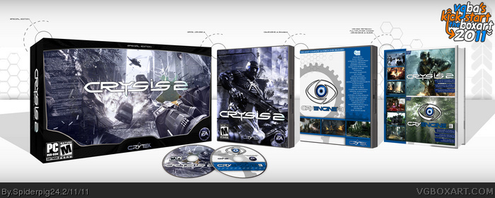
Well here is my box for the Kick Start 2011 event! I'm really happy with the end result, even if it has gone through many different versions. I wanted to make this like a World of Warcraft or Diablo Battle Chest, including the Crysis 2 game, the CryEngine 3 sandbox (Since the first game came with CryEngine 2 sandbox), and a book with Crysis 2 artwork and CryEngine 3 tutorials. There are two discs as well, one for the game and one for the CryEngine 3 sandbox.
The front of the bundle box took the longest, and is supposed to represent looking through the visor of the main character in the game. It took quite a while to put that together and make the visor. It seemed like the only way to represent the visor would be the outside edge and the broken area in the glass, interupting the HUD and the vision. Comments and critiques are welcome, please view in full, and have a great Kick Start 2011!
Credit to Ninty for the plastic part of the template, which actually started out as his 3D DS template.
I loved it when you showed it to me, and I love it now. It's just layer after layer after layer of amazingness. The presentation was quite unique as well. Great kickstart!
Very, very good cover for what is a seemingly disappointing game.
Clever idea, using a first-person perspective as the forefront of the design. The little touches, like HUD numbering and statistics, make it all the more special. I'm glad you made the logo unobstructed, as it's much easier to see now.
The effort clearly shows on the other pieces of the design, and there's little to no flaws as far as I can tell. The layout of the case itself is strange though, as it looks like there's multiple surfaces placed over each other, to the right of Nomad.
Implementing the design into the presentation was a nice little touch of effort as well. Good work.
Thanks for the comments guys! I do agree after playing the demo too lol, it's not the greatest. Visually maybe, but gameplay wise no.
@sd, Yeah I thought about using a different image. The multiple surfaces in the image to the right was like that when I found it. I added the explosions and the soldier to it, the filters, color overlays, and adjusted it to fit with the rest of the artwork. Now that you mention it I do think that they do look kinda strange. I just couldn't find any other good artwork to use on that right side. If I do I may update this. Thanks for the comment, favorite, and constructive criticism, it's really appreciated :)
@#9, This originally was just going to be the Crysis 2 game box, not a bundle. Mariolee mentioned to me that there are quite a few FPS boxes on the site like that now, and to try something unique. That's how the first person perspective idea came about. I've been wanting to do a landscape style box for a while now after seeing the amazing boxes from aelixus, and I'm really happy with how it turned out.
the box alone is original and deserved HoF. but the bundle steals the show :D also, its funny i'm sure the broken glass texture was the same i used on my latest box. faved. hope this gets to master
 Crysis 2 Box Cover Comments
Well here is my box for the Kick Start 2011 event! I'm really happy with the end result, even if it has gone through many different versions. I wanted to make this like a World of Warcraft or Diablo Battle Chest, including the Crysis 2 game, the CryEngine 3 sandbox (Since the first game came with CryEngine 2 sandbox), and a book with Crysis 2 artwork and CryEngine 3 tutorials. There are two discs as well, one for the game and one for the CryEngine 3 sandbox.
The front of the bundle box took the longest, and is supposed to represent looking through the visor of the main character in the game. It took quite a while to put that together and make the visor. It seemed like the only way to represent the visor would be the outside edge and the broken area in the glass, interupting the HUD and the vision. Comments and critiques are welcome, please view in full, and have a great Kick Start 2011!
Credit to Ninty for the plastic part of the template, which actually started out as his 3D DS template.
[ Reply ]
I loved it when you showed it to me, and I love it now. It's just layer after layer after layer of amazingness. The presentation was quite unique as well. Great kickstart!
[ Reply ]
Wow this is awesome. Now, I tested out the demo though, it didnt even worked.
Epic box for an epic fail :P
[ Reply ]
Very, very good cover for what is a seemingly disappointing game.
Clever idea, using a first-person perspective as the forefront of the design. The little touches, like HUD numbering and statistics, make it all the more special. I'm glad you made the logo unobstructed, as it's much easier to see now.
The effort clearly shows on the other pieces of the design, and there's little to no flaws as far as I can tell. The layout of the case itself is strange though, as it looks like there's multiple surfaces placed over each other, to the right of Nomad.
Implementing the design into the presentation was a nice little touch of effort as well. Good work.
[ Reply ]
Thanks for the comments guys! I do agree after playing the demo too lol, it's not the greatest. Visually maybe, but gameplay wise no.
@sd, Yeah I thought about using a different image. The multiple surfaces in the image to the right was like that when I found it. I added the explosions and the soldier to it, the filters, color overlays, and adjusted it to fit with the rest of the artwork. Now that you mention it I do think that they do look kinda strange. I just couldn't find any other good artwork to use on that right side. If I do I may update this. Thanks for the comment, favorite, and constructive criticism, it's really appreciated :)
[ Reply ]
This is really incredible. The colors, layout,and the idea itself are top-notch. This is defiantly one of my favorite 'bundles' on the site.
[ Reply ]
this is awesome!
[ Reply ]
Obviously there's alot of work in this.
Excellent job!
[ Reply ]
Effort shows nicely through the design overall. Neat idea to use a first person perspective screenshot as the front of the design.
[ Reply ]
#6-#9, Thanks guys :)
@#9, This originally was just going to be the Crysis 2 game box, not a bundle. Mariolee mentioned to me that there are quite a few FPS boxes on the site like that now, and to try something unique. That's how the first person perspective idea came about. I've been wanting to do a landscape style box for a while now after seeing the amazing boxes from aelixus, and I'm really happy with how it turned out.
[ Reply ]
Gorgeous work!
[ Reply ]
And WHERE is my free download!?
This box is pretty amazing, and in full view you can see all the details. Sorry that I didn't see this one before!
[ Reply ]
You promised me a download vile cretin. You shall pay for this.
[ Reply ]
Sorry, missed the best box of the fuckstart the boxart 2011, gourgeous work here dude!
[ Reply ]
Congratz, I knew it!
[ Reply ]
#11-#15, Thanks guys, I really appreciate the comments!
#12-#13, XD, I figured that would get some people lol.
Thanks for the Hall of Fame everyone!
[ Reply ]
Looks great!
[ Reply ]
the box alone is original and deserved HoF. but the bundle steals the show :D also, its funny i'm sure the broken glass texture was the same i used on my latest box. faved. hope this gets to master
[ Reply ]
Definitely a HOF worthy box! Devil is in the details.
[ Reply ]
Amazing! But skewing is a bit off on the slip cover.
Even that shouldn't stop this box from achieving masterworks.
[ Reply ]
How I missed this I will never know. I love it man!
[ Reply ]
Very Nice
[ Reply ]