This is took a Really long time to make. First of all it was in the WIP threads. Barely anyone was responding to it. After time, people started to. and this is the final Product.
Things I want to point out:
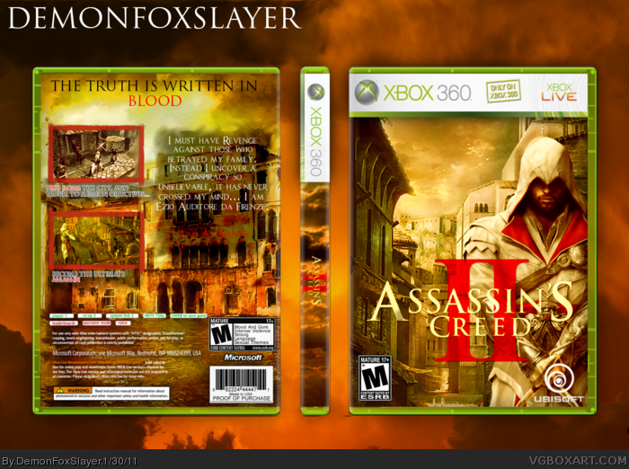
The Screenshot descriptions, look kind of weird. The way they are out lined, makes it look a bit... Different.
I was trying to side wheather to upload as is, or to change those. I decided to Upload as is.
The Back Rating Info thing, looks weirdly placed... But there is really no other option.
I Hoping this box will put me in the Hall of Fame. As long As I was making BoxArt, I have over 60 Boxes, and none in the Hall of fame, and
Im still only rank 4. The reason for this? It's simply because how stubborn I was and I used paint at the beginning. Not I see paint is a waste of time, and I cannot go back and delet my unwanted boxes.
Even though Im Almost 100% sure i wont get into the hall of fame, I hoping it will get awfully close.
As you know, Feedback and Favoriting is Always Welcomed!
Anyways time for the real stuff.
Credit:
Template: Soundwave, and Techne
ESRB Logos: ADFD
Ezio Render: Bazzah23 (@Planetrenders.net)
Bloody Screenshot Borders: LEGOslayer
Assassin's Creed II Logo: TwistRox
Ubisoft Logo: HellKnight
Back of case backdrop: Phatpuppy (@DeviantArt.com link )
#3, First off, Don't be lazy... Click full view, and i can guarantee that you will be able to read the back text, as for the layout i can see where your coming from, but all in all, its not really a big problem for me.
#4, Ok, I just try to help.
1. I have viewed this box in full view before I commented.
2. I don't think the text is easy to read here ("I'm Assassin", and screenshots texts)
3. I can't see the effort you put in the back as well as the front.
If everything is fine to you, you just keep your works and ignore me.
#5, The Thing that more important, is if it appeals to others. I can see where you're coming from with the "I am an Assassin''... Screenshot text aren't to bad, but i see where your coming from...
You CANT see the effort... I lot of effort went into it. Matter of fect a Shit Load of it.
Just please... I don't want to be harsh. Have you put enough effort into this??? You say a lot but I don't think so. Don't be mistake with Effort & Time. I really love the golden color of this box and want to fav just for the front. And now, I don't think I'll fav this anymore when you replied my critique.
I accept your critique I really do. And maybe I did get Effort and Time mixed up.
But i assure... A good helping of effort was put into it.
I'd like to remind you, there are people out there that are so skilled, that they could put little effort into a box and it turnout to be a masterpiece. It's called Skill. Well, actually it's called, Great Skill+++.
Most of all, I'd like to thank you, for providing feedback for my box, when others wouldn't, and you took the time to do so.
I'm still not a fan of the back design, but I see how much work you put into it. The front is AMAZING too. Very simple and straightforward, yet complex, and has a lot of feeling. Nice work, but there;s always something to learn!
 Assassin's Creed II Box Cover Comments
This is took a Really long time to make. First of all it was in the WIP threads. Barely anyone was responding to it. After time, people started to. and this is the final Product.
Things I want to point out:
The Screenshot descriptions, look kind of weird. The way they are out lined, makes it look a bit... Different.
I was trying to side wheather to upload as is, or to change those. I decided to Upload as is.
The Back Rating Info thing, looks weirdly placed... But there is really no other option.
I Hoping this box will put me in the Hall of Fame. As long As I was making BoxArt, I have over 60 Boxes, and none in the Hall of fame, and
Im still only rank 4. The reason for this? It's simply because how stubborn I was and I used paint at the beginning. Not I see paint is a waste of time, and I cannot go back and delet my unwanted boxes.
Even though Im Almost 100% sure i wont get into the hall of fame, I hoping it will get awfully close.
As you know, Feedback and Favoriting is Always Welcomed!
Anyways time for the real stuff.
Credit:
Template: Soundwave, and Techne
ESRB Logos: ADFD
Ezio Render: Bazzah23 (@Planetrenders.net)
Bloody Screenshot Borders: LEGOslayer
Assassin's Creed II Logo: TwistRox
Ubisoft Logo: HellKnight
Back of case backdrop: Phatpuppy (@DeviantArt.com link )
Please Enjoy.
[ Reply ]
Oh, and also credit to everyone in my WIP thread who helped me out. (wouldn't let me edit my first post)
[ Reply ]
I love the front the back seems need more works. It's hard to read text and the layout isn't good here, tagline too.
[ Reply ]
#3, First off, Don't be lazy... Click full view, and i can guarantee that you will be able to read the back text, as for the layout i can see where your coming from, but all in all, its not really a big problem for me.
[ Reply ]
#4, Ok, I just try to help.
1. I have viewed this box in full view before I commented.
2. I don't think the text is easy to read here ("I'm Assassin", and screenshots texts)
3. I can't see the effort you put in the back as well as the front.
If everything is fine to you, you just keep your works and ignore me.
[ Reply ]
#5, The Thing that more important, is if it appeals to others. I can see where you're coming from with the "I am an Assassin''... Screenshot text aren't to bad, but i see where your coming from...
You CANT see the effort... I lot of effort went into it. Matter of fect a Shit Load of it.
[ Reply ]
I meant to say "fact"... (It never lets me edit for some reason)
[ Reply ]
Just please... I don't want to be harsh. Have you put enough effort into this??? You say a lot but I don't think so. Don't be mistake with Effort & Time. I really love the golden color of this box and want to fav just for the front. And now, I don't think I'll fav this anymore when you replied my critique.
[ Reply ]
Sorry, I'm not in good mod, just wanna give you critique and hope you accept it >_<
[ Reply ]
I accept your critique I really do. And maybe I did get Effort and Time mixed up.
But i assure... A good helping of effort was put into it.
I'd like to remind you, there are people out there that are so skilled, that they could put little effort into a box and it turnout to be a masterpiece. It's called Skill. Well, actually it's called, Great Skill+++.
Most of all, I'd like to thank you, for providing feedback for my box, when others wouldn't, and you took the time to do so.
[ Reply ]
np, mate. Hope to see more works from you :D
[ Reply ]
Nice, only problem I have is that I can't really read the text on the back.
[ Reply ]
Sweet. Love how it looks... Looks... I don't know what the word I'm looking for is. :P
[ Reply ]
I'm still not a fan of the back design, but I see how much work you put into it. The front is AMAZING too. Very simple and straightforward, yet complex, and has a lot of feeling. Nice work, but there;s always something to learn!
[ Reply ]
#14, Thanks, and Yeah, im starting to dislike the back design as well.
[ Reply ]