bad interpretation is interpretation too... the front is good, even though I am not sure about the angelic touch on the front, but the back is way too basic and not fitting to the front.
Very nice. In my opinion you should use more a distorted font for the front, get rid of the ovals and use something like distorted squares and maybe isolate the red and turn down the saturation on the rest of the box.
 Fifa 11 Box Cover Comments
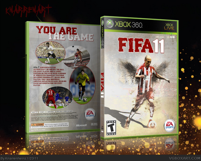
complete new interpretation of the series! Attention: a purely subjective view! :D
[ Reply ]
luvvit
[ Reply ]
bad interpretation is interpretation too... the front is good, even though I am not sure about the angelic touch on the front, but the back is way too basic and not fitting to the front.
[ Reply ]
Very nice. In my opinion you should use more a distorted font for the front, get rid of the ovals and use something like distorted squares and maybe isolate the red and turn down the saturation on the rest of the box.
[ Reply ]
========
UPDATE!!
========
[ Reply ]
sweet
[ Reply ]