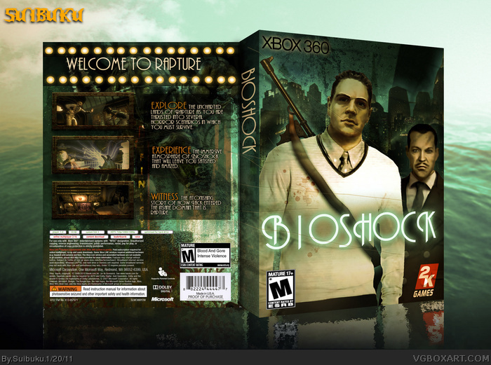
I haven't played BioShock so there isnt very much I can help you with here, other than some key flaws in the design. For starters, the red text contrasts on the blue background too much and makes it illegible. Also, I think you went overboard on the glows, on the front all the characters and the logo has one and its all too much.
You are definitely talented and your doing well though. Keep it up.
But I will say I hate the front renders, seeing two guys just standing there doesn't make me interested in any game..
Ontop of that, they're terrible quality.
Other than that bit. I like it.
And they arent even renders. They are custom made images from 100 px X 130 px portraits of the characters. There are only about 4 pictures of Jack on the internet itself.
This is an artistic box. It doesn't matter what its about or how recognizable it is. It is about how I feel about the game. The atmosphere, and the unique "renders".
#8, I've played the game 10 times already! But I never felt an atmosphere like on the front. Strange ... so different are the feelings! Thank God it is! : D
Hes not attacking your box man. He was just telling you what it reminds him of thats all....and actually if you put the bioshock color scheme on that fresh price....then yea i see where hes coming from. But your is unique but what you did was VERY risky....putting a face when no one knows what he looks like anyways. Risky
*Prince. Sorry. But yea you did a very risky move on putting him on the cover...very creative...but I dont think it worked the way you wanted it to. Good attempt though. And glad you didnt put a big daddy on the cover :p
#14, Seriously dude, lose the attitude. No one has attacked your box at all, you're really not understanding what they're saying.
I agree with most of them. The front doesn't give off any BioShock feel in my opinion. Saying that this box is the most creative BioShock box on the site is a very bad claim, especially since this is your box.
You're a good artist, and I can tell you have alot of potential, but you need to stop acting like everyone is attacking you, you look like a dick when you do.
What is the point of a box art? To attract the attention of a customer who has never heard of the game so that they look at it and then hopefully buy. You did make a very creative box but it does not attract the right attention for a Bioshock game.
And RAiDeN-209 is right, you need to relax. You put your box on the site and people are going to say what they dont like about it. If you cant handle that then dont put any up. Having an attitude isnt going to get anyone to like your box.
#14, I'm sorry but Andrew Ryan and the main character look like they're hanging out, that's not at all what the game is like and it doesn't capture much of the atmosphere that the game is about. It doesn't need a Big Daddy on the front but as it is now it doesn't work for me.
The back could use some downsizing of the screens and text, then you'd have a lot more room for legal info and other effects. You may not belive it but legal info sometimes makes a box look better.
 BioShock Box Cover Comments
Credits to Prong1978, tleeart, and oxol.
[ Reply ]
I haven't played BioShock so there isnt very much I can help you with here, other than some key flaws in the design. For starters, the red text contrasts on the blue background too much and makes it illegible. Also, I think you went overboard on the glows, on the front all the characters and the logo has one and its all too much.
You are definitely talented and your doing well though. Keep it up.
[ Reply ]
Did you even view full size?
[ Reply ]
#2, I disagree on both accounts.
But I will say I hate the front renders, seeing two guys just standing there doesn't make me interested in any game..
Ontop of that, they're terrible quality.
Other than that bit. I like it.
[ Reply ]
Well to me this box is a success, it is the most unique BioShock box on the site in my opinion.
[ Reply ]
And they arent even renders. They are custom made images from 100 px X 130 px portraits of the characters. There are only about 4 pictures of Jack on the internet itself.
[ Reply ]
If I do not know the game ... I would think it's about teachers! (because of the front)
[ Reply ]
This is an artistic box. It doesn't matter what its about or how recognizable it is. It is about how I feel about the game. The atmosphere, and the unique "renders".
[ Reply ]
1) The texture work makes me think of Bioshock, but the rugby player and his coach do not.
2) Using red to emphasize the text isn't consistent with the color scheme you've established.
3) I see what you were trying to do with the reflection but it turned out looking a bit cheesy.
But hey, that's just my opinion.
[ Reply ]
#8, I've played the game 10 times already! But I never felt an atmosphere like on the front. Strange ... so different are the feelings! Thank God it is! : D
[ Reply ]
I can agree with you all on the front with the characters as they are only shown briefly. But you cannot doubt its uniqueness.
[ Reply ]
#11, ... well already! But unique is an elastic term!
Jack in straps would adorn the front ... as unique as quirky :D
[ Reply ]
This doesn't really capture much of the feeling of the game if you ask me, to be honest it reminds me more of a Fresh Prince DVD than Bioshock.
link
[ Reply ]
By no way it resembles a fresh prince dvd. Sorry. Just because it doesn't have a big daddy doesn't mean that its a fresh prince dvd.
By the way it says at the bottom.
"Comments are meant to provide the author with feedback on their work."
Basicly you are attacking my box.
[ Reply ]
Constructive criticism is the rule!
[ Reply ]
Hes not attacking your box man. He was just telling you what it reminds him of thats all....and actually if you put the bioshock color scheme on that fresh price....then yea i see where hes coming from. But your is unique but what you did was VERY risky....putting a face when no one knows what he looks like anyways. Risky
[ Reply ]
*Prince. Sorry. But yea you did a very risky move on putting him on the cover...very creative...but I dont think it worked the way you wanted it to. Good attempt though. And glad you didnt put a big daddy on the cover :p
[ Reply ]
#14, Seriously dude, lose the attitude. No one has attacked your box at all, you're really not understanding what they're saying.
I agree with most of them. The front doesn't give off any BioShock feel in my opinion. Saying that this box is the most creative BioShock box on the site is a very bad claim, especially since this is your box.
You're a good artist, and I can tell you have alot of potential, but you need to stop acting like everyone is attacking you, you look like a dick when you do.
[ Reply ]
Not quite mate,
link
[ Reply ]
What is the point of a box art? To attract the attention of a customer who has never heard of the game so that they look at it and then hopefully buy. You did make a very creative box but it does not attract the right attention for a Bioshock game.
[ Reply ]
And RAiDeN-209 is right, you need to relax. You put your box on the site and people are going to say what they dont like about it. If you cant handle that then dont put any up. Having an attitude isnt going to get anyone to like your box.
[ Reply ]
#14, I'm sorry but Andrew Ryan and the main character look like they're hanging out, that's not at all what the game is like and it doesn't capture much of the atmosphere that the game is about. It doesn't need a Big Daddy on the front but as it is now it doesn't work for me.
The back could use some downsizing of the screens and text, then you'd have a lot more room for legal info and other effects. You may not belive it but legal info sometimes makes a box look better.
[ Reply ]
I am sorry guys. I've been dealing with a lot lately. Though that is no excuse. #22 that is good advice. Now I know what you mean.
[ Reply ]
#23, It's good that you're apologizing. I've seen quite a few artists who have made everyone hate them because of their attitude.
[ Reply ]
Printable added just in case someone now or in the future wants to print it out.
[ Reply ]
Needs a lot more attention.
[ Reply ]