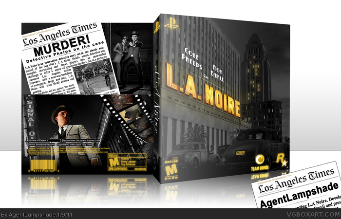
Clever idea with the logo and casting, it looks pretty cool. Trev's right though, white would have sufficed for the legal text. A subtle texture over the newspaper would've made it more believable as well, right now it's too square and perfect.
The back is... not amazing. Splitting it between two main images is a bit strange. You have your newspaper for the description, and the film reel for the screenshots, but having two main images is just strange. Try looking at some of the backs for the Uncharted games that we have here for some ideas for how to handle a situation like this.
 L.A. Noire Box Cover Comments
Ok then...First box of 2011. I wanted to give off a "movie-poster" vibe for this one, I think I pulled it off.
I'm quite happy with this one myself. Thanks for viewing!
[ Reply ]
this is cool
[ Reply ]
Very nice, although my only issue is the legal info, I would have sticked to the official colour for that.
[ Reply ]
It looks like the news paper should be on top of the bottom image so it doesn't look so square.
[ Reply ]
Clever idea with the logo and casting, it looks pretty cool. Trev's right though, white would have sufficed for the legal text. A subtle texture over the newspaper would've made it more believable as well, right now it's too square and perfect.
Good effort on the front, I like it.
[ Reply ]
Front is great, back is a mixed back.
I am no fan of theyellow @ the legal text and logos though. white would seem better....
[ Reply ]
Black and yellow, black and yellow, black and yellow, black and yellow. Hey... uhuh...
Sorry, had to.
[ Reply ]
The back is... not amazing. Splitting it between two main images is a bit strange. You have your newspaper for the description, and the film reel for the screenshots, but having two main images is just strange. Try looking at some of the backs for the Uncharted games that we have here for some ideas for how to handle a situation like this.
[ Reply ]
Thanks everyone! I'll look into updating it. I did struggle with the back. I'm also very glad everyone liked the front.
[ Reply ]
Front is very clever and damn fine looking :)
the back needs some work, as you mentioned yourself.
[ Reply ]