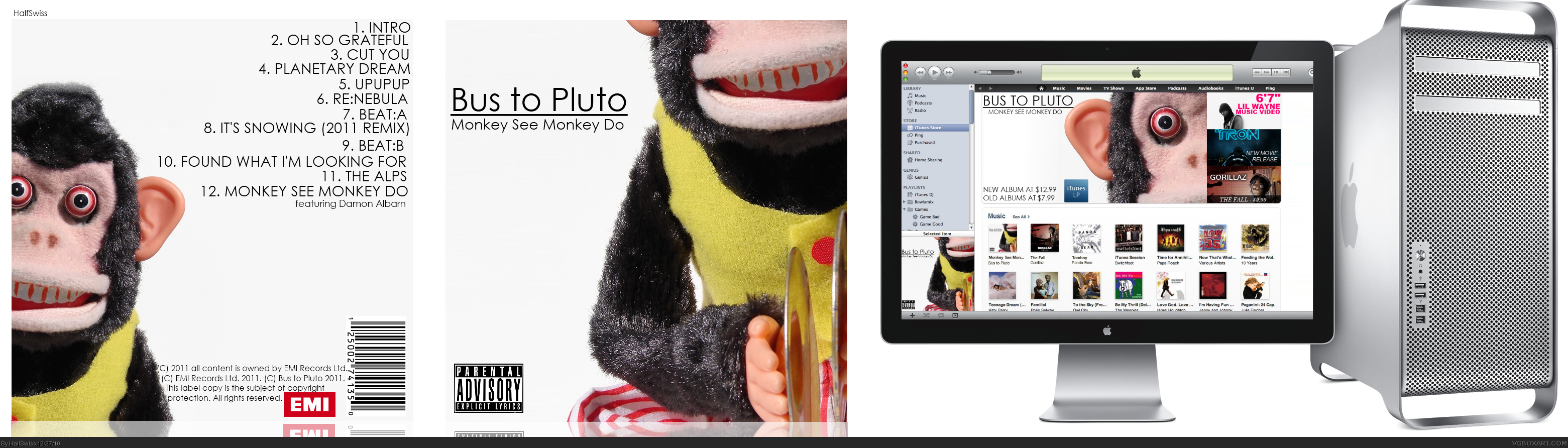
You have all the copy right text, bar-code, company logo and even the advisory logo. That is about 10 times the effort most people put into their CD covers.
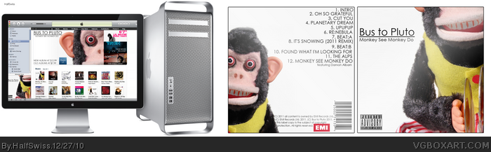
But personally I think you should flip the cover and the computer so the cover is in your thumbnail.
Did you try to texture the white so it's not so empty?
#2, The white is actually the way the original photo was, so I expanded the color to the whole box. I like i being empty; feels nice and simple.
I'll try to flip it later.
 Bus to Pluto: Monkey See Monkey Do Cover Comments
I felt like it.
[ Reply ]
You have all the copy right text, bar-code, company logo and even the advisory logo. That is about 10 times the effort most people put into their CD covers.
But personally I think you should flip the cover and the computer so the cover is in your thumbnail.
Did you try to texture the white so it's not so empty?
[ Reply ]
#2, The white is actually the way the original photo was, so I expanded the color to the whole box. I like i being empty; feels nice and simple.
I'll try to flip it later.
[ Reply ]
I would probably flip it as well, and maybe putting a small border around the box would help when distinguishing it from the presentation.
[ Reply ]
Updated presentation.
[ Reply ]
Btw you know there is a hotkey that you can do to get copyright logos in a text or what I do is copy and paste the logo into the text.
Here (©) Usually I have to make the font bigger on the copyright so it looks normal.
[ Reply ]
awesome box man this deserves more attention and favs.
love how you putted in the mac.the positioning looks perfect
FAV:)
[ Reply ]
#6, I know, but I was actually noticed that sometimes they just use (C).
link
[ Reply ]
The presentation is much better, it looks great.
[ Reply ]
Thanks!
[ Reply ]