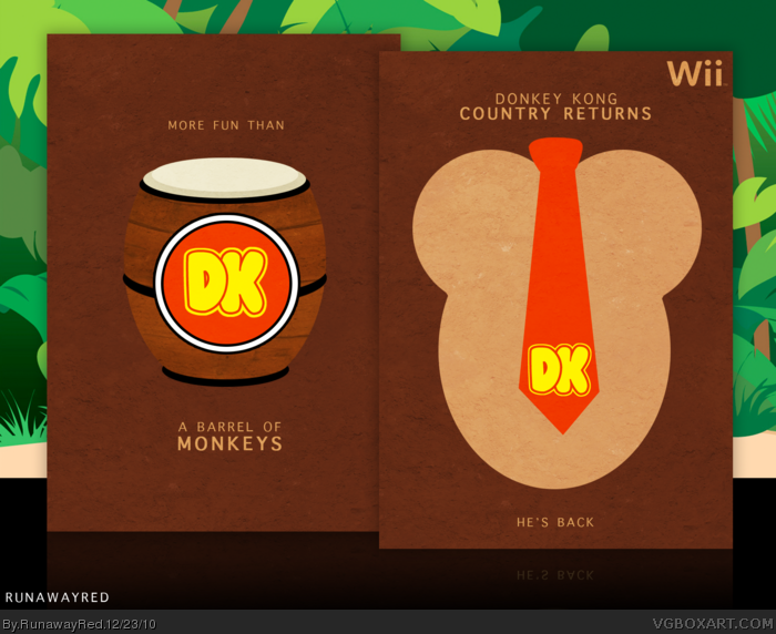
The front instantly makes me think of Mickie Mouse because of the shape of DK's chest. This looks too cartoonish for the game too. I feel like it's good but at the same time, it has its glaring flaws.
#5, I'm a bit confused. How is a cartoon box too cartoon for a cartoon game? I understand where you are coming from on the whole mickey mouse thing too. Any ideas on how to fix that?
I immediately thought of DK when I saw the image, though not because of the tie. To me, it's recognizable, and works well as a more simplistic, artistic design. A slip cover, almost. Nice work yet again, RR, I admire your unique approach to games like this.
#6, I honestly don't have a suggestion as to how to fix it, but the game really isn't a cartoon game. I mean that this is reminiscent of a cartoon type TV program, which I don't think of DK as. It's definitely not a bad box by any means, but I just don't think it's right for this game.
It's perfect for this game. It's like BOOM! He's back! If reminds me of those Spiderman 3 posters where it just says S3 and has web like things so you know whay its talking about. It looks great too!
Here is the thing: Yeah, this box makes me think of Donkey Kong. The problem is, that it shouldnt just make me think of the series, but of the actual game. If there were no logos, I would have no idea which game it was, which tells me that it doesnt show the game well enough. All in my opinion of course.
This really seems more like a Criterion Box. I love the idea, and I actually think it works. Loose mentioned that the box seems like a "cartoon tv show" which I don't think of DK as either, but it does take the most prominent (and out of place) feature of DK, and shows it as the highlight of the box.
 Donkey Kong Country Returns Box Cover Comments
Don't know what to say about this one. I'm getting really mixed feelings about it.
[ Reply ]
Just an idea I've had for awhile. Hope you like it! :)
[ Reply ]
#1, I'm with you on that.
[ Reply ]
I'm not really sure about this either, but that back is so awesome.
[ Reply ]
The front instantly makes me think of Mickie Mouse because of the shape of DK's chest. This looks too cartoonish for the game too. I feel like it's good but at the same time, it has its glaring flaws.
[ Reply ]
#5, I'm a bit confused. How is a cartoon box too cartoon for a cartoon game? I understand where you are coming from on the whole mickey mouse thing too. Any ideas on how to fix that?
[ Reply ]
Not really sure what everyone is talking about. This is godly.
[ Reply ]
I immediately thought of DK when I saw the image, though not because of the tie. To me, it's recognizable, and works well as a more simplistic, artistic design. A slip cover, almost. Nice work yet again, RR, I admire your unique approach to games like this.
[ Reply ]
Very original, well done sir
[ Reply ]
I would say it's original but I have seen a lot of shirts with the same thing but it is original to go on a box. Good overall design.
[ Reply ]
#6, I honestly don't have a suggestion as to how to fix it, but the game really isn't a cartoon game. I mean that this is reminiscent of a cartoon type TV program, which I don't think of DK as. It's definitely not a bad box by any means, but I just don't think it's right for this game.
[ Reply ]
I love this sooooo much.
It's perfect for this game. It's like BOOM! He's back! If reminds me of those Spiderman 3 posters where it just says S3 and has web like things so you know whay its talking about. It looks great too!
[ Reply ]
I had this idea, but I didn't think it would look very good.
I'm not a fan of the texture, and the lack of detail gives the whole thing a "meh" vibe.
[ Reply ]
great just wonderful job
[ Reply ]
This is the pure definition of simplicity! Well done!
[ Reply ]
Here is the thing: Yeah, this box makes me think of Donkey Kong. The problem is, that it shouldnt just make me think of the series, but of the actual game. If there were no logos, I would have no idea which game it was, which tells me that it doesnt show the game well enough. All in my opinion of course.
[ Reply ]
This really seems more like a Criterion Box. I love the idea, and I actually think it works. Loose mentioned that the box seems like a "cartoon tv show" which I don't think of DK as either, but it does take the most prominent (and out of place) feature of DK, and shows it as the highlight of the box.
Executed perfectly.
[ Reply ]
I think the simplicity would work better if the text on the front is gone and placed on a slipcase of sorts.
[ Reply ]
Nice!
[ Reply ]
The "cute and simple" concept doesn't quite work for this game, but I would be remiss not to fave this. It looks REALLY nice.
[ Reply ]
I think its pretty cool its creative but it has no warnings or anything but good job.
[ Reply ]
i wish i could download this one
[ Reply ]
This box is still amazing.
[ Reply ]
Print please
[ Reply ]