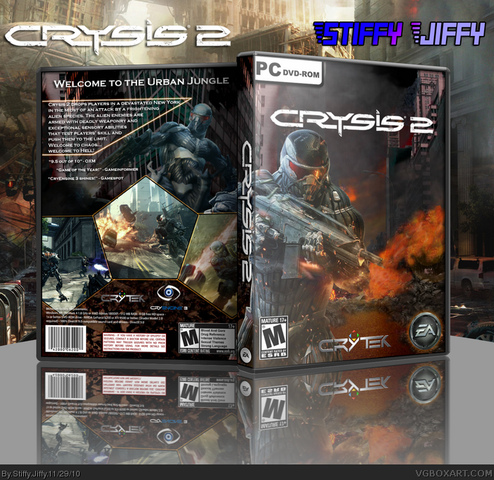
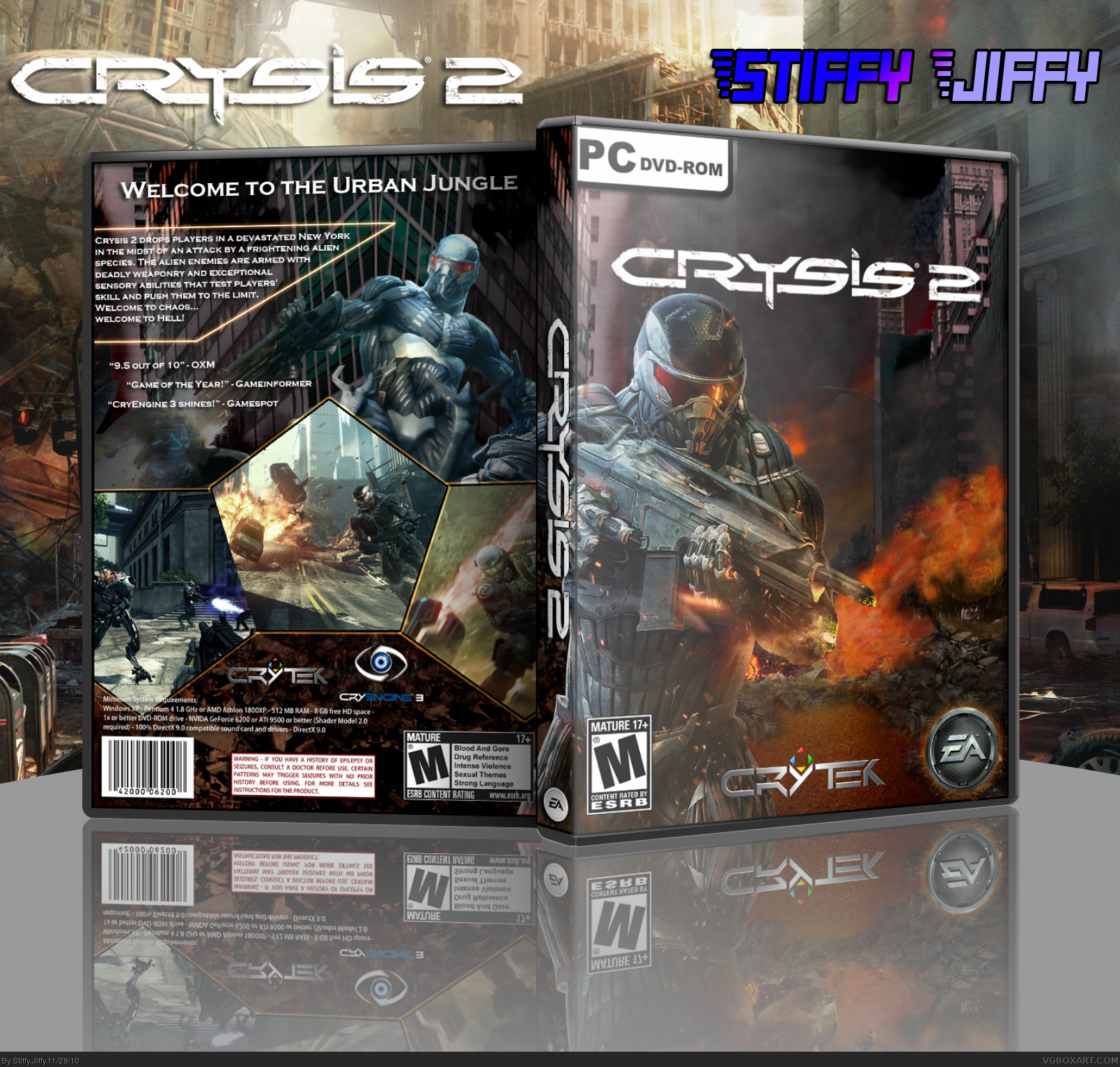
It's good for a second box, but I would suggest you start working on making the renders blend better with the background. If you can start adjusting things like the hue, saturation, highlights, shadows, etc to make the renders look as if they were part of the background, it would look much better. Right now the renders look slapped on rather than part of the image. Does that make sense?
The front cover is great!
I agree with Walrus for the back render, seems too bright and really stands out.
Love the the shape of your screen shots. However I noticed there isn't a glow to the left-side of your center shot. Looks off with out that glow. Last thing, I think your story info text is too close to the edge. I would move it to the right a little so it doesn't seem like it falls off the edge.
UPDATE: Added some slightly noticeable changes on the text and moved it over a little. Also changed the lighting effect on the back render and added the glow to the left side of the center shot.
#2, #3 Thank you for your comments and suggestions :)
 Crysis 2 Box Cover Comments
My second box :) took me a few days to do. Please view in full! Comments are greatly appreciated. Credit goes to Silent Oblivion for the template.
[ Reply ]
It's good for a second box, but I would suggest you start working on making the renders blend better with the background. If you can start adjusting things like the hue, saturation, highlights, shadows, etc to make the renders look as if they were part of the background, it would look much better. Right now the renders look slapped on rather than part of the image. Does that make sense?
[ Reply ]
The front cover is great!
I agree with Walrus for the back render, seems too bright and really stands out.
Love the the shape of your screen shots. However I noticed there isn't a glow to the left-side of your center shot. Looks off with out that glow. Last thing, I think your story info text is too close to the edge. I would move it to the right a little so it doesn't seem like it falls off the edge.
[ Reply ]
UPDATE: Added some slightly noticeable changes on the text and moved it over a little. Also changed the lighting effect on the back render and added the glow to the left side of the center shot.
#2, #3 Thank you for your comments and suggestions :)
Criticism and suggestions are welcomed!
[ Reply ]
I love this box! I agree about the renders, but the overall design and loom are awesome. I'd give it a few weeks before you pass my level up, lol.
[ Reply ]
*look
[ Reply ]
#5 Thank you very much! :)
[ Reply ]
Awesome. Just. Awesome.
[ Reply ]
#8 Thank you :)
[ Reply ]