No one ever replies to my boxes either -_- *sigh* looks pretty good but i would do something around the screenshots to sperate them from the image. It just seems a bit cut and paste like. try using more blurs and effects untill you get a nice effect.
I just want to point out that it's really amazing how there are way more comments on a bad box or kinda bad but then when there is a good box hardly any comments
#8, You realize we have lives ._. and stop bumping your own box!!
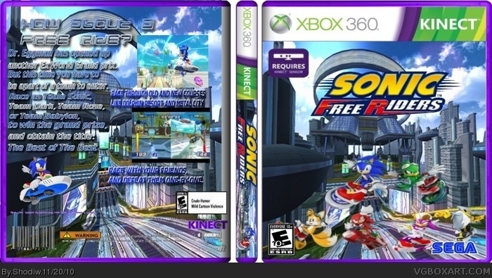
the text on the back is hard to read.
why is the temp purple, it doesn't fit with sonic...
the front is blurry.
6/10
#9, If you view in full then you could read the text and the front will not be blurry, but since it is not that big in regular view then it looks this way
 Sonic Free Riders Box Cover Comments
My sixth box.
Credit to FMD for the template
Sonic wiki for the renders and
Google images for the logo.
[ Reply ]
Wow my best box and no comments
[ Reply ]
It is one of your better boxes; you're improving. I'll fave.
[ Reply ]
#3, Thanks.
[ Reply ]
Is my box really not good?
[ Reply ]
No one ever replies to my boxes either -_- *sigh* looks pretty good but i would do something around the screenshots to sperate them from the image. It just seems a bit cut and paste like. try using more blurs and effects untill you get a nice effect.
[ Reply ]
#6, Thanks for the advice. I'll try that next time.
[ Reply ]
I just want to point out that it's really amazing how there are way more comments on a bad box or kinda bad but then when there is a good box hardly any comments
[ Reply ]
#8, You realize we have lives ._. and stop bumping your own box!!
the text on the back is hard to read.
why is the temp purple, it doesn't fit with sonic...
the front is blurry.
6/10
[ Reply ]
#9, If you view in full then you could read the text and the front will not be blurry, but since it is not that big in regular view then it looks this way
[ Reply ]