The front is really well put together, but I do agree that the logo doesn't really fit. The layout of the back isn't the greatest, and the brightness is way too high. If you could redo the back, and lower the brightness, this could be a great box.
Way too bright, the 3D is wrong again (or is this supposed to be a normal cd-case?) and what's up with the gradient chrome-gradient on the rating on the back?
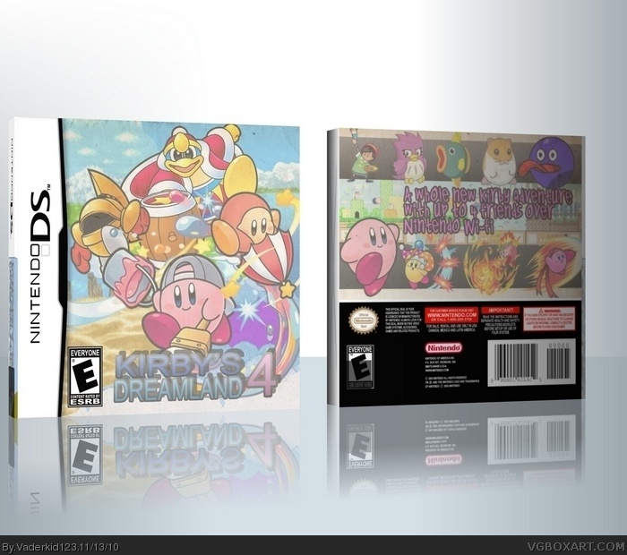
 Kirby's Dreamland 4 Box Cover Comments
Kirby's Dreamland 4
Just a quicky.
[ Reply ]
Waaay to bright! Oh and you partially left the Imandix cover trial thing on the back ESRB...
[ Reply ]
The back is kinda messy...put lines or something between the screenshots. The logo doesn't match the Kirby theme.
[ Reply ]
The front is really well put together, but I do agree that the logo doesn't really fit. The layout of the back isn't the greatest, and the brightness is way too high. If you could redo the back, and lower the brightness, this could be a great box.
[ Reply ]
You should lower the overall brightness, and take out that old paper texture you put on top of everything.
The template's mine, btw.
[ Reply ]
Way too bright man and the back is way too dark. Fix it and i'll fav.
[ Reply ]
Way too bright, the 3D is wrong again (or is this supposed to be a normal cd-case?) and what's up with the gradient chrome-gradient on the rating on the back?
[ Reply ]