Alright, so here's my first box on the site! I hope you enjoy it!
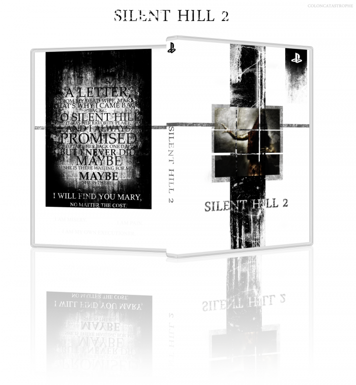
I wanted to go for a fairly minimal approach, since it really helps convey the emotion and solitude of the game. I've always loved the image of Pyramid Head that ScabbedAngel created, so I threw it on the cover alone.
The back I wanted to keep simple as well. A short bit of text, no screens, and get out the plot of the game through James' point of view.
Thanks to Star89er for his 3D box tutorial, as I never really expected to put the art on the box like that before, but decided it would help make it look a bit more professional.
Silent Hill 2 being one of my all-time favorite games, I'm pretty damn pleased with this. I think the overall imagery used, the stark white against the dark grunge/dirty texture is really pretty nice looking.
At first I was really displeased with Pyramid Head being on the cover. I'm pretty set against PH getting much face-time on SH2 covers due to the over-abundance of him in SH media and more importantly because he's not the star of the show.
However, I think I would be more inclined to appreciate it, or at least be content with it if you framed the image of him on the cover. Right now it looks literally like somebody pasted the picture onto the cover in MSPaint. Maybe frame it with complimenting dark grunge, or maybe a more traditional frame. Maybe you'd want to look into the original picture of Pyramid Head from the Historical Society building and look at how it was framed. Maybe now is a good time to embrace the 3x3 "final save point" design that was used for the Japanese cover of the game. There is a plethora of ideas here that could improve what you're going for.
I also think it would be much nicer and classy looking without the nurse on the back, and lastly, the "hole" text is unnecessary, and it feels like you're trying to force a fan-favorite reference to the game. I'd liken it to making a Portal cover and squeezing in the words "cake," "triumph," or "lie." It's a big no-no in my book.
It also steals the impact of the moment in the game when you see the text, and lessens the confusion, which is a bad thing in this case.
Great job though. I hope you take some of my suggestions to heart.
Slyder, I appreciate you coming in here to comment on it, as the Silent Hill thread showed how much you appreciate the series. I'll hit this point by point.
Honestly, Pyramid Head is the poster-boy for Silent Hill 2, and practically the whole series now. I think a picture of James would probably do it justice as well, but I feel like Pyramid Head has such an important role in the game that it's hard to not put him at the forefront. The image does help take a pure white background, and with the frames, really clash and make it a bit eclectic. I do see your point on it looking like it was just slapped on, and I did like the simplicity of it, but now that you brought it up, there's so much more that could be done with it and give it a little bit more polish that I'm gonna go back to the drawing boards and change it just a little.
The nurse was thrown on quickly at the end because there was a blank spot and I didn't really want to leave it open. I was hoping it was dark enough to not be so much a focus, but I can figure out something else. And you've got a damn fine point on the "hole" quote. It was, as I say a lot, "fan service." If nobody has played the game, they might not have as much a "WTF" moment when they find the quote.
I really appreciate all the help you guys have been, and the positive feedback. I'll try to brush it up just a tad and call it complete.
Yeah, I think I speak for all of us when I say that you look like you're capable of contributing a lot of fine work to the community, and we hope you stick around.
I agree with Slyder about framing pyramid head on the front, just to make him stand out a little bit more and anchor the image. I think you need to spice up the logo a bit also, it blends into the image a bit too much and its a little difficult to distinguish to two apart in areas.
Non of that really takes away from what you have made though, very nice way to start making a name for yourself!
I honestly didn't expect this to go over that well, as it was my first box uploaded, and I was almost dead-set on it being a bit too mundane.
TheSlyder and Sentroavium, that's a big order to fill, but I'll try to upload quality stuff. I think this is the kind of place with a great community, so I'd love to contribute and become a part of said community.
Drakxxx, thank you very much, and I'm enjoying this site immensely!
HellKnight [and Slyder again], I'm currently trying to mess around with the Pyramid Head picture on the front, and I took the 3x3 panel from the Japanese cover to spice it up a little bit. It took a bit of time to figure out what to do, but it adds a little bit to the front and keeps it from being so plain. As for the logo, I really tried to erode it a bit, and it ended up detracting a little bit, but I'll mess around with it and see if I can find a better medium than what I have.
I did post it in my WIP thread, but I figured it was pretty much to my liking, but once it's up, you start noticing the small nuances that could be improved, and the advice you guys have given is really helping me figure out what direction to go in.
To be honest, I see some brilliance here, but I don't like all that much. There are some really good elements, but as I am a different artist, I can't help but see the work and think "I would have done this".
I like the patchy feeling, but it's a bit too abrupt. I also think you've taken that "missing" element from the game. For me, the experience in Silent Hill always makes me feel lost, this game particularly made me feel that way. But as I look around the design, most of it is clear cut. I suppose though that the mystery feel to the game is not the approach you took, which I can totally respect.
Now what I do like about the box is the inverse usage of negative space. You've got a lot going on, or at least a lot being said, by doing so little, and excluding so much. Maybe I'm interpreting it wrong but I see two crucifixes on either side of the box, one with the "judgement" maker on it, and his assailants on the other. Anyone who has played the game knows that James battled his way through Hell in order to admit to his wrongs, and earn a second chance at judgement. It's a nice contrast that probably un-intentionally brings out the religious aspects of the game, well done on that front.
I think I'll follow your work good sir. :] Looking forward to seeing more.
"Maybe I'm interpreting it wrong but I see two crucifixes on either side of the box, one with the "judgement" maker on it"
Goddamn I wish I had thought of this. I've got a Silent Hill 2 box in the works, and reading that has kind of inspired me to mash more symbolism into it.
Ray Blade, you're a damned genius. I wanted to connect the front and back black boxes somehow, which is why I had the gray line run through, but your interpretation really just gives a whole new spin to the art. It wasn't totally meant to be two crosses, but it does give a deeper meaning to the simplicity. I'm sure if I really tried to dig, there could be another meaning I (or anybody else) could pull out. I hate for it to seem unintentional, but I have to say the idea of a cross on the front to symbolize Pyramid Head as a "cleansing" almost, in a sick way being like James' "personal savior" is a wonderful idea, and on the back, more of an upside down cross to symbolize James feeling of inadequacy for losing Mary and his return to Silent Hill could be his redemption.
You guys are great for the feedback, and I'd say an update with all these updates will be up in the afternoon!
Brettska, I nudged the Konami logo down a bit just for you! It did look a tad high.
I took the 3x3 save point idea from Slyder and applied it to the image of Pyramid Head. I made sure it wasn't even and a bit messy, since that ties to the emotion felt through the game. I added a bit of a border too. Something that didn't take away, but helped give it a little more. I also deleted the picture of the nurse on the back, and took off the hole quote. I changed it to a desperate plea from James. Much more fitting.
I tried to give the logo a little more filth, as mentioned by HellKnight. I felt like a clean logo helped go against what the game essentially was, but the rest of the box is pretty clean, so a dirty, worn logo doesn't take away.
I also bumped the Konami logo a little for Brettska, as it was a tad high.
I fixed the back ESRB block as well, since both pieces of text describing the rating were on the same level. Also added the Konami website address on the back as I felt it was a bit bare. I would have put something else, but I really didn't want to take away from the simplicity. Simplicity and barren are both close, but I think there's enough on this box to give people an idea of what it's about. As they enjoy the game (if it's their first playthrough) the clean/dirty clash would hopefully flip on a switch. James is trying to clense himself in a dirty place...
Thanks for all the feedback, and I appreciate the warm welcome everybody!
I was honestly thinking that the changes weren't going to be enough, and I was prepared to go back and try to fix it up again, but, it sounds like it's just about right now. Thank you so much guys! Hopefully I'll be able to throw something else up within the next few days!
@25, wow, really? I appreciate the compliment to my box, and seeing as it's my first, and probably (definitely) my strongest on the site, it makes me feel great. I can't totally see it in the HoF, but maybe I'm just jaded, but like I said, it's nice to know you like it!
Small update, by the way. Aligned the back icons with the black bar to make it a little more precise and neat.
Wow, I have to thank everybody who helped this get into the Hall of Fame. I can't express how I'm feeling, since this was my first box, and looking back, by far my strongest. Thank you all, so so much. I've been in a drought lately, but it looks like I'm gonna move onto the other three Team Silent games, maybe try to keep a running theme. Thank you again!
Quick update/beating a dead horse off. That's the correct saying, yes?
Anyways, I've lost about all of my abilities to create new boxes, so I've pretty much given up. You won't see me around much anymore unfortunately. I did decide to really quick throw this on the sort of new template I've been using to make it look a little more s(l)ick.
 Silent Hill 2 Box Cover Comments
Alright, so here's my first box on the site! I hope you enjoy it!
I wanted to go for a fairly minimal approach, since it really helps convey the emotion and solitude of the game. I've always loved the image of Pyramid Head that ScabbedAngel created, so I threw it on the cover alone.
The back I wanted to keep simple as well. A short bit of text, no screens, and get out the plot of the game through James' point of view.
Thanks to Star89er for his 3D box tutorial, as I never really expected to put the art on the box like that before, but decided it would help make it look a bit more professional.
[ Reply ]
good start, i like it.
[ Reply ]
Good first. I like the minimalist style.
[ Reply ]
Thank you both!
I do tend to leave things a little plain, but I felt like this was a game where less is more. I appreciate the kind words!
[ Reply ]
This box is amazing dude. The typography on the back is very well done, and like ADFD said, the minimalistic style works well with this.
[ Reply ]
Silent Hill 2 being one of my all-time favorite games, I'm pretty damn pleased with this. I think the overall imagery used, the stark white against the dark grunge/dirty texture is really pretty nice looking.
At first I was really displeased with Pyramid Head being on the cover. I'm pretty set against PH getting much face-time on SH2 covers due to the over-abundance of him in SH media and more importantly because he's not the star of the show.
However, I think I would be more inclined to appreciate it, or at least be content with it if you framed the image of him on the cover. Right now it looks literally like somebody pasted the picture onto the cover in MSPaint. Maybe frame it with complimenting dark grunge, or maybe a more traditional frame. Maybe you'd want to look into the original picture of Pyramid Head from the Historical Society building and look at how it was framed. Maybe now is a good time to embrace the 3x3 "final save point" design that was used for the Japanese cover of the game. There is a plethora of ideas here that could improve what you're going for.
I also think it would be much nicer and classy looking without the nurse on the back, and lastly, the "hole" text is unnecessary, and it feels like you're trying to force a fan-favorite reference to the game. I'd liken it to making a Portal cover and squeezing in the words "cake," "triumph," or "lie." It's a big no-no in my book.
It also steals the impact of the moment in the game when you see the text, and lessens the confusion, which is a bad thing in this case.
Great job though. I hope you take some of my suggestions to heart.
[ Reply ]
Slyder, I appreciate you coming in here to comment on it, as the Silent Hill thread showed how much you appreciate the series. I'll hit this point by point.
Honestly, Pyramid Head is the poster-boy for Silent Hill 2, and practically the whole series now. I think a picture of James would probably do it justice as well, but I feel like Pyramid Head has such an important role in the game that it's hard to not put him at the forefront. The image does help take a pure white background, and with the frames, really clash and make it a bit eclectic. I do see your point on it looking like it was just slapped on, and I did like the simplicity of it, but now that you brought it up, there's so much more that could be done with it and give it a little bit more polish that I'm gonna go back to the drawing boards and change it just a little.
The nurse was thrown on quickly at the end because there was a blank spot and I didn't really want to leave it open. I was hoping it was dark enough to not be so much a focus, but I can figure out something else. And you've got a damn fine point on the "hole" quote. It was, as I say a lot, "fan service." If nobody has played the game, they might not have as much a "WTF" moment when they find the quote.
I really appreciate all the help you guys have been, and the positive feedback. I'll try to brush it up just a tad and call it complete.
[ Reply ]
Wow, looks really cool! You seem to know what your doing.
[ Reply ]
Yeah, I think I speak for all of us when I say that you look like you're capable of contributing a lot of fine work to the community, and we hope you stick around.
[ Reply ]
#9, This.
[ Reply ]
Nice work all around, and I really like the type on the back. Welcome to the site. :)
[ Reply ]
Excellent, really excellent work.
I agree with Slyder about framing pyramid head on the front, just to make him stand out a little bit more and anchor the image. I think you need to spice up the logo a bit also, it blends into the image a bit too much and its a little difficult to distinguish to two apart in areas.
Non of that really takes away from what you have made though, very nice way to start making a name for yourself!
[ Reply ]
I honestly didn't expect this to go over that well, as it was my first box uploaded, and I was almost dead-set on it being a bit too mundane.
TheSlyder and Sentroavium, that's a big order to fill, but I'll try to upload quality stuff. I think this is the kind of place with a great community, so I'd love to contribute and become a part of said community.
Drakxxx, thank you very much, and I'm enjoying this site immensely!
HellKnight [and Slyder again], I'm currently trying to mess around with the Pyramid Head picture on the front, and I took the 3x3 panel from the Japanese cover to spice it up a little bit. It took a bit of time to figure out what to do, but it adds a little bit to the front and keeps it from being so plain. As for the logo, I really tried to erode it a bit, and it ended up detracting a little bit, but I'll mess around with it and see if I can find a better medium than what I have.
I did post it in my WIP thread, but I figured it was pretty much to my liking, but once it's up, you start noticing the small nuances that could be improved, and the advice you guys have given is really helping me figure out what direction to go in.
[ Reply ]
To be honest, I see some brilliance here, but I don't like all that much. There are some really good elements, but as I am a different artist, I can't help but see the work and think "I would have done this".
I like the patchy feeling, but it's a bit too abrupt. I also think you've taken that "missing" element from the game. For me, the experience in Silent Hill always makes me feel lost, this game particularly made me feel that way. But as I look around the design, most of it is clear cut. I suppose though that the mystery feel to the game is not the approach you took, which I can totally respect.
Now what I do like about the box is the inverse usage of negative space. You've got a lot going on, or at least a lot being said, by doing so little, and excluding so much. Maybe I'm interpreting it wrong but I see two crucifixes on either side of the box, one with the "judgement" maker on it, and his assailants on the other. Anyone who has played the game knows that James battled his way through Hell in order to admit to his wrongs, and earn a second chance at judgement. It's a nice contrast that probably un-intentionally brings out the religious aspects of the game, well done on that front.
I think I'll follow your work good sir. :] Looking forward to seeing more.
[ Reply ]
"Maybe I'm interpreting it wrong but I see two crucifixes on either side of the box, one with the "judgement" maker on it"
Goddamn I wish I had thought of this. I've got a Silent Hill 2 box in the works, and reading that has kind of inspired me to mash more symbolism into it.
[ Reply ]
The more i stared at this, the more it grew on me. I like the simplicity and typography, but the Konami logo is a tad high. Still, +fav
[ Reply ]
#15, :P Well I'm glad my perverse ideas can inspire you.
[ Reply ]
Ray Blade, you're a damned genius. I wanted to connect the front and back black boxes somehow, which is why I had the gray line run through, but your interpretation really just gives a whole new spin to the art. It wasn't totally meant to be two crosses, but it does give a deeper meaning to the simplicity. I'm sure if I really tried to dig, there could be another meaning I (or anybody else) could pull out. I hate for it to seem unintentional, but I have to say the idea of a cross on the front to symbolize Pyramid Head as a "cleansing" almost, in a sick way being like James' "personal savior" is a wonderful idea, and on the back, more of an upside down cross to symbolize James feeling of inadequacy for losing Mary and his return to Silent Hill could be his redemption.
You guys are great for the feedback, and I'd say an update with all these updates will be up in the afternoon!
Brettska, I nudged the Konami logo down a bit just for you! It did look a tad high.
[ Reply ]
Alright, here's the updated version!
I took the 3x3 save point idea from Slyder and applied it to the image of Pyramid Head. I made sure it wasn't even and a bit messy, since that ties to the emotion felt through the game. I added a bit of a border too. Something that didn't take away, but helped give it a little more. I also deleted the picture of the nurse on the back, and took off the hole quote. I changed it to a desperate plea from James. Much more fitting.
I tried to give the logo a little more filth, as mentioned by HellKnight. I felt like a clean logo helped go against what the game essentially was, but the rest of the box is pretty clean, so a dirty, worn logo doesn't take away.
I also bumped the Konami logo a little for Brettska, as it was a tad high.
I fixed the back ESRB block as well, since both pieces of text describing the rating were on the same level. Also added the Konami website address on the back as I felt it was a bit bare. I would have put something else, but I really didn't want to take away from the simplicity. Simplicity and barren are both close, but I think there's enough on this box to give people an idea of what it's about. As they enjoy the game (if it's their first playthrough) the clean/dirty clash would hopefully flip on a switch. James is trying to clense himself in a dirty place...
Thanks for all the feedback, and I appreciate the warm welcome everybody!
[ Reply ]
#18, Hehe Thank you sir. :] And the idea sounds fantastic. Silent Hill is so full of symbolism, it's hard not to be inspired.
As far as the update, Now I'm loving it! Great work!
[ Reply ]
Aaaaand favorited.
This is just fan-fucking-tastic!
[ Reply ]
I was honestly thinking that the changes weren't going to be enough, and I was prepared to go back and try to fix it up again, but, it sounds like it's just about right now. Thank you so much guys! Hopefully I'll be able to throw something else up within the next few days!
[ Reply ]
Fuck. This is gorgeous.
[ Reply ]
WOOOOOW...not much more I can say to this, besides,WOOOOOW....
I wish I could Author FAV but Reed still ain't fixed his shit...
[ Reply ]
Still waiting on a HoF for this... Anyone agree?
[ Reply ]
@25, wow, really? I appreciate the compliment to my box, and seeing as it's my first, and probably (definitely) my strongest on the site, it makes me feel great. I can't totally see it in the HoF, but maybe I'm just jaded, but like I said, it's nice to know you like it!
Small update, by the way. Aligned the back icons with the black bar to make it a little more precise and neat.
[ Reply ]
Damn, how the hell did I miss this? Silent Hill 2 is one of my favorite games of all time and this box does justice to the game well. Good job!
+ FAV
[ Reply ]
Wow, I have to thank everybody who helped this get into the Hall of Fame. I can't express how I'm feeling, since this was my first box, and looking back, by far my strongest. Thank you all, so so much. I've been in a drought lately, but it looks like I'm gonna move onto the other three Team Silent games, maybe try to keep a running theme. Thank you again!
[ Reply ]
I'm in love with this. Allow me to help u get it into masterworks.
[ Reply ]
Quick update/beating a dead horse off. That's the correct saying, yes?
Anyways, I've lost about all of my abilities to create new boxes, so I've pretty much given up. You won't see me around much anymore unfortunately. I did decide to really quick throw this on the sort of new template I've been using to make it look a little more s(l)ick.
[ Reply ]
Why don't you make boxes anymore? :(
[ Reply ]