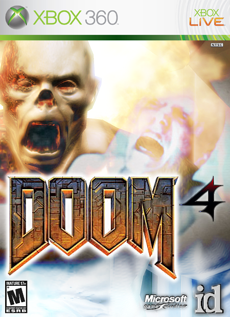
Id said it ain't gonna happen, but i hope it does, i always thought Doom would be cool in a city or something :)
Anyways, i hope you like this, i made to make the 4 myself in the logo, so (of course) it isn't the best. :P
really nice and your proably like i dont want a noobs advice but im not a noob im a previous member. but its really nice bob i like it. great job. o and i didnt create that super smash brothers brawl picture thats in the forums under super smash brothers attempt two.
Very nice, my only suggestion's would be to make the ESRB logo a little bigger. And try to make the "4" a little bigger, everything else looks nice. 4.5/5 ;)
thanx Mr.speed, but if you look at the 3 in Doom 3, it's small, so i wanted to do the same thing for this.
PS. Sergent, the way i se it:
any advice is god advice :)
#4, haha. nice ;)
and about the box, it looks pretty good, but maybe a bit too bright for a Doom box. the '4' should also be somewhere else, maybe to make the logo more centered.
You should make the 4 better by copying a bit of the texture of the DOOM writing and making your 4 transparent on it yeah, the 4 looks completely out of place out at the moment, also make it darker so 3/5.
thanx Gunslinger, but i thought that this four loked better this way, if i had done IV, it wouldn't have been able to be seen from behind the DOOM logo.
um....evil max...
yeah, um...why do you keep on making up numbers on the rating scale?
12/12
6/6
9/9
i mean, you know those dont exist right? if you wanna keep searching, be my guest, i just thought i'd say something... :X
#32, the real numbers go up to 5. you could give a person, say, 9/10, or you could go with the scale which stops at five, so it would be a 4/5. But that's just an example.

 Doom 4 Box Cover Comments
nice
[ Reply ]
Id said it ain't gonna happen, but i hope it does, i always thought Doom would be cool in a city or something :)
Anyways, i hope you like this, i made to make the 4 myself in the logo, so (of course) it isn't the best. :P
[ Reply ]
really nice and your proably like i dont want a noobs advice but im not a noob im a previous member. but its really nice bob i like it. great job. o and i didnt create that super smash brothers brawl picture thats in the forums under super smash brothers attempt two.
[ Reply ]
#1, Sir, thank you, Sir! :P
[ Reply ]
Very nice, my only suggestion's would be to make the ESRB logo a little bigger. And try to make the "4" a little bigger, everything else looks nice. 4.5/5 ;)
[ Reply ]
thanx Mr.speed, but if you look at the 3 in Doom 3, it's small, so i wanted to do the same thing for this.
PS. Sergent, the way i se it:
any advice is god advice :)
[ Reply ]
#4, haha. nice ;)
and about the box, it looks pretty good, but maybe a bit too bright for a Doom box. the '4' should also be somewhere else, maybe to make the logo more centered.
[ Reply ]
thanx Wicked, i was going to put it underneath the DOOM logo, inbetween the 2 O's. i'll see what io can do.
[ Reply ]
hooo-rah wickedgamer1 hooo-rah by the way keep up the good work radioactive bob. over. lol
[ Reply ]
Ok, updated with the newely placed logo :) The ESRB logo is also bigger.
PS. thanx Sergent dude. i-i mean Sir "0_0"
[ Reply ]
#10, lol i like it radioactive bob. it looks better like this. now fall out marine. drop and give me 20.
[ Reply ]
cool box mikey i just dont like the 4 thats about it though.
4/5
[ Reply ]
thanx treesquirrel :)
[ Reply ]
You should make the 4 better by copying a bit of the texture of the DOOM writing and making your 4 transparent on it yeah, the 4 looks completely out of place out at the moment, also make it darker so 3/5.
[ Reply ]
Cool i don't the 4 and remove the microsft game logo .
4/5
[ Reply ]
#14, i'll see if i can make it darker.
#15, why would i get rid of the MS logo?
[ Reply ]
Activision owns Doom not MGS . It would look even cooler if you can maker Draker and fix the 4.
[ Reply ]
Alrighty then, i made the box darker since you ALL wanted it ;)
also, i moved the logo up more, and replaced MS with Activision. I hope you like it :)
[ Reply ]
i think you mean you made it srcay and draker lol
[ Reply ]
thanx sergent... i guess ;)
[ Reply ]
lol
[ Reply ]
Doom shouldnt have got as far as 3 it was a legend series now its not anyways nice try 3/5
[ Reply ]
not bad
and they said there will most likley be a sequal but it wont be for a long time
[ Reply ]
A lot beter . 4/5
[ Reply ]
#22, thanx Vhero
#23, i haven't heard anything about a sequel, but i can't wait for it if it's true :)
#24, thanx Ratchetcommand
[ Reply ]
ihave updated this with a completely different 4 logo. I figured that since Doom 2 used Roman numberals, Dom 4 (if it happens) might use it too.
[ Reply ]
Accept a four in Roman Numerals is IV. Overall the box looks really cool.
[ Reply ]
Sheesh. Except not accept.
I r t3h smart. *slaps self*
[ Reply ]
thanx Gunslinger, but i thought that this four loked better this way, if i had done IV, it wouldn't have been able to be seen from behind the DOOM logo.
[ Reply ]
very good ah i hope that id make doom 4 will i give it 9/9
[ Reply ]
um....evil max...
yeah, um...why do you keep on making up numbers on the rating scale?
12/12
6/6
9/9
i mean, you know those dont exist right? if you wanna keep searching, be my guest, i just thought i'd say something... :X
[ Reply ]
#31 i know that but the box art is way better pluse i do not know the real scale
[ Reply ]
#32, the real numbers go up to 5. you could give a person, say, 9/10, or you could go with the scale which stops at five, so it would be a 4/5. But that's just an example.
[ Reply ]
uh...hate to be a bother but that IIII looks bad because in RN 4 is acually IV
[ Reply ]
#34, ya, i know, i'll change it since your all so picky :P
[ Reply ]
Lol, whats IIII? don't you mean IV? hehehaha!
[ Reply ]
#36, lol my bad didn't read you're other comment :|
[ Reply ]
#37, well, you can expect an update by the end of the day, so quiet your ranting :P
[ Reply ]
IT'S THE UPDATE YOU'VE ALL BEEN WAITING FOR!!!!!! i changed the 4...Enjoy :)
[ Reply ]
i....wasn't waiting...
:P
you need to find a texture to put over the four that resembles that of the DOOM logo.
...if that made any sense....
^_^'
[ Reply ]
#40 , iknow what you mean Wiked, but i wouldn't knopw where to start looking for a texture :(
[ Reply ]
i love this box sorry to rate so late but its never gunna happen looks sweet though thumbs up
[ Reply ]
Thanks. This is an old box of mine, i actually forgot I made it. :(
[ Reply ]
GOOD NEWS!!!
ID and bethesta softworks (who own ID now) have decided to make DOOM 4 and Quake 5
Anyway back to the box, it looks nice and cleanly cut. 9.5/10
[ Reply ]