just another box i made.
not too fancy or colourful coz all da other hitman games aren't so i wanted to keep it like da other covers.
feedback appreciated and plz fav dis.
still more 2 come
can I just highlight something. 'You must make an effort to spell correctly and use proper grammar. If you can't be bothered to post coherently and spell out "you" instead of "u" (as an example), don't bother posting at all.'
please, just type 'that' instead of 'dat'.
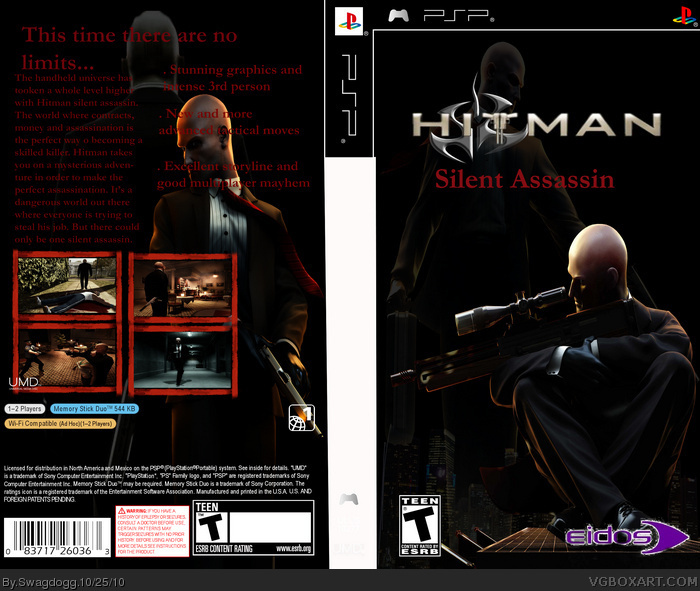
Anyway the choppy Eidos logo spoils the front, there's no IO interactive logo (they're the developers) and lack of proper logo is rather bad. The back is quite good, but looks messy and inconsistent.
Use the resource section at the top, it'll save a lot of trouble with rendering.
Overall, frustratingly average, not your best, but a marked improvement over the Mario box you made.
#6, Dude who are you referring too? dont get cocky now..... and everyone here was giving you ways to improve, if you dont listen, you will most likely make crappy boxes then, get banned
 Hitman silent assassin Box Cover Comments
just another box i made.
not too fancy or colourful coz all da other hitman games aren't so i wanted to keep it like da other covers.
feedback appreciated and plz fav dis.
still more 2 come
[ Reply ]
sorry da eidos sign and the hitman sign are a lil blurry when you zoom into da pic
[ Reply ]
i kept da text like dis in red to represent blood and the text font like dat because there's nothing too fancy about hitman.
it has to remain simple
[ Reply ]
can I just highlight something. 'You must make an effort to spell correctly and use proper grammar. If you can't be bothered to post coherently and spell out "you" instead of "u" (as an example), don't bother posting at all.'
please, just type 'that' instead of 'dat'.
Anyway the choppy Eidos logo spoils the front, there's no IO interactive logo (they're the developers) and lack of proper logo is rather bad. The back is quite good, but looks messy and inconsistent.
Use the resource section at the top, it'll save a lot of trouble with rendering.
Overall, frustratingly average, not your best, but a marked improvement over the Mario box you made.
[ Reply ]
There are lots of mistakes, you don't check over your typing- you just wanted to post a box. link for hitman font.
[ Reply ]
atleast i have more favs than u
[ Reply ]
#6, Dude who are you referring too? dont get cocky now..... and everyone here was giving you ways to improve, if you dont listen, you will most likely make crappy boxes then, get banned
[ Reply ]