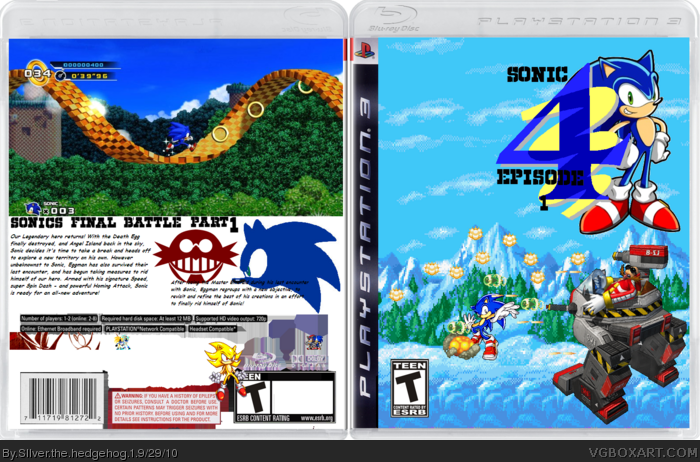
Anyway, use the official logo and make it less confusing. The renders are all over the place. Also use some screenshots. One big screenshot on the back doesn't cut it
#1, Oh shut up. He doesn't need to use the official logo, in fact, I commend him for using his own, but seriously, what's so confusing about Sonic jumping away from Robotnik's attack? And lastly, how does one big screenshot "Not cut it" for a sidescrolling game where you only see the game at one angle?
#3, I never said it was an insult, but it certainly didn't sound like critique to me. It sounded like you wanted it to look like the covers you see every day. You don't want it to look different. That's why you don't like it.
 Sonic The Hedgehog 4 Box Cover Comments
Cerium...why would you fav this??
Anyway, use the official logo and make it less confusing. The renders are all over the place. Also use some screenshots. One big screenshot on the back doesn't cut it
[ Reply ]
#1, Oh shut up. He doesn't need to use the official logo, in fact, I commend him for using his own, but seriously, what's so confusing about Sonic jumping away from Robotnik's attack? And lastly, how does one big screenshot "Not cut it" for a sidescrolling game where you only see the game at one angle?
[ Reply ]
#2 The box just looks atrocious to me. The back is also screwed up. That isn't meant to be an insult, it's critique
[ Reply ]
#3, I never said it was an insult, but it certainly didn't sound like critique to me. It sounded like you wanted it to look like the covers you see every day. You don't want it to look different. That's why you don't like it.
[ Reply ]