crossover [ Buy Desperate Steel at Amazon ] By Daemon 46 on September 20th, 2010 No Printable Available Desperate Steel Box Cover Comments Comment on Daemon's Desperate Steel Box Art / Cover. Cancel Reply Daemon 46 [ 1 decade ago ] No More Heroes 2: Desperate Struggle logo courtesy of Tat76. Enjoy ;) [ Reply ] sd1833 48 [ 1 decade ago ] An interesting idea, and I like the execution for the most part. The brown colors look unappealing though, and make the synopsis text seem almost transparent outside of full-view. Why not try red? [ Reply ] Daemon 46 [ 1 decade ago ] #2, I tried red and looked like a horrible bloody mess. [ Reply ] Eggboy'13 48 [ 1 decade ago ] Font is gorgeous. Back needs practice. [ Reply ] Brettska99 45 [ 1 decade ago ] The concept is nice, in fact im in love with it (im a sucker for cross-overs) but the back needs work, try using a better font [ Reply ] jevangod 50 [ 1 decade ago ] #2, Agreed. [ Reply ] MattStar 49 [ 1 decade ago ] I really like this. It definitely deserves my fav! [ Reply ] Vaderkid123 20 [ 1 decade ago ] I like it, but a think a better title would have been No More Steel. But thats just me. [ Reply ]
 Desperate Steel Box Cover Comments
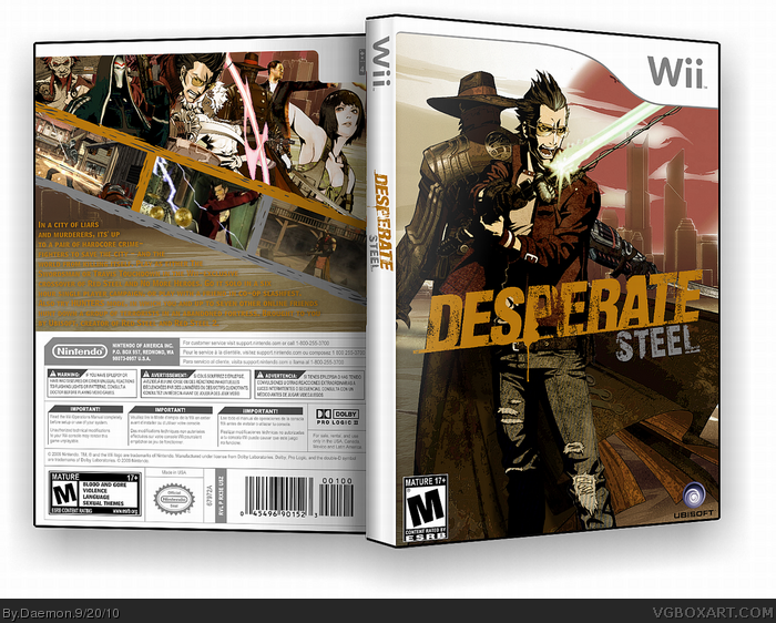
No More Heroes 2: Desperate Struggle logo courtesy of Tat76.
Enjoy ;)
[ Reply ]
An interesting idea, and I like the execution for the most part. The brown colors look unappealing though, and make the synopsis text seem almost transparent outside of full-view. Why not try red?
[ Reply ]
#2, I tried red and looked like a horrible bloody mess.
[ Reply ]
Font is gorgeous. Back needs practice.
[ Reply ]
The concept is nice, in fact im in love with it (im a sucker for cross-overs) but the back needs work, try using a better font
[ Reply ]
#2, Agreed.
[ Reply ]
I really like this. It definitely deserves my fav!
[ Reply ]
I like it, but a think a better title would have been No More Steel. But thats just me.
[ Reply ]