Hi there! I had a nice time making this box.
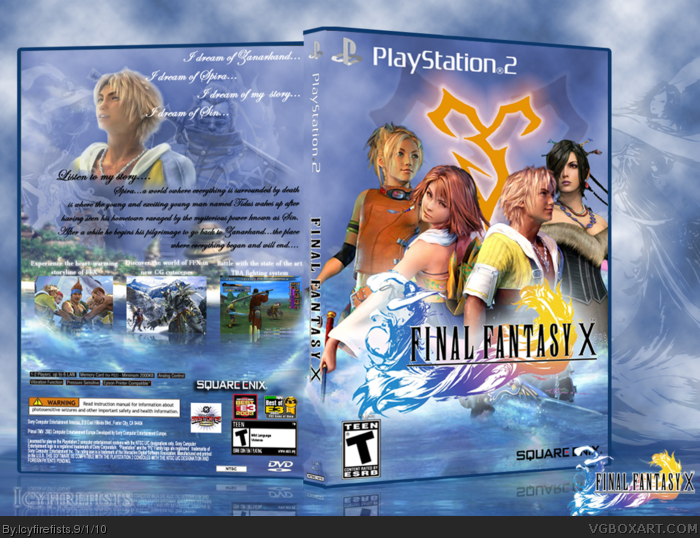
My latest. inspired by Throavium's FFX. Not much to say other than customized the Yuna Render on the front and the water renders and sky renders.
Credit to Throavium for Tidus on the front and Besaid island on the back. And credit to google for the other images.
Hope you enjoy.
I like the front, it's bright and nicely composed, not a fan of the back though, Tidues looks weird being cut off like that and the tagline font isn't appealing to me. Like the colors and softness of it... it carries the game's feeling.
#7, I wanted to have Tidus in the clouds a little faded but like still there as he is the MC of the game. I wanted to keep the back dreamlike and not cluttered and as for the font...i thought something cursive-like would fit the FFX theme more than abstract or regular FF text. It seemed fitting. i left the water and the reflections of the screenshots there because they fit and the main text i realise is a little hard to read but i thought it was better than any old text.
 Final Fantasy X Box Cover Comments
Hi there! I had a nice time making this box.
My latest. inspired by Throavium's FFX. Not much to say other than customized the Yuna Render on the front and the water renders and sky renders.
Credit to Throavium for Tidus on the front and Besaid island on the back. And credit to google for the other images.
Hope you enjoy.
[ Reply ]
Actually, jevangod rendered that Tidus.
[ Reply ]
woops...credit where credit is due then
[ Reply ]
I don't like the back much.. but I love the front.
[ Reply ]
Thank you very much guys! #4, whats up with the box on the back?
[ Reply ]
Thank you very much guys! #4, whats up with the box on the back?
[ Reply ]
I like the front, it's bright and nicely composed, not a fan of the back though, Tidues looks weird being cut off like that and the tagline font isn't appealing to me. Like the colors and softness of it... it carries the game's feeling.
[ Reply ]
#7, I wanted to have Tidus in the clouds a little faded but like still there as he is the MC of the game. I wanted to keep the back dreamlike and not cluttered and as for the font...i thought something cursive-like would fit the FFX theme more than abstract or regular FF text. It seemed fitting. i left the water and the reflections of the screenshots there because they fit and the main text i realise is a little hard to read but i thought it was better than any old text.
[ Reply ]
i like.
any chance of a printable?
[ Reply ]
Overall, not too shabby. The front is excellent.
[ Reply ]
Thank you very much
[ Reply ]