- On the front slip cover, that large gray outline around Samus' visor is distracting, unfitting, and should be removed.
- Using an image of a Metroid on the back just to fill up space doesn't make much sense when that space could have been used to spread out the three separate games and add in descriptions for each.
- Why not just use an actual image of Dark Samus instead of an edited render from Brawl, it's inaccurate.
 Metroid Prime Trilogy Box Cover Comments
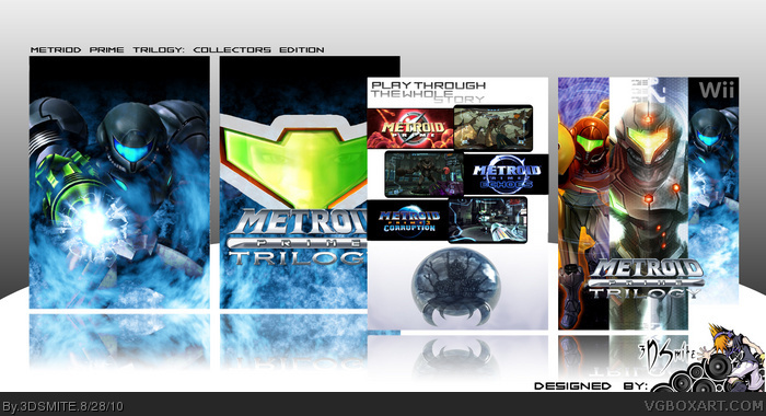
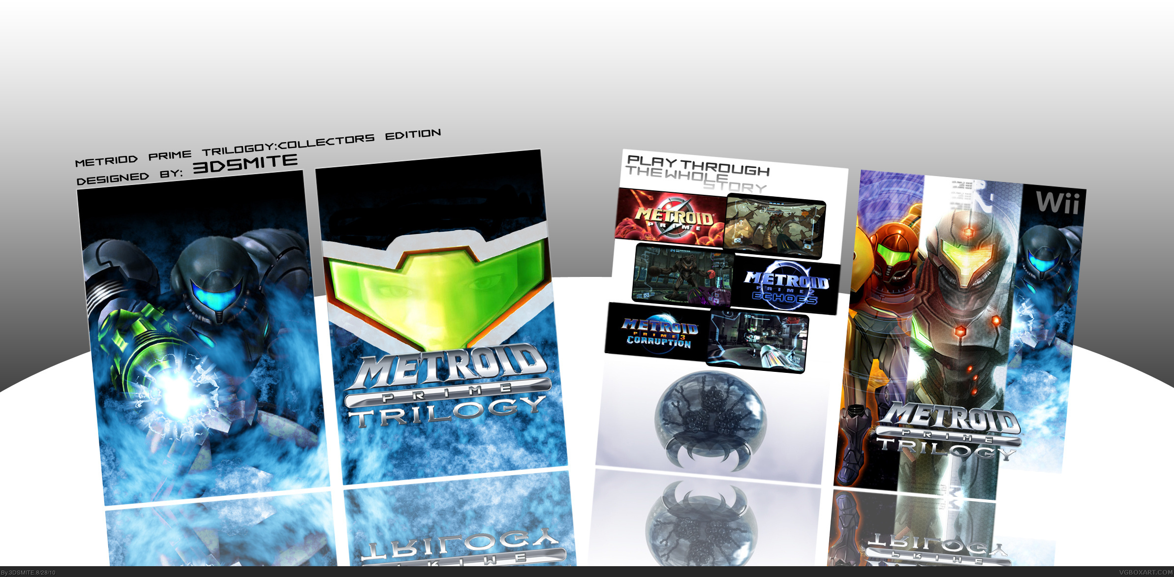
Ok, this is my newest one that I worked on for quite a while and I think it turned out great!
Comments? Suggestions?
[ Reply ]
Update. I had to fix the display because it looked weird.
[ Reply ]
Beautiful! The only problem is the overlap of the reflections doesn't look good.
[ Reply ]
Thanks for pointing that out because I didn't notice that.
[ Reply ]
Fix the reflection. It's a pretty nice box.
[ Reply ]
I really like it! Excellent!!
[ Reply ]
Thanks for the comments!
[ Reply ]
Update. I fixed the reflection.
Comments? Suggestions?
[ Reply ]
Awesome! +Fav
[ Reply ]
Hmmm....
- On the front slip cover, that large gray outline around Samus' visor is distracting, unfitting, and should be removed.
- Using an image of a Metroid on the back just to fill up space doesn't make much sense when that space could have been used to spread out the three separate games and add in descriptions for each.
- Why not just use an actual image of Dark Samus instead of an edited render from Brawl, it's inaccurate.
[ Reply ]
Thanks for all of the comments and favs so far.
[ Reply ]
Woot! 11 favs. New record!
[ Reply ]
Wow, random Favs!
[ Reply ]
wow! +Fav
[ Reply ]
thanks!
[ Reply ]