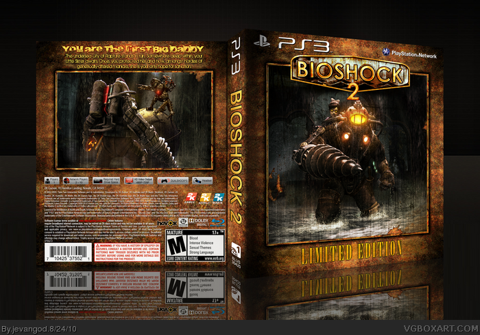
For this. I wated to make it seem sort of like a photo book. Took me a long time to make this. I wanted to make this look like a really old book too. Something that you would find in Rapture. The pictures are faded and its coming off as well.
Ohh and if some of you guys dont mind. Could you vote for me in the Servbot contest Capcom is holding. link Im in the "J's" You'll see my name. Please vote for me. It will only take 2 seconds. You dont need a username at all.
I really like this. It's not a box that I'd expect to see on shelves but I think it could be a limited edition. I don't know if it looks exactly like a photo album, but I like it all the same. Great textures, great colors. Clean cut and well put together.
EDIT: Ok I feel like an idiot, this is a limited edition.
Looks really good man. The back is a little simple though, even for a LE box, and I'm not a fan of the typography. The colours, however, are great and it's very stylish. You've got my favourite.
#11, Yeah, I find the back shitty. Just plain and unworthy of the HoF. The text just make it look cheap. No, I really don't think the back's good enough for a HoF and for a dude of your talent.
Is that so bad a dude critics it instead of sucking your balls ? Accept critics. When I say "the text looks bad", it means that you might have to change it to me. Then again, it looks like blue ranked people on this site believe they are untouchable and perfect.
#31, Who the hell said im untouchable and perfect. You didnt even give me critics at all. Just the back is shitty. How the hell am I suppose to approve on that? You should say something like add some screenshots or something. Or move this here or the text doesnt look right. Its simple and thats what I went for.
Guys! Frenchboy, just say the box is good or bad and walk away, don't complain about it. Blue ranked are not perfect, Ive seen some crap boxes from a few. My point is, did I complain? no, so back off.
#32, Yeah, I admit my first comment wasn't really nice and constructive (I'm french don't your remember it ?). But I made an enormous effort explaining why I find the back shitty, I say the texts isn't good, and you got the guts to tell me I must have said "the text doesnt look right". This is what I said !! But I feel like nobody approves comments when they're not "The text doesn't look good, I suggest you move it and change the police, but don't take it bad it's still really awesome and I'm just talking about a really tiny detail, don't hit me please.".
And when I say blue ranked are perfect and untouchable, I say that they can make a box with paint, and it will be HoFed just because 3 or 4 squares are blue aside their name.
#34, lol. I find that last part funny. Cause Ive been in the blue for like a year now and I dont have that many HOF's then when I was in red. Blue is nothing more than red.
#39, Thanks Ayron. Your right though. I could of done alot better though. I just wanted to do something simple here. Nothing great but nothing bad either.
#41, Actually this is a completely different texture. It may look similar to the other texture but it isnt. The other texture I used sort of looked like it was peeling off and all. This one is sort of like its an old leather book.
#43, I do make Printable covers. Look right under the image it says view printable. People around the world can use my cover. This is the actual template except without the black bar behind the words at the top and back.
 Bioshock 2 Limited Edition Box Cover Comments
Pretty.
[ Reply ]
Rusty!
[ Reply ]
For this. I wated to make it seem sort of like a photo book. Took me a long time to make this. I wanted to make this look like a really old book too. Something that you would find in Rapture. The pictures are faded and its coming off as well.
Ohh and if some of you guys dont mind. Could you vote for me in the Servbot contest Capcom is holding. link Im in the "J's" You'll see my name. Please vote for me. It will only take 2 seconds. You dont need a username at all.
Edited at 1 decade ago
[ Reply ]
Looks great. I like the textures and the color tone.
[ Reply ]
Awesome. Love the simplicity!
[ Reply ]
#3, I voted. ;)
[ Reply ]
#6, Thanks Super-Mega. I can always count on you.
[ Reply ]
I voted, wonderful box.
Edited at 1 decade ago
[ Reply ]
Well, the back is pretty much... shitty. Nice front though.
[ Reply ]
Looking good.
[ Reply ]
#8, Thanks.
#9, .........
#10, Thanks.
[ Reply ]
I really like this. It's not a box that I'd expect to see on shelves but I think it could be a limited edition. I don't know if it looks exactly like a photo album, but I like it all the same. Great textures, great colors. Clean cut and well put together.
EDIT: Ok I feel like an idiot, this is a limited edition.
Edited at 1 decade ago
[ Reply ]
#12, lol.
[ Reply ]
This is nice! you can count my fav in!
Oh and also i voted.
[ Reply ]
Great feeling through the whole box. Faved and voted.
[ Reply ]
#14-15, Thanks you two. Thank you so much for both of the things you have done for me.
[ Reply ]
Looks really good man. The back is a little simple though, even for a LE box, and I'm not a fan of the typography. The colours, however, are great and it's very stylish. You've got my favourite.
[ Reply ]
#17, Well I wanted to give it an old feeling. Cause Bioshock is old and back in the day. So I didnt want to make it fancy or anything. But thanks.
[ Reply ]
Fav'd and voted! :)
[ Reply ]
#19, Thank you so much.
[ Reply ]
Great box man.And since this is soon going to HoF congrats on that aswell
[ Reply ]
Grats on HoF!
[ Reply ]
So very deserving of the HOF. Good work.
[ Reply ]
Thanks everyone.
[ Reply ]
Not bad, I like it, did you create the scenery on the back photo? If so nice job.
[ Reply ]
Awesome box but I don't think you noticed the typo on the back. "Maniaxs" :P
[ Reply ]
#26, Fixed the typo on the printable.
PRINTABLE ADDED!!!!
[ Reply ]
Wonderful design. :)
[ Reply ]
#11, Yeah, I find the back shitty. Just plain and unworthy of the HoF. The text just make it look cheap. No, I really don't think the back's good enough for a HoF and for a dude of your talent.
Edited at 1 decade ago
[ Reply ]
#29, Wow. Ok. Such a great comment and thanks for the helpful suggestions.
Edited at 1 decade ago
[ Reply ]
Is that so bad a dude critics it instead of sucking your balls ? Accept critics. When I say "the text looks bad", it means that you might have to change it to me. Then again, it looks like blue ranked people on this site believe they are untouchable and perfect.
[ Reply ]
#31, Who the hell said im untouchable and perfect. You didnt even give me critics at all. Just the back is shitty. How the hell am I suppose to approve on that? You should say something like add some screenshots or something. Or move this here or the text doesnt look right. Its simple and thats what I went for.
[ Reply ]
Guys! Frenchboy, just say the box is good or bad and walk away, don't complain about it. Blue ranked are not perfect, Ive seen some crap boxes from a few. My point is, did I complain? no, so back off.
[ Reply ]
#32, Yeah, I admit my first comment wasn't really nice and constructive (I'm french don't your remember it ?). But I made an enormous effort explaining why I find the back shitty, I say the texts isn't good, and you got the guts to tell me I must have said "the text doesnt look right". This is what I said !! But I feel like nobody approves comments when they're not "The text doesn't look good, I suggest you move it and change the police, but don't take it bad it's still really awesome and I'm just talking about a really tiny detail, don't hit me please.".
And when I say blue ranked are perfect and untouchable, I say that they can make a box with paint, and it will be HoFed just because 3 or 4 squares are blue aside their name.
Edited at 1 decade ago
[ Reply ]
#34, lol. I find that last part funny. Cause Ive been in the blue for like a year now and I dont have that many HOF's then when I was in red. Blue is nothing more than red.
[ Reply ]
I didn't know that, sorry for not taking VGboxart seriously.
[ Reply ]
#35, That's what I like to call biasing.
[ Reply ]
#36, Who said I was?
[ Reply ]
#31, that's really funny,fb1.
Seriously, judging someone by their rank is so 2008.
Jevangod, I like the box,although there are some things I believe could've been executed a bit better..It's still a solid design.
Grats!
[ Reply ]
#39, Thanks Ayron. Your right though. I could of done alot better though. I just wanted to do something simple here. Nothing great but nothing bad either.
[ Reply ]
#40, Some of your boxes are starting to look kind of generic, involving the same kind of overused (grunge / scratchy metal texture).
It isn't bad by a long shot but I'm trying to figure out why no one seems to pay attention to these things.
[ Reply ]
#41, Actually this is a completely different texture. It may look similar to the other texture but it isnt. The other texture I used sort of looked like it was peeling off and all. This one is sort of like its an old leather book.
[ Reply ]
#42, Question, why don't you make printable covers?
I know that your covers are 300DPI, but people around the world would be able to use all of your covers only if you used actual templates.
[ Reply ]
#43, I do make Printable covers. Look right under the image it says view printable. People around the world can use my cover. This is the actual template except without the black bar behind the words at the top and back.
[ Reply ]