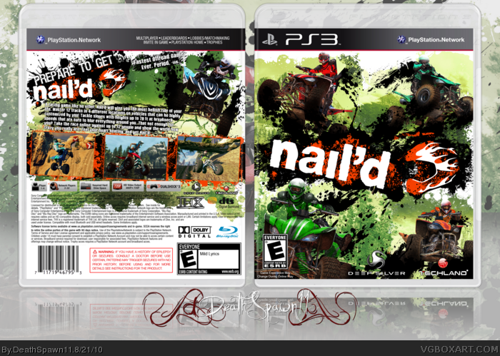
Yeap, Nail'd.
Before you go HURRR U OVERDID TEH SPLATS.
It's the game's art style, the only splats I added in the box were behind the logo on both sides, behind the top right rider near his head, near the bottom for some filler, and behind the screens and text on the back. Everything else is purely from the art. I quite enjoyed making this box.
Temp by Deiviuxs
PS. Excuse my terrible summary. There's not much to say about the game other than "VROOM VROOM MAKE ATV KEWL GO FAST DO JUMP VROOOM NAIL'D."
I like it, but I dislike the back description. The font, how it's placed, and it seems just kind of crammed to me. I don't mind how it's written. The rest is really nice though. I see you changed it to 4 different colors from the original in the WIP thread :p
#4, Well FUCK YOU.
Lawljaykay. It seems fine to me, and there isn't really any other place to put it and I didn't want to make it to small AND it would look even more awkward if I had tried to squish it into that space between the logo and the rider.
#5. Indeed.
#6, Yeah, I was gonna add more but I figured I'd overused the same two splatter brush sets too much and didn't feel like perusing for more.
#7, Wink. =|
Whether it captures the style of the game or not, I'm still not very fond. There are times when splatters work, but I honestly don't think they really do here, it's just too much in my opinion.
 Nail'd Box Cover Comments
LOLSPLATSPLATSPLAT.
Yeap, Nail'd.
Before you go HURRR U OVERDID TEH SPLATS.
It's the game's art style, the only splats I added in the box were behind the logo on both sides, behind the top right rider near his head, near the bottom for some filler, and behind the screens and text on the back. Everything else is purely from the art. I quite enjoyed making this box.
Temp by Deiviuxs
PS. Excuse my terrible summary. There's not much to say about the game other than "VROOM VROOM MAKE ATV KEWL GO FAST DO JUMP VROOOM NAIL'D."
Edited at 1 decade ago
[ Reply ]
I think it's AWESOME!!
[ Reply ]
Sexy
[ Reply ]
I like it, but I dislike the back description. The font, how it's placed, and it seems just kind of crammed to me. I don't mind how it's written. The rest is really nice though. I see you changed it to 4 different colors from the original in the WIP thread :p
Edited at 1 decade ago
[ Reply ]
ohhh yes.
[ Reply ]
Not enough splatters. Faved though.
[ Reply ]
*Crosses legs*
[ Reply ]
#4, Well FUCK YOU.
Lawljaykay. It seems fine to me, and there isn't really any other place to put it and I didn't want to make it to small AND it would look even more awkward if I had tried to squish it into that space between the logo and the rider.
#5. Indeed.
#6, Yeah, I was gonna add more but I figured I'd overused the same two splatter brush sets too much and didn't feel like perusing for more.
#7, Wink. =|
[ Reply ]
Whether it captures the style of the game or not, I'm still not very fond. There are times when splatters work, but I honestly don't think they really do here, it's just too much in my opinion.
[ Reply ]
FANTASTIC STEVEN ^_^ b
[ Reply ]
Stylish as hell.
[ Reply ]
LAWLJUSTLIKEYOURMOM
Yeah. I went there.
[ Reply ]
#9, HRRNGGHGHGHGHGHRRRGGHHLE
#10-11, Tanks.
#12, No u.
[ Reply ]
This is cool bro
[ Reply ]
yesplease.
[ Reply ]
Thurnks gaiz.
[ Reply ]
#8 Yeah yeah I know what you mean, but not for me :p
[ Reply ]
#17, NO U DUN NO WUT I MEEN!!! UR GAY AND U HAV NO TASTE IN ART FAEG.
=p
Edited at 1 decade ago
[ Reply ]
WHATISTHISIDONTEVEN
[ Reply ]