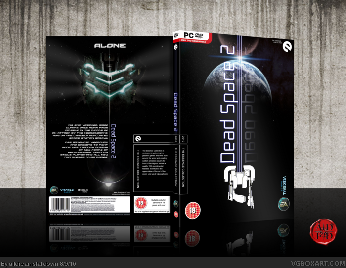
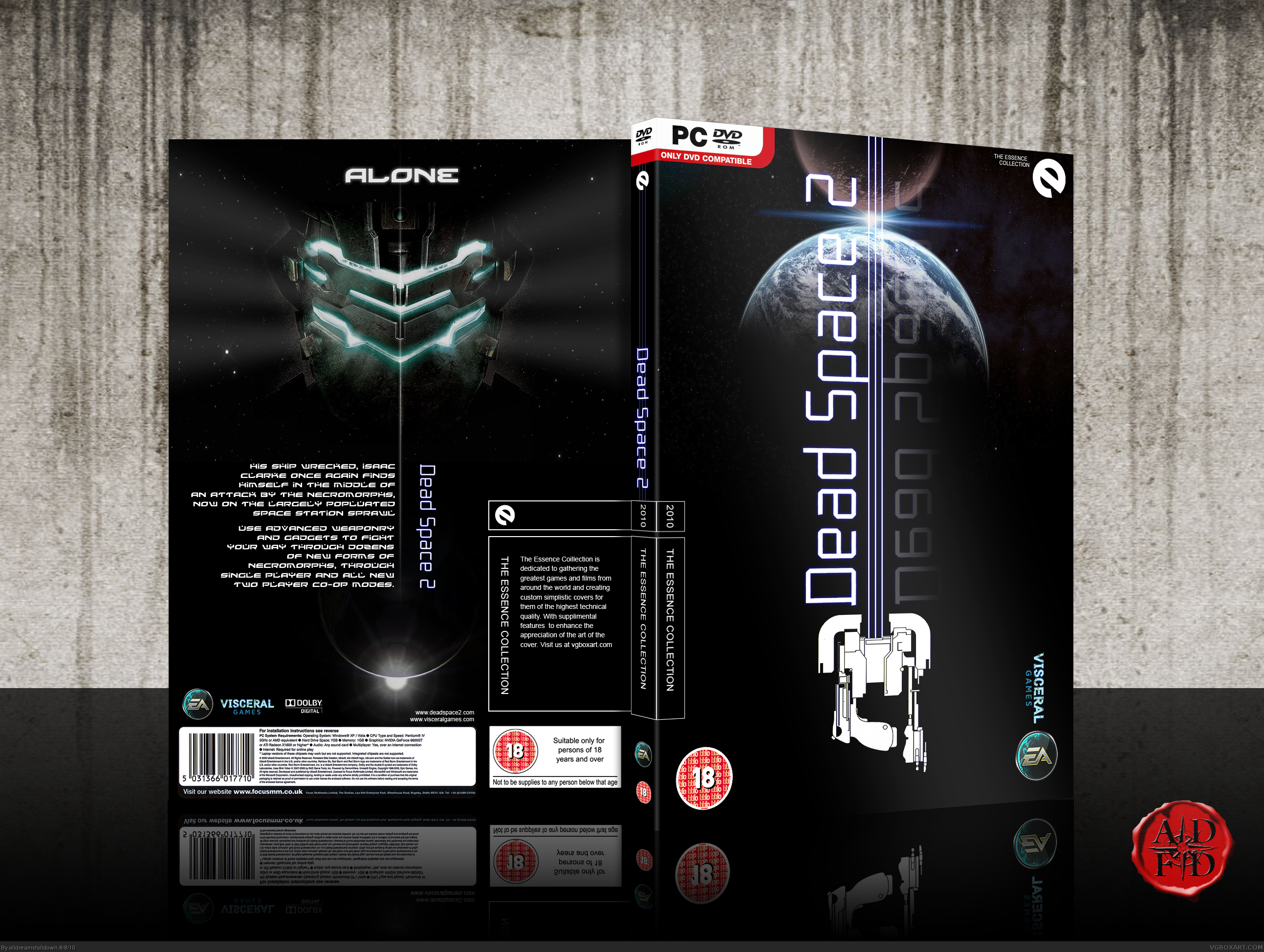
essence [ Buy Dead Space 2 at Amazon ] » 2010 Hall of Fame Winner! By alldreamsfalldown 49 on August 8th, 2010 No Printable Available [ Box updated on August 9th, 2010 ] [ original ] Dead Space 2 Box Cover Comments Comment on alldreamsfalldown's Dead Space 2 Box Art / Cover. Cancel Reply Throavium 1 [ 1 decade ago ] I really don't like essence, but this looks good. [ Reply ] jesse777 35 [ 1 decade ago ] It looks excellent well done! [ Reply ] Delicious1 36 [ 1 decade ago ] This is great. [ Reply ] alldreamsfalldown 49 [ 1 decade ago ] Credit to sd1833 for the synopsis and deiviuxs for the EA logo. [ Reply ] Spiderpig24 48 [ 1 decade ago ] Oh wow, I love the whole vertical setup and dark feel to this. [ Reply ] rpgfreak 14 [ 1 decade ago ] This is slick. [ Reply ] Throavium 1 [ 1 decade ago ] Another comment, this is good. Symmetrical face on the back with light waves of breath coming out, kills me. Edited at 1 decade ago [ Reply ] UNDiiSPUTED L3G3NDS 5 [ 1 decade ago ] i like how this is different to most dead space boxes ive seen...it shows less but looks alot more...original. an idea no one has come up with yet...well done. [ Reply ] Drakxxx 46 [ 1 decade ago ] I can always count on you to put your own spin on things, and the results have yet to disappoint. Awesome as always sir. [ Reply ] Starstormz 7 [ 1 decade ago ] Holy... [ Reply ] Whoomp 43 [ 1 decade ago ] Incredible. Though, it mildly annoys me that the gun lines isn't aligned with the shine on the front. [ Reply ] Throavium 1 [ 1 decade ago ] #11, You had to point that out, now I can't stop noticing it. [ Reply ] sd1833 48 [ 1 decade ago ] #12, I can't either... Good job either way ADFD, everything looks great. I love that simple tagline too. [ Reply ] alldreamsfalldown 49 [ 1 decade ago ] [Update] Aligned. [ Reply ] nothing94 35 [ 1 decade ago ] Really caputures the essence and has an astethic look. [ Reply ] Throavium 1 [ 1 decade ago ] #14, Looks ace now sir. [ Reply ] sd1833 48 [ 1 decade ago ] Much better, I can't believe something so minor was bugging me. [ Reply ] White_Dove 38 [ 1 decade ago ] Looks fantastically great! I love the front. :) [ Reply ] munhozzshow 1 [ 1 decade ago ] nice [ Reply ] munhozzshow 1 [ 1 decade ago ] nice [ Reply ]
 Dead Space 2 Box Cover Comments
I really don't like essence, but this looks good.
[ Reply ]
It looks excellent well done!
[ Reply ]
This is great.
[ Reply ]
Credit to sd1833 for the synopsis and deiviuxs for the EA logo.
[ Reply ]
Oh wow, I love the whole vertical setup and dark feel to this.
[ Reply ]
This is slick.
[ Reply ]
Another comment, this is good. Symmetrical face on the back with light waves of breath coming out, kills me.
Edited at 1 decade ago
[ Reply ]
i like how this is different to most dead space boxes ive seen...it shows less but looks alot more...original. an idea no one has come up with yet...well done.
[ Reply ]
I can always count on you to put your own spin on things, and the results have yet to disappoint. Awesome as always sir.
[ Reply ]
Holy...
[ Reply ]
Incredible. Though, it mildly annoys me that the gun lines isn't aligned with the shine on the front.
[ Reply ]
#11, You had to point that out, now I can't stop noticing it.
[ Reply ]
#12, I can't either...
Good job either way ADFD, everything looks great. I love that simple tagline too.
[ Reply ]
[Update] Aligned.
[ Reply ]
Really caputures the essence and has an astethic look.
[ Reply ]
#14, Looks ace now sir.
[ Reply ]
Much better, I can't believe something so minor was bugging me.
[ Reply ]
Looks fantastically great! I love the front. :)
[ Reply ]
nice
[ Reply ]
nice
[ Reply ]