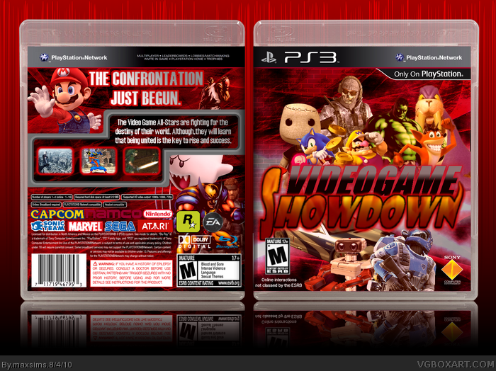
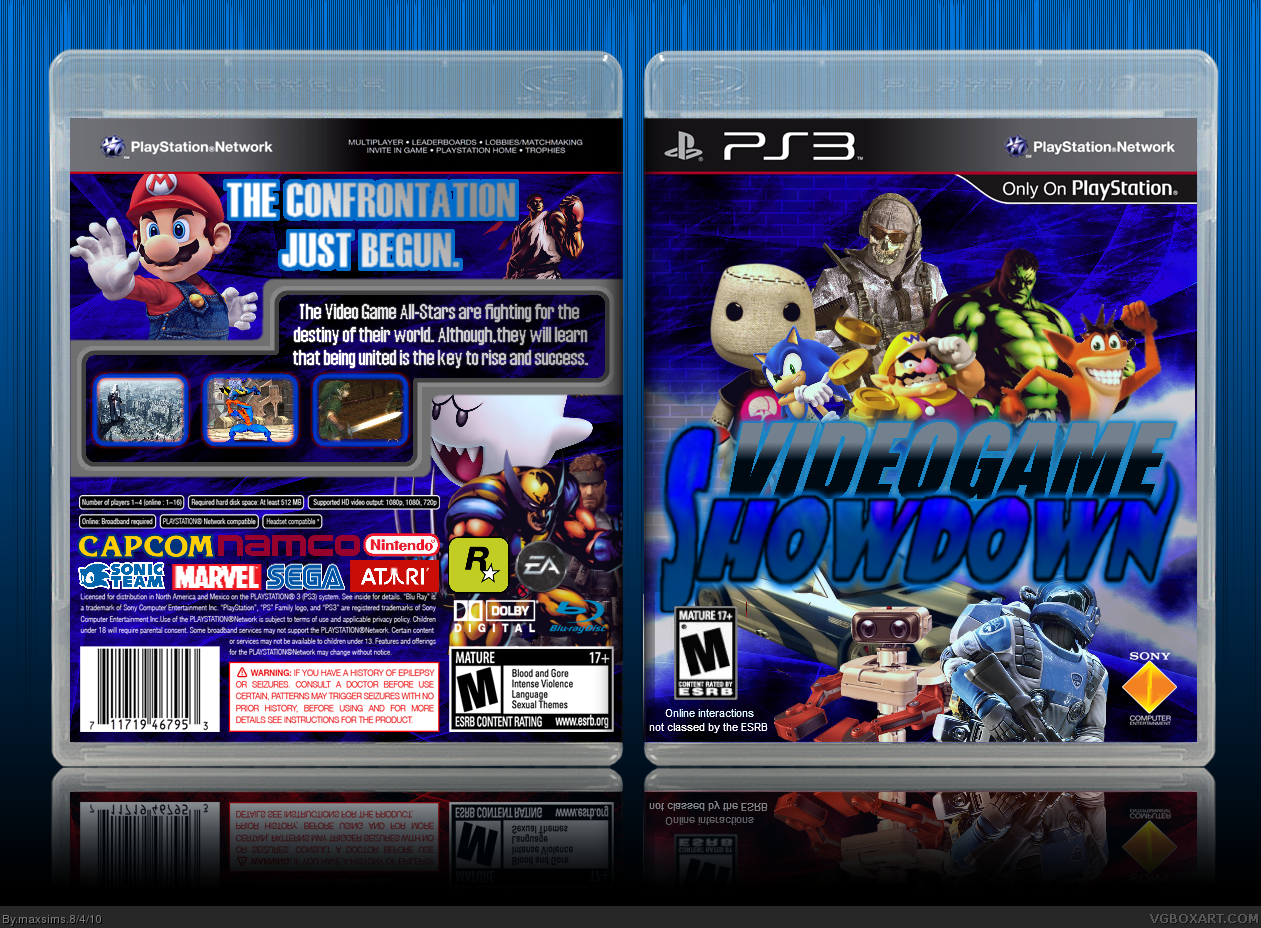
This is my fifth box. I made it with Paint.net
Thanks to everybody that helped me in the WIP thread. If you have comments/critiques, I'd be happy to read it, I always want to improve.
I don't like the blue astronaut at the bottom, he looks very weird there, and I hate the jumbled mess of dev logos on the back.
Overall - 6/10 = It's Okay
Overall the colors could be a little more vibrant I think, but the composition is good, and I can tell a good amount of effort went into things. Good job. :)
#2. Yeah, the astronaut was a request, so I had to put it here. But I think it's okay there.
And for the dev logos, I had nowhere else to put them, and I don't know what is supposed to go there.
#3. I actually wanted the colors to be less vibrant. I added a little tint of red to the renders. Anyway thanks :D
#7 Thanks
#8 I know. I mean, I never played that game (ikr, shame on me..?), but if I play it some day I might put it.
#9 Really? I thought about changing the renders to normal colour, should I? Or maybe it's better in blue (see version 1)?
 Videogame Showdown Box Cover Comments
This is my fifth box. I made it with Paint.net
Thanks to everybody that helped me in the WIP thread. If you have comments/critiques, I'd be happy to read it, I always want to improve.
[ Reply ]
I don't like the blue astronaut at the bottom, he looks very weird there, and I hate the jumbled mess of dev logos on the back.
Overall - 6/10 = It's Okay
[ Reply ]
Overall the colors could be a little more vibrant I think, but the composition is good, and I can tell a good amount of effort went into things. Good job. :)
[ Reply ]
#2. Yeah, the astronaut was a request, so I had to put it here. But I think it's okay there.
And for the dev logos, I had nowhere else to put them, and I don't know what is supposed to go there.
#3. I actually wanted the colors to be less vibrant. I added a little tint of red to the renders. Anyway thanks :D
*UPDATE* Added the walrus by request.
Edited at 1 decade ago
[ Reply ]
The walrus was a nice touch.
[ Reply ]
#5 indeed XD
[ Reply ]
nice
[ Reply ]
damn you! you left out banjo and kazooie! still pretty good. fav
[ Reply ]
I think it looks good but I think its a bit to red
Edited at 1 decade ago
[ Reply ]
#7 Thanks
#8 I know. I mean, I never played that game (ikr, shame on me..?), but if I play it some day I might put it.
#9 Really? I thought about changing the renders to normal colour, should I? Or maybe it's better in blue (see version 1)?
[ Reply ]