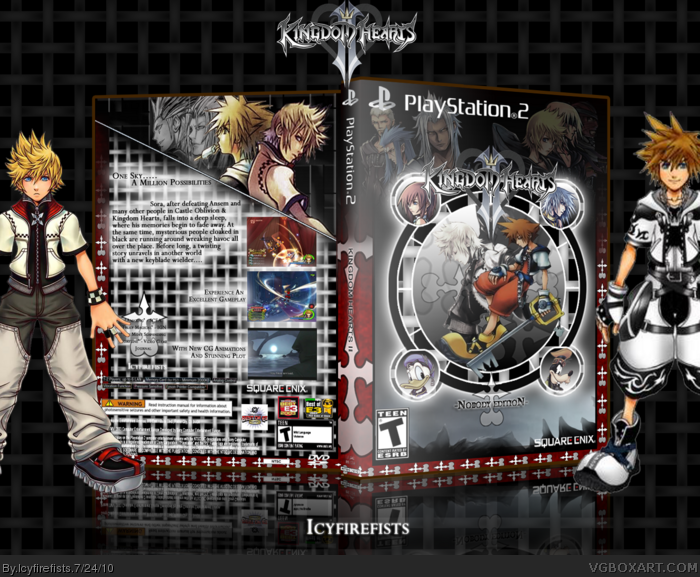
Blurry Sora aside, I would actually lower the opacity of the weave pattern on the back. It's kind of distracting. Also, the spine is unattractive to me. I would go with a simple black with white bold font for that. I really like the front, as well as the concept of the 'Nobody' Special Edition.
 Kingdom Hearts II - Nobody Edition Box Cover Comments
Oh my..
[ Reply ]
I like it, but the guy on the far right outside of the box is really blurry. Maybe get a different picture of someone.
[ Reply ]
Yeah. Sora is very blurry ( If i remember correctly, this is the Final Form? ) Try getting a better picture of him or someone. Kairi/Riku.
[ Reply ]
Blurry Sora aside, I would actually lower the opacity of the weave pattern on the back. It's kind of distracting. Also, the spine is unattractive to me. I would go with a simple black with white bold font for that. I really like the front, as well as the concept of the 'Nobody' Special Edition.
[ Reply ]
I like the front and spine, but the back seems rushed.
[ Reply ]
Yeah it took me ages to do the platform thing on the front. I really enjoyed making this one. Thank You everyone
[ Reply ]
I like it, the front specially though there is too much white and too much glowing on the back. It is a very good box nevertheless. :)
[ Reply ]
Nice box mate.Too bad it was ignored
[ Reply ]
Thank you very much everyone.
[ Reply ]