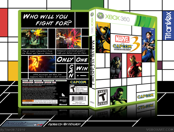
My expression session 04 box! I modeled the art after Piet Mondrian: link
I tried to capture his style of art, while also maintaining the "Marvel vs Capcom" theme, which is why I chose to have the front white, and the back black, to signify the two different entities. It is also my first 3D box, and I think hat turned out alright as well.
Not that good simply because there is SO MUCH MORE artwork out now of characters like Amaterasu, Felicia, etc. Find the rest of the artwork and fill in those white spaces.
However, the geometrical approach tickles me. Faved.
I love how you captured the style of the artist, and took it a step further by integrating the two worlds with the black and white colors. There could have been more characters on the front like Grand said, but it's still a nice box.
You've done a great job expressing the style. I knew what it was instantly. :) The comic book video game concept works really well with Mondrian's boxy lines obviously, and in such, you've put yourself together a very nice design.
I appreciate the comments. I understand what you are saying, Grand, but I thought that it somewhat fit because comics have squares and geometry in them to separate pictures and words.
Shoot, sorry, I forgot credits.
360 Template: Partially Scorpion Soldier, Partially me, Partially del337er
Rated T for teen, and Capcom Logo - Alldreamsfalldown
 Marvel vs. Capcom 3: Fate of Two Worlds Box Cover Comments
My expression session 04 box! I modeled the art after Piet Mondrian: link
I tried to capture his style of art, while also maintaining the "Marvel vs Capcom" theme, which is why I chose to have the front white, and the back black, to signify the two different entities. It is also my first 3D box, and I think hat turned out alright as well.
[ Reply ]
Love it. Fav+ Author Fav+
[ Reply ]
Not that good simply because there is SO MUCH MORE artwork out now of characters like Amaterasu, Felicia, etc. Find the rest of the artwork and fill in those white spaces.
However, the geometrical approach tickles me. Faved.
Edited at 1 decade ago
[ Reply ]
#3, HE can't add more its based on a piece of art, which he can't edit.
[ Reply ]
I love how you captured the style of the artist, and took it a step further by integrating the two worlds with the black and white colors. There could have been more characters on the front like Grand said, but it's still a nice box.
[ Reply ]
You've done a great job expressing the style. I knew what it was instantly. :) The comic book video game concept works really well with Mondrian's boxy lines obviously, and in such, you've put yourself together a very nice design.
[ Reply ]
Pretty different from what people usually do and that's a fav by itself!
[ Reply ]
creative
[ Reply ]
#4, I don't think he should have opted for a Mondrian-styled front. Artistically, there's a huge gap between comic books and Mondrian.
[ Reply ]
I appreciate the comments. I understand what you are saying, Grand, but I thought that it somewhat fit because comics have squares and geometry in them to separate pictures and words.
[ Reply ]
Shoot, sorry, I forgot credits.
360 Template: Partially Scorpion Soldier, Partially me, Partially del337er
Rated T for teen, and Capcom Logo - Alldreamsfalldown
[ Reply ]