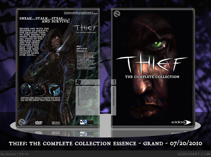
The first of a series of Essence boxes for my favorite PC games. Thief is without a doubt the best stealth game series out there. Fair amount of work went into this, mostly involving text placement. Planning on printing this and the upcoming ones and then making a nice boxed set.
It really has a stealth and dark feel to it, which I really like. The text alignment on the back and the logo placement on the front is really great too.
Front is awesome. Doesn't need the Eidos logo though.
The back description text however......eeesh you need to do something about it. It's too big, the font is odd (make it something different than the tagline text, so they contrast) it's too close to the edge. I'd say don't wrap it around the image. I'd just bring it down and have it on top of the image (underneath the face).
Also, the bottom text on the back where you describe what is in the box:
It would be much more clear if you spread that out, and maybe made some bullet points. Plus it would help fill up some space.
 Thief: The Complete Collection Box Cover Comments
The first of a series of Essence boxes for my favorite PC games. Thief is without a doubt the best stealth game series out there. Fair amount of work went into this, mostly involving text placement. Planning on printing this and the upcoming ones and then making a nice boxed set.
Edited at 1 decade ago
[ Reply ]
I feel like this could have not been an Essence box, and it would've been better for it.
[ Reply ]
It really has a stealth and dark feel to it, which I really like. The text alignment on the back and the logo placement on the front is really great too.
[ Reply ]
#2, It looks weird without the Essence stuff. Without it, the right side of the back is empty.
[ Reply ]
Nice work, here, Grand. : )
But Splinter Cell beats out Thief.
What's your avatar supposed to be?
[ Reply ]
#5, Trust me--Thief II: The Metal Age is still unbeaten. Best stealth game of all time.
As for the avatar, it's the one I've been using all across the Internet since 2006ish.
Edited at 1 decade ago
[ Reply ]
Front is awesome. Doesn't need the Eidos logo though.
The back description text however......eeesh you need to do something about it. It's too big, the font is odd (make it something different than the tagline text, so they contrast) it's too close to the edge. I'd say don't wrap it around the image. I'd just bring it down and have it on top of the image (underneath the face).
Also, the bottom text on the back where you describe what is in the box:
It would be much more clear if you spread that out, and maybe made some bullet points. Plus it would help fill up some space.
Edited at 1 decade ago
[ Reply ]
Huge fan of the Thief series, definatly the best stealth game out there. Great work here, can't wait for more of these PC classics!
[ Reply ]