Don't use the Sonic Title font for your synopsis. The letters are way too big to work as a description.
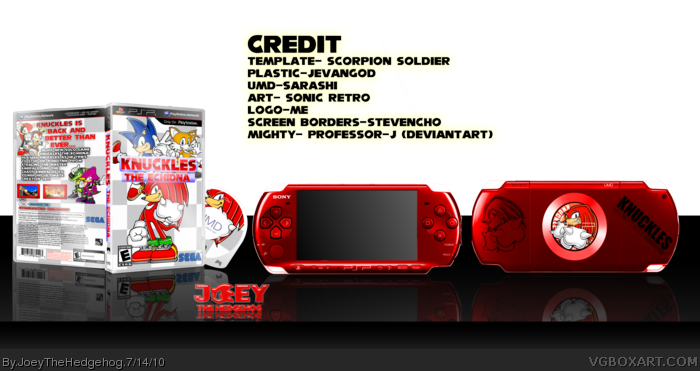
The design of the box is nothing new compared to other Sonic boxes. It just looks like another box with a checkered background and a couple of characters placed on it. As for the tagline... ugh... "Insert character name" is back, and better then ever!" Is the most overused tagline in existence. The back of the box is pretty good overall. I just hate the use of the Sonic Title Font. One thing thing that bugs me is the fact that you gave credit ON the box itself. It takes the presentation down quite a bit, and the effects used on it look very lazily chosen. I really like what you did with the PSP design, though. It's nice, clean, and simple.
It's a pretty decent box, but nothing I haven't seen before.
 Knuckles The Echidna Box Cover Comments
New Box. Wanted to make a psp box. enjoy. credit on the box
[ Reply ]
NICE! I don't see much of anything wrong with this
fav!
[ Reply ]
the PSPs are really good!
[ Reply ]
thanks
[ Reply ]
awesome box and cool logo :)
[ Reply ]
Red's my favorite color! 5/5
[ Reply ]
perfect eveything fav
[ Reply ]
Awesome!!! Your best work yet!!!
[ Reply ]
thanks everyone
[ Reply ]
Don't use the Sonic Title font for your synopsis. The letters are way too big to work as a description.
The design of the box is nothing new compared to other Sonic boxes. It just looks like another box with a checkered background and a couple of characters placed on it. As for the tagline... ugh... "Insert character name" is back, and better then ever!" Is the most overused tagline in existence. The back of the box is pretty good overall. I just hate the use of the Sonic Title Font. One thing thing that bugs me is the fact that you gave credit ON the box itself. It takes the presentation down quite a bit, and the effects used on it look very lazily chosen. I really like what you did with the PSP design, though. It's nice, clean, and simple.
It's a pretty decent box, but nothing I haven't seen before.
Box - 3/5
Presentation - 2/5
PSP - 3/5
Overall - 8/15
Edited at 1 decade ago
[ Reply ]
#10, I'll change the font.
[ Reply ]
to be honest i liked knuckles more than the other sonic charters :L
5/5
[ Reply ]