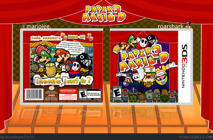
So this is the newest collab from me and Mariolee. He made the back, and I made the front. We are both Paper Mario fans so this stuck out as a great idea for us to do. This box is part custom part official art. Mario and Luigi are the official art, where as I made Wario, Shy Guy, Bowser, and King Boo. Mario Made the audience and Waluigi as well as the Chain Chomp and the presentation. We had fun making this. Also if you wouldn't mind commenting with what you think of this and ways we could improve that would be great. Also we added a printable.
Good job guys, nice consistency in the designs. Back seems a little 'busy', though I like the front and am glad you went for a darker theme in the background.
Am I the only one who thinks this looks identical to every other Paper Mario box out there?
A strain of originality would be lovely. Hell, as a side note, people (including myself) need to calm on the favourite system. I' am from here, anywho.
#15, Well actually we went for something more original and we achieved that. We tried to make sure that the front and back weren't the same old pattern. The back layout is something different from what I have seen on most other boxes. The front layout though similar is also different. I see what you are coming from but you are wrong in saying that this is the same as every other Paper Mario box. I agree with you and the favorite thing though ( I need to do the same ).
#16, Look at the box, and simply go on the Paper Mario section and take a peek.
Its using the same type of idea, the stage set. And thats just the start. The logo idea has been done countless times, the bad guys upside down with the good guys ontop. The rest of the front is just the stage idea again (and the curtains also look horrible, really static for some reason =/)
Sure, you've tilted the title and the art, but that hardly makes it look any different from the other stuff.
The back is more original, with a different layout than most, but personally, it looks like a mess. It (looks, and may not be these things) like a bunch of renders on a background, and it really hard to distingish the other stuff. It may be a different looking back, but it just doesn't work. Again, its the stage setting.
Its not original, it just has a couple of unique elements. Personally, I just can't see any appeal in it, and honestly would have hoped for a lot better from two artists like yourselves.
Of course, this is simply my opinion, and you can just disregard it. Expect a Hall of Fame, as much as I hope it doesn't get it (this is of course because of the fact that everyone sticks their dick into anything Mario or Sonic. The truth. A 'mediocre' Mario box, for example, will get more favourites than a 'mediocre' or slightly better The Witcher box.)
#17, The curtains look static because that is how they look in the screen shot that they are based off of. I saw one other time where the characters were used in a similar fashion (YoshiStar's Paper Mario 3 box), the stage idea, yea its been done before but the audience at the time we made the decision hadn't, it was used by a box posted prior to this. I understand that it is you opinion. You are entitled to that. I just think that you are just seeing the same old same old in something that is not. Also its quite insulting that you think this has little to no appeal at all. I think the reason why you don't see a difference is the fact that Paper Mario art looks lack luster and generally terrible. Also if I am overlooking something please do tell.
#19, Same art work? We made the majority of what was used. Its not old artwork by any means. Also if I am understanding you correctly your saying that using old artwork makes it un-original? Then wouldn't that make the majority of the boxes submitted to the site unoriginal including many or yours and mine?
#18, My argument is simple to understand:
This box is not original and to me, I cannot see any appeal.
You may overlay a wall with wallpaper, but underneath it is still the same old wall. Thats what I'm trying to say.
The box may have a couple of different sections, but its entire idea is the same as every other. Same artwork, same backdrop etc.
What you are overlooking is my argument. The fact that you may see different features, but it does not in anyway make it original, because underneath these sparse features is the same old PM boxart.
#18, Are you only reading say, a third of what I say?
My points are obvious, for gods sake, and your completely skimming past them. How are they going over your head, even when I try to put it into really simple terms?
I stopped critiquing the box long ago. Now, I'm simply trying to get you to understand originality. It uses the same colour scheme, same artwork (by this, I mean the Mario with hammer render, the re-used renders etc) same backdrop, same idea. Sure the auidence idea is neat and hasn't been done before, but everything else has, therefore making the box 'unoriginal'. I'm not saying an unoriginal box is nessercerily bad, I'm saying this one is because its extremely unoriginal, and there is so many like it. For example, two Red Faction boxes that look amazing, but basically use the same layout and artwork is easily acceptable. But the fouth-millionth Mario box using very similar features to others, quickly becomes/looks old.
#20, I understood that the entire time. I have understood what you are coming from the entire time, in my comments I focused on parts though. By the way you are absolutely right when you said a mediocre Mario or Sonic box gets more favs than a good box from a game that is not as well known. Also I want to point out how ridiculous the last three comments by both of us have been. They are the same thing repeated 3 times, (mostly my fault for being a bit pissed off.)
I knew when I saw this in your WIP thread it would be awesome and I really think it turned out great. It looks fantastic, the colors are vibrant and exciting, the art is really HQ and really captures Paper Mario and I think overall it's just a well put together box. I think that it flows so nicely that it really looks like it was all made by one person. The box is even almost witty, if you will, so it definitely represents Paper Mario well. Excellent collab and probably one of my favorite boxes in a while and while I have to agree with Silent Oblivion that this isn't anything particularly unique, I still think it's a job well done.
 Paper Mario Box Cover Comments
So this is the newest collab from me and Mariolee. He made the back, and I made the front. We are both Paper Mario fans so this stuck out as a great idea for us to do. This box is part custom part official art. Mario and Luigi are the official art, where as I made Wario, Shy Guy, Bowser, and King Boo. Mario Made the audience and Waluigi as well as the Chain Chomp and the presentation. We had fun making this. Also if you wouldn't mind commenting with what you think of this and ways we could improve that would be great. Also we added a printable.
Edited at 1 decade ago
[ Reply ]
Sexy.
[ Reply ]
Really nice job guys. The custom art and official art mix together pretty well. Good placement of characters and I love the tagline.
[ Reply ]
Roar said it all. I loved working on our last collab, and had fun on this one as well!
[ Reply ]
YUMMY. And awesome tagline, I lol'd bahaha.
[ Reply ]
I really like it guys. Seems like you two work together well.
[ Reply ]
That tagline could even fit for super paper mario.
[ Reply ]
That's awesome!
The screenshots being hidden is nice!
Edited at 1 decade ago
[ Reply ]
You two make some of the greatest boxes together, incredible job on this. The colors and layout on the front and back match up perfectly.
[ Reply ]
Oh, my I CANNOT WAIT TO GET THIS GAME!I love this, and I am also making a box for this game. Fawful is a partner!
[ Reply ]
Thanks guys so much!
Edited at 1 decade ago
[ Reply ]
#11, Pretty much what he said. I am glad that everyone seems to like it this much.
[ Reply ]
Good job guys, nice consistency in the designs. Back seems a little 'busy', though I like the front and am glad you went for a darker theme in the background.
[ Reply ]
#13 it's funny, because the reason it's so busy is that I felt at the start, it was way too empty. :p
[ Reply ]
Am I the only one who thinks this looks identical to every other Paper Mario box out there?
A strain of originality would be lovely. Hell, as a side note, people (including myself) need to calm on the favourite system. I' am from here, anywho.
[ Reply ]
#15, Well actually we went for something more original and we achieved that. We tried to make sure that the front and back weren't the same old pattern. The back layout is something different from what I have seen on most other boxes. The front layout though similar is also different. I see what you are coming from but you are wrong in saying that this is the same as every other Paper Mario box. I agree with you and the favorite thing though ( I need to do the same ).
Edited at 1 decade ago
[ Reply ]
#16, Look at the box, and simply go on the Paper Mario section and take a peek.
Its using the same type of idea, the stage set. And thats just the start. The logo idea has been done countless times, the bad guys upside down with the good guys ontop. The rest of the front is just the stage idea again (and the curtains also look horrible, really static for some reason =/)
Sure, you've tilted the title and the art, but that hardly makes it look any different from the other stuff.
The back is more original, with a different layout than most, but personally, it looks like a mess. It (looks, and may not be these things) like a bunch of renders on a background, and it really hard to distingish the other stuff. It may be a different looking back, but it just doesn't work. Again, its the stage setting.
Its not original, it just has a couple of unique elements. Personally, I just can't see any appeal in it, and honestly would have hoped for a lot better from two artists like yourselves.
Of course, this is simply my opinion, and you can just disregard it. Expect a Hall of Fame, as much as I hope it doesn't get it (this is of course because of the fact that everyone sticks their dick into anything Mario or Sonic. The truth. A 'mediocre' Mario box, for example, will get more favourites than a 'mediocre' or slightly better The Witcher box.)
Edited at 1 decade ago
[ Reply ]
#17, The curtains look static because that is how they look in the screen shot that they are based off of. I saw one other time where the characters were used in a similar fashion (YoshiStar's Paper Mario 3 box), the stage idea, yea its been done before but the audience at the time we made the decision hadn't, it was used by a box posted prior to this. I understand that it is you opinion. You are entitled to that. I just think that you are just seeing the same old same old in something that is not. Also its quite insulting that you think this has little to no appeal at all. I think the reason why you don't see a difference is the fact that Paper Mario art looks lack luster and generally terrible. Also if I am overlooking something please do tell.
#19, Same art work? We made the majority of what was used. Its not old artwork by any means. Also if I am understanding you correctly your saying that using old artwork makes it un-original? Then wouldn't that make the majority of the boxes submitted to the site unoriginal including many or yours and mine?
Edited at 1 decade ago
[ Reply ]
#18, My argument is simple to understand:
This box is not original and to me, I cannot see any appeal.
You may overlay a wall with wallpaper, but underneath it is still the same old wall. Thats what I'm trying to say.
The box may have a couple of different sections, but its entire idea is the same as every other. Same artwork, same backdrop etc.
What you are overlooking is my argument. The fact that you may see different features, but it does not in anyway make it original, because underneath these sparse features is the same old PM boxart.
[ Reply ]
#18, Are you only reading say, a third of what I say?
My points are obvious, for gods sake, and your completely skimming past them. How are they going over your head, even when I try to put it into really simple terms?
I stopped critiquing the box long ago. Now, I'm simply trying to get you to understand originality. It uses the same colour scheme, same artwork (by this, I mean the Mario with hammer render, the re-used renders etc) same backdrop, same idea. Sure the auidence idea is neat and hasn't been done before, but everything else has, therefore making the box 'unoriginal'. I'm not saying an unoriginal box is nessercerily bad, I'm saying this one is because its extremely unoriginal, and there is so many like it. For example, two Red Faction boxes that look amazing, but basically use the same layout and artwork is easily acceptable. But the fouth-millionth Mario box using very similar features to others, quickly becomes/looks old.
Right, now do you understand?
Edited at 1 decade ago
[ Reply ]
#20, I understood that the entire time. I have understood what you are coming from the entire time, in my comments I focused on parts though. By the way you are absolutely right when you said a mediocre Mario or Sonic box gets more favs than a good box from a game that is not as well known. Also I want to point out how ridiculous the last three comments by both of us have been. They are the same thing repeated 3 times, (mostly my fault for being a bit pissed off.)
[ Reply ]
#21, you got my fave =D be sure to check my first box, thanks man
[ Reply ]
I knew when I saw this in your WIP thread it would be awesome and I really think it turned out great. It looks fantastic, the colors are vibrant and exciting, the art is really HQ and really captures Paper Mario and I think overall it's just a well put together box. I think that it flows so nicely that it really looks like it was all made by one person. The box is even almost witty, if you will, so it definitely represents Paper Mario well. Excellent collab and probably one of my favorite boxes in a while and while I have to agree with Silent Oblivion that this isn't anything particularly unique, I still think it's a job well done.
Edited at 1 decade ago
[ Reply ]
Geez, what happened in here? :p
[ Reply ]
Hoorah.
[ Reply ]
Bout time.
[ Reply ]
Deserved it!
[ Reply ]
Congrats!
[ Reply ]
#27, Agreed
[ Reply ]
LOL
[ Reply ]
Now called Paper Mario Sticker Star
[ Reply ]
I wish the actual game were as good as this box...
[ Reply ]