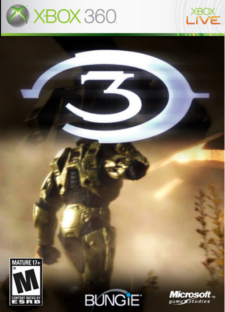
neat pic, but it loks like MC head get's cut off by the logo...other than that, this is great, everyhitng is near perfect quality. 4.5/5
(fixing MC head will score you a 5) :P
Radioactive Bob more like Over Enthusiastic Bob; all he did was add the Halo3 plain font onto a picture that doesnÂ’t reflect the game which is covering the chiefs also the end of the template is snipped of in accordance to the image, this is bad.
Its it unoriginal and required no thinking effort, please stop flooding the site with Halo 3 effortless pieces.

 Halo 3 Box Cover Comments
yea boy i got an awesome halo 3 pic and rendered it around a bit it kick @$$.
[ Reply ]
i do not like how the logo cuts of mastercheifs head..you should use the other logo you know..the one with words were it says halo 3..
[ Reply ]
neat pic, but it loks like MC head get's cut off by the logo...other than that, this is great, everyhitng is near perfect quality. 4.5/5
(fixing MC head will score you a 5) :P
[ Reply ]
#3, ok i will fix
[ Reply ]
there i updated it for you guys
[ Reply ]
Radioactive Bob more like Over Enthusiastic Bob; all he did was add the Halo3 plain font onto a picture that doesnÂ’t reflect the game which is covering the chiefs also the end of the template is snipped of in accordance to the image, this is bad.
Its it unoriginal and required no thinking effort, please stop flooding the site with Halo 3 effortless pieces.
[ Reply ]
#6, ok i will
[ Reply ]
1 thing- add more color to the name (halo, its just plain white)
[ Reply ]
I am so sick of E G pointing out something small on a box that everyone likes! Anyway, I like it. 4/5
[ Reply ]