My 2nd Box, Im sorry if im not that good but i think this came out pretty good, i made it in paint.NET. Im don't think im that good at backs, their pretty hard. This box took me around 4 hours to do. and credit bearded walrus for the template. everything else was made and rendered by me!Hope you like it.
Id also appreciate it if you comment.
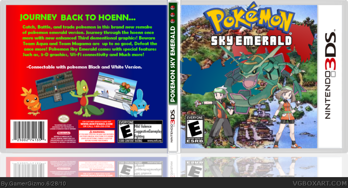
On the front, you're missing the Pokemon Company, Nintendo, and Wi-Fi logos, as well as "Game Experience May Change During Online Play".
Also, in full view, the bad rendering is very visible. I suggest erasing what's left over after using Magic Wand, rather than leaving the strange outlines.
The back suffers from the same rendering, and I feel it's a bit too plain.
Also, "Suggestive Gameplay" and "Fighting" don't belong with the rating, and "Mild Violence should be "Fantasy Violence".
The tagline and description are also kind of boring; drop shadow or outline would be good.
"..." in the tagline doesn't look right, a simple "!" would be. Also, there are quite a few capitalization, spelling and grammatical errors in the description.
Still, this is good for a second, and it has some potential.
6/10
wow i must admit i like if especially for a beginnner. you have an outline of groudon yet no kyogre, and the back is a little plain. try background instead of color fade. get pictures or patterns. i'll fave tho :D
 Pokemon Sky Emerald Box Cover Comments
My 2nd Box, Im sorry if im not that good but i think this came out pretty good, i made it in paint.NET. Im don't think im that good at backs, their pretty hard. This box took me around 4 hours to do. and credit bearded walrus for the template. everything else was made and rendered by me!Hope you like it.
Id also appreciate it if you comment.
Edited at 1 decade ago
[ Reply ]
On the front, you're missing the Pokemon Company, Nintendo, and Wi-Fi logos, as well as "Game Experience May Change During Online Play".
Also, in full view, the bad rendering is very visible. I suggest erasing what's left over after using Magic Wand, rather than leaving the strange outlines.
The back suffers from the same rendering, and I feel it's a bit too plain.
Also, "Suggestive Gameplay" and "Fighting" don't belong with the rating, and "Mild Violence should be "Fantasy Violence".
The tagline and description are also kind of boring; drop shadow or outline would be good.
"..." in the tagline doesn't look right, a simple "!" would be. Also, there are quite a few capitalization, spelling and grammatical errors in the description.
Still, this is good for a second, and it has some potential.
6/10
Edited at 1 decade ago
[ Reply ]
#2, Alright ill try to fix those, thank you
[ Reply ]
wow
[ Reply ]
#4, Wow as in you like it?
[ Reply ]
I think for a beginner it's a very decent box, some submit really crappy ones but this looks promising. few tips though:
-Find higher quality images when making a box (Graphic design in general)
- Don't use gradiant maps as backgrounds (find actual BG for the game and use them)
- Don't use default fonts (download some fancy fonts)
- always use an official box of the game for references and not copying, just to see how the game feels.
- Make everything same contrast/brighteness so all blend together.
- Post box in the WIP forums to get help and to improve. :)
Good luck and never stop or give up.
[ Reply ]
THIS BOX IS A FAIL SUCKS THE WORSE BOX EVER IN LIFE
[ Reply ]
#7, so because i gave you rough constructive criticism on your box you come and troll on mine? grow up kid.
[ Reply ]
wow i must admit i like if especially for a beginnner. you have an outline of groudon yet no kyogre, and the back is a little plain. try background instead of color fade. get pictures or patterns. i'll fave tho :D
[ Reply ]
#9, Thanks for the fav and advice, but i do have a kyogre outline thats not as easy to see because its blue.
[ Reply ]
#9, Still waiting for that fav XD.
[ Reply ]
love the idea, is it supposed to be like a sequel to emeral, sapphire, and ruby?
[ Reply ]
#12, thanks, but its supposed to be a remake, like how fire red was a remake of red, soul silver was a remake of silver, ETC.
[ Reply ]
#7, That was by purpose not that this box sucks.
[ Reply ]
#14, What?
[ Reply ]
Great boxart. My SkyEmerald one is kinda basic, so I think yours is better. Check my profile out for it!
[ Reply ]
I think this is good. I like the front better than the back. 8/10
[ Reply ]