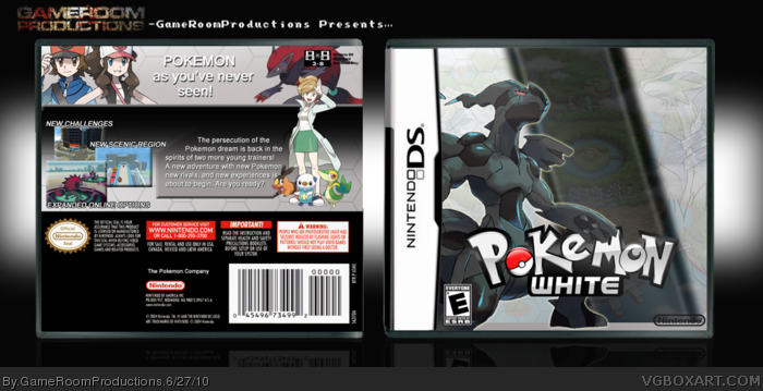
I thought it was about time I made a Black or White box, and since I am getting White I thought I'd make that one. This was a lot of fun to make and I can't wait for this game!!
Credits:
Template- jevangod
Logo- YoshiStar
Nintendo Logo- Cerium
Renders- Bulbapedia
Umm... This may sound weird, but it almost looks like you copy and pasted the hexagons from my portal box. Lol I'm probably horribly wrong, but it's a suspicion :D
#6, Nah, for some reason I just wasn't feeling it.
#7, No, lol. I got these hexagons just from Google Images.
#9, A couple things. First, I'd appreciate it if you didn't advertise your box on my box's page. Second, that box isn't even funny. I hate when people think they're funny by saying things like, "lolz. Pikachu on cocaine, lolz".
#9, I see what you're saying and I thought the same, but then I decided to go with a contrast look and have the opposite colors.
Interesting, I like the front design. Though the back, I'm a bit disappointed you didn't try for something original and similar to the front, and instead went for a more basic Pokemon layout we've seen before.
Not bad. I'm not a fan of the back, but the front is nearly perfect. I think the line that splits black and white should be more pronounced, as in sharp as opposed to blurry.
 Pokemon White Version Box Cover Comments
I thought it was about time I made a Black or White box, and since I am getting White I thought I'd make that one. This was a lot of fun to make and I can't wait for this game!!
Credits:
Template- jevangod
Logo- YoshiStar
Nintendo Logo- Cerium
Renders- Bulbapedia
[ Reply ]
It is good, but the font on the back looks a little strange, though.
Edited at 1 decade ago
[ Reply ]
Nice!
[ Reply ]
Pretty good!
[ Reply ]
#2, I will try to find a more suitable font.
#3 and #4, Thanks guys!!
[ Reply ]
No Wall-E this time?
[ Reply ]
Umm... This may sound weird, but it almost looks like you copy and pasted the hexagons from my portal box. Lol I'm probably horribly wrong, but it's a suspicion :D
[ Reply ]
I thought TheSlyder made this, if he made a cover like this the world would end.
[ Reply ]
link
[ Reply ]
#9, Please don't advertise your box on other people's boxart pages. It's annoying and disrespectful.
I don't think this box is white enough for Pokemon White. :P It looks nice though.
[ Reply ]
#6, Nah, for some reason I just wasn't feeling it.
#7, No, lol. I got these hexagons just from Google Images.
#9, A couple things. First, I'd appreciate it if you didn't advertise your box on my box's page. Second, that box isn't even funny. I hate when people think they're funny by saying things like, "lolz. Pikachu on cocaine, lolz".
#9, I see what you're saying and I thought the same, but then I decided to go with a contrast look and have the opposite colors.
[ Reply ]
Interesting, I like the front design. Though the back, I'm a bit disappointed you didn't try for something original and similar to the front, and instead went for a more basic Pokemon layout we've seen before.
Edited at 1 decade ago
[ Reply ]
#12, I agree with you 100% and you can expect a much more original back layout on my Black Version box.
[ Reply ]
Not bad. I'm not a fan of the back, but the front is nearly perfect. I think the line that splits black and white should be more pronounced, as in sharp as opposed to blurry.
[ Reply ]
I really dislike that tagline font. It isn't very exciting, and it looks very generic. Other then that, It is very nicely made.
[ Reply ]