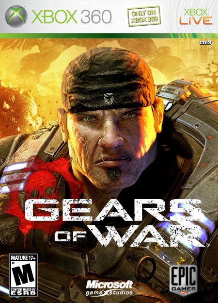
I really wish the official box haven't of came out yet, or I would be praising over this. Unfortunately, it has, and I can't stop comparing it toward the official one. 4.0/5
Suggestions:
1. Move Marcus Fenix up just enough so that his head is barely being cut-off by the template.
2. Move the logo more to the center because it's pretty rare to see a logo so far down like that. This may allow the logo to look a lot more clearer.
3. Straighten up the company logos a bit like the Epic Games logo needs to be more over to the right. Also, widen the Mature logo a little bit.
I am already saw this somewhere:) link
Anyway, you made a good job. Good quality, but very low resolution! Looks like first time ever I should agree with HelghastMist :D... 4/5

 Gears of War Box Cover Comments
I love it! but try making the GoW logo more noticable at the end. i can't easily read the "s" and "r" other than that,
4.5/5
[ Reply ]
I see...hmmm, any suggestions?
[ Reply ]
#2 - Maybe try a 1 or 2 pixel outline or a subtle drop shadow.
[ Reply ]
#3, Thanks, I'll give it a shot!
[ Reply ]
Better?
[ Reply ]
i up this up to a 5/5, this is too awesome :)
[ Reply ]
I really wish the official box haven't of came out yet, or I would be praising over this. Unfortunately, it has, and I can't stop comparing it toward the official one. 4.0/5
Suggestions:
1. Move Marcus Fenix up just enough so that his head is barely being cut-off by the template.
2. Move the logo more to the center because it's pretty rare to see a logo so far down like that. This may allow the logo to look a lot more clearer.
3. Straighten up the company logos a bit like the Epic Games logo needs to be more over to the right. Also, widen the Mature logo a little bit.
[ Reply ]
I am already saw this somewhere:) link
Anyway, you made a good job. Good quality, but very low resolution! Looks like first time ever I should agree with HelghastMist :D... 4/5
[ Reply ]
Fixed, again.
[ Reply ]
I looked at the previous versions and compared them with teh comments, and your latests version, one word: Awesome.
5/5
[ Reply ]